


Table of contents
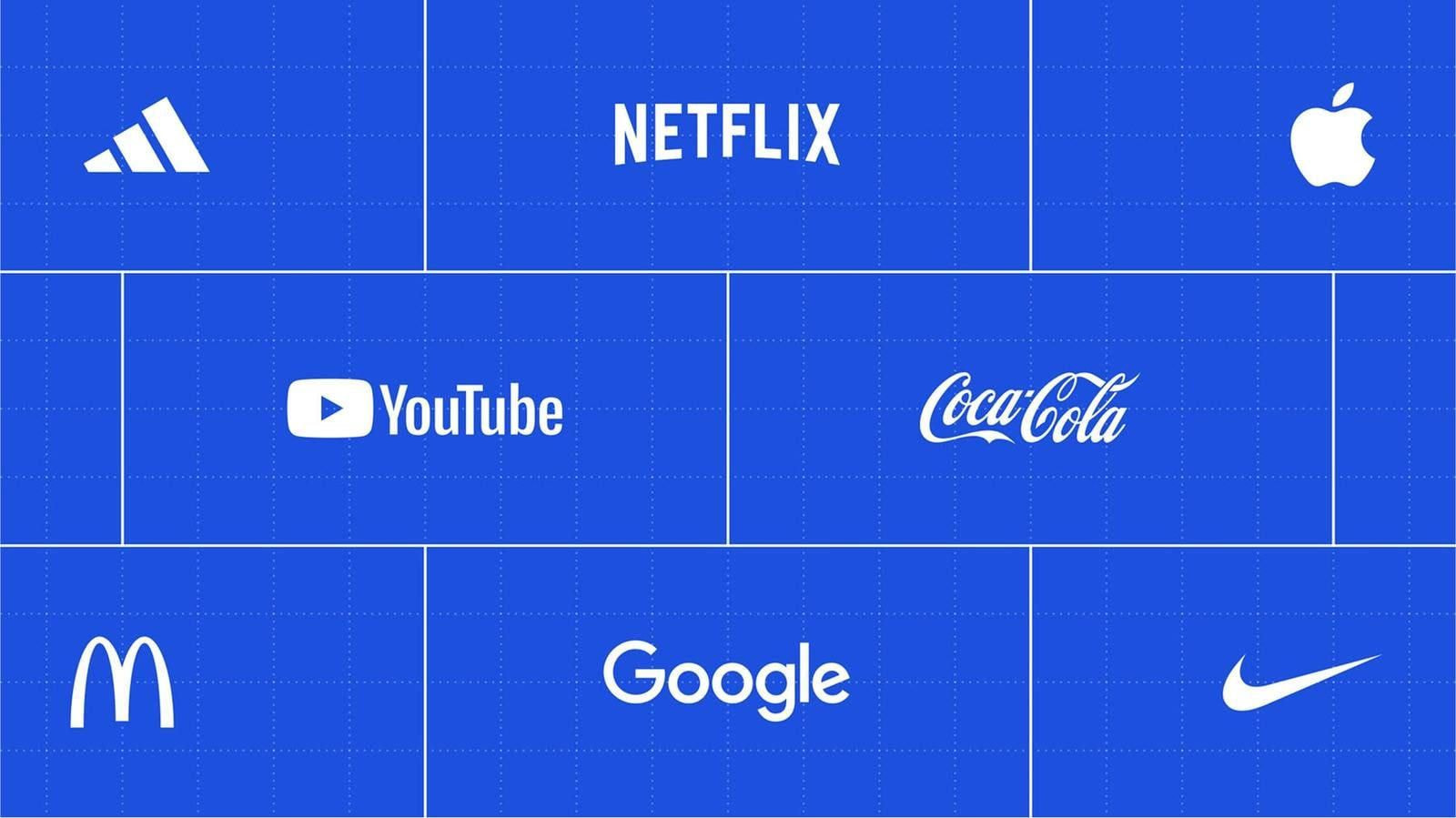
Famous logos stick in your brain long before you realize it. Think of the Nike swoosh on a hoodie, the Coca-Cola script on a can, or the Apple silhouette glowing on a laptop. These tiny visuals shape culture, spark emotion, and build entire empires. Here’s your backstage pass to what makes famous logos unforgettable and how you can craft your own.
What makes a logo famous?
Famous logos rise fast when a brand commits to clarity, repetition, and a visual story people remember. The best logos keep their shape over decades, adapt to new trends, and use design elements that land instantly at first glance. When a logo symbol feels timeless, recognition becomes effortless.
Here’s what helps logos break into the “famous” tier:
-
Consistency across products, ads, and digital platforms
-
Simplicity that survives any size, format, or background
-
Symbolism tied to what the company name stands for
-
Emotional pull that sticks longer than the original logo
-
Adaptability without losing core logo features
-
Color choices that create a lasting impression
-
A clear story, even without words or hidden meaning
Together, these ingredients shape famous brands that carve out space in culture and stay recognizable for generations. Now let’s take a closer look at some of the most successful logos and uncover what makes each one so memorable.
20 Most famous logos and their stories
1. Apple
The Apple logo started as a detailed illustration but quickly shifted to the clean silhouette everyone knows. Its power comes from stripping the idea down to a bold, unmissable shape that works at any scale.
The bite adds balance and creates instant recognition. It’s one of the most famous logos because it communicates innovation without a single word. The simplicity helped Apple shape a sleek, modern brand that audiences connect with instantly.
2. Microsoft
Microsoft’s four-color window squares bring clarity to its mission of connection and creativity. The earlier mark leaned more corporate, but the refreshed design introduced a friendly, modern structure.
Each square hints at a product category, giving the layout a subtle logic. The uniform geometry keeps the logo steady across products and screens. It’s recognizable at first glance, and its approachable tone reflects a company built around everyday digital experiences.
3. Google
The Google logo thrives on color, rhythm, and personality. Its playful mix of hues breaks tech’s old rules and keeps the identity approachable. Over time, Google moved from serif lettering to a cleaner, geometric style that feels modern but still warm.
The shifting doodles helped audiences connect with the brand on a human level. This balance makes it one of the most famous logos used across global search, tools, and platforms.
4. Amazon
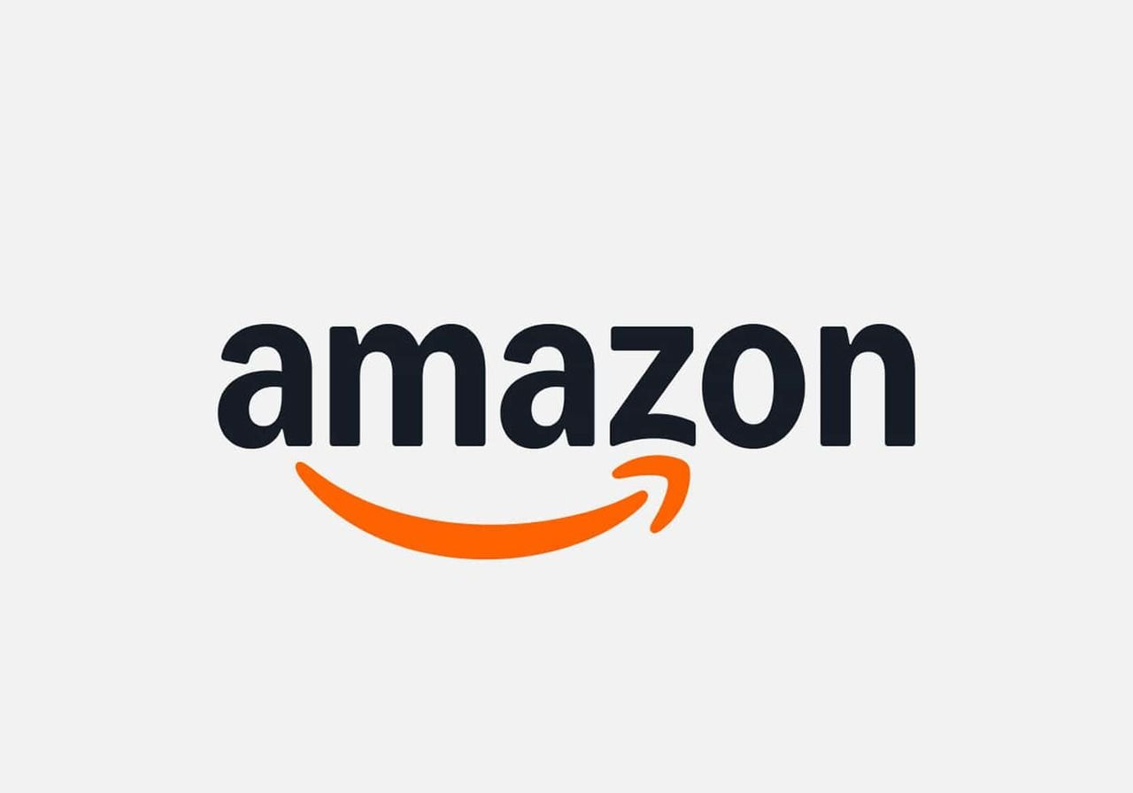
Amazon uses a friendly arrow that runs from A to Z, showing range, delivery, and movement in one gesture. That small curve also resembles a smile, adding warmth to the mark. It’s a concise visual summary of ambition and convenience.
The stability of Amazon's logo across the years helped shape trust, especially as new services appeared. It delivers meaning through a single stroke, which gives the icon lasting power.
5. Facebook
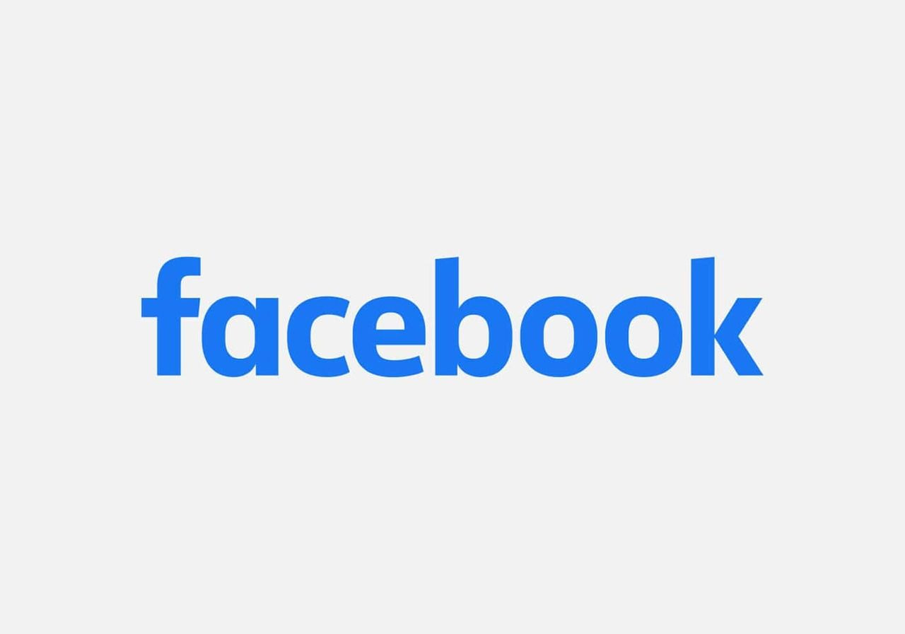
Facebook’s mark leans into simplicity, pairing a calm blue tone with a familiar rounded form. Subtle updates over the years kept the current logo fresh without removing its core shape. The pared-down structure shows how color psychology supports a platform built on connection.
While styles change, this identity still competes with the most famous logos thanks to its clarity and approachability across billions of screens.
6. YouTube
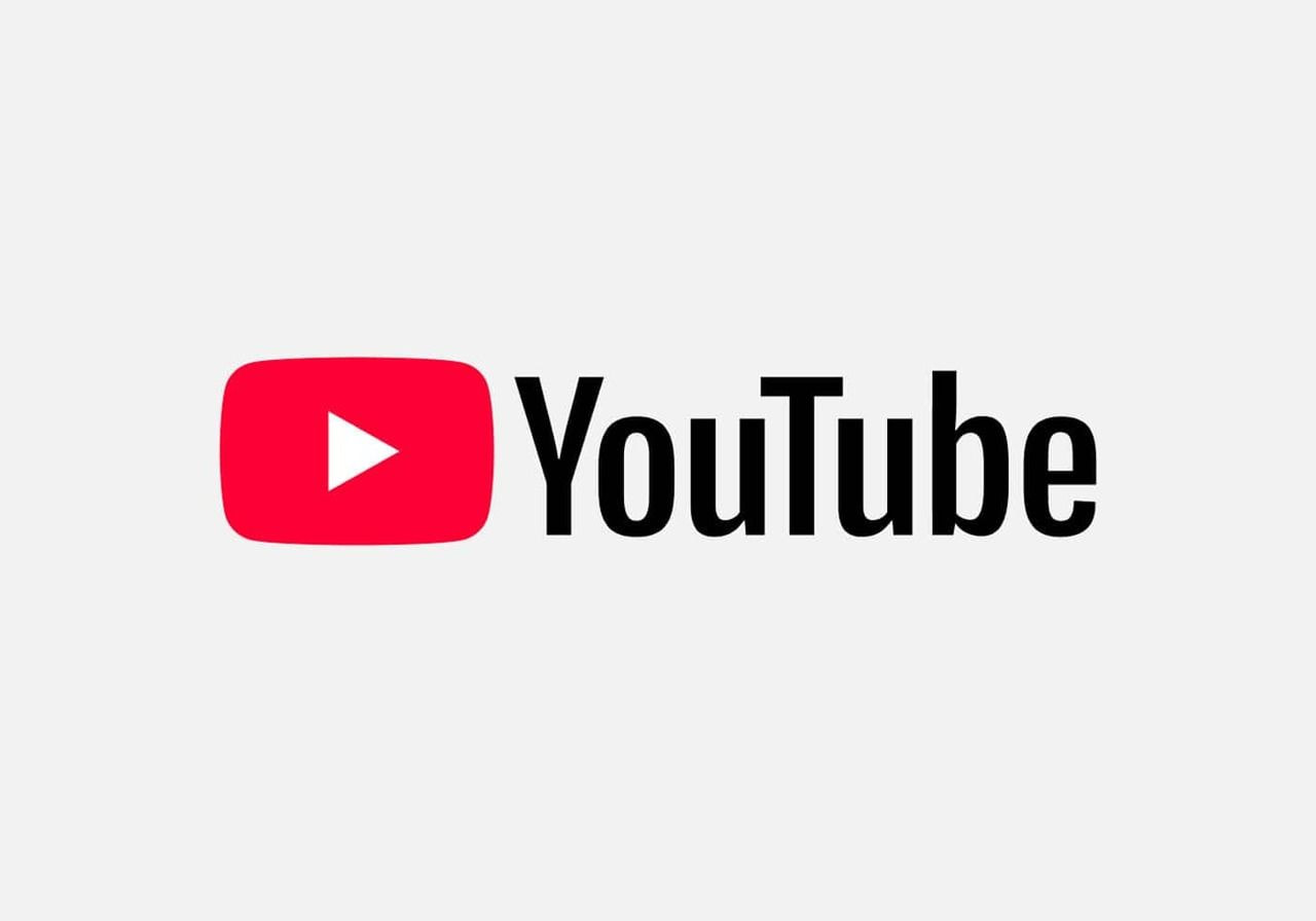
YouTube’s red play button tells the entire story without extra decoration. Earlier versions used a more dimensional style, but the simplified one feels sharper and more focused. The symbol works everywhere – from TV apps to tiny mobile screens – and contains the entire platform’s purpose inside one shape.
It rises above many company logos because it blends utility and personality, making it easy to spot in any media lineup.
7. Coca-Cola
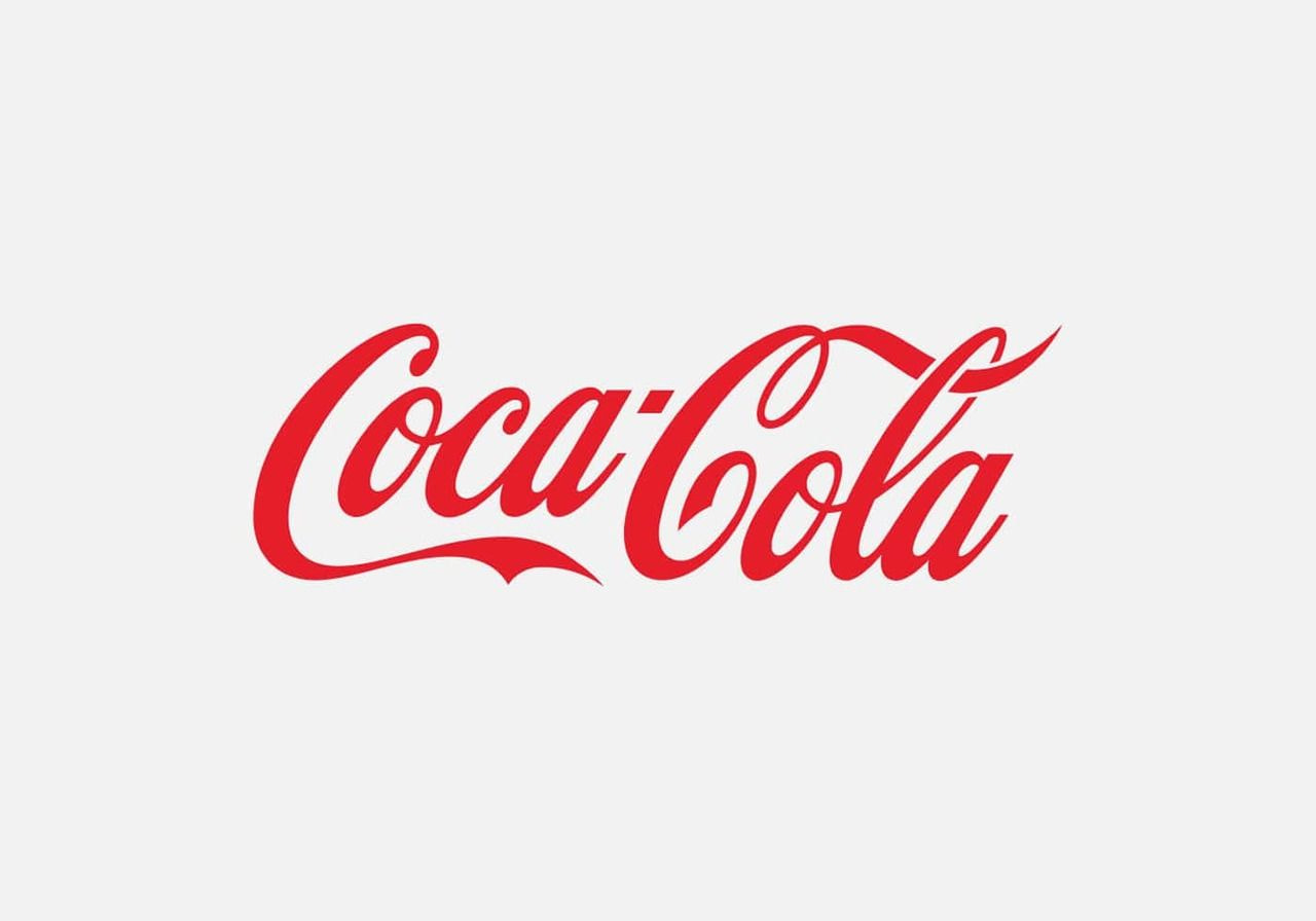
With its flowing script and energetic curve, Coca-Cola shows how typography alone can express joy and tradition. The style stays remarkably close to the original, which keeps the heritage alive. Its red and white palette became part of global culture, and even seasonal variations never stray far from the core.
The design creates a festive feeling at first glance, making it one of the most famous brand visuals ever created.
8. Pepsi
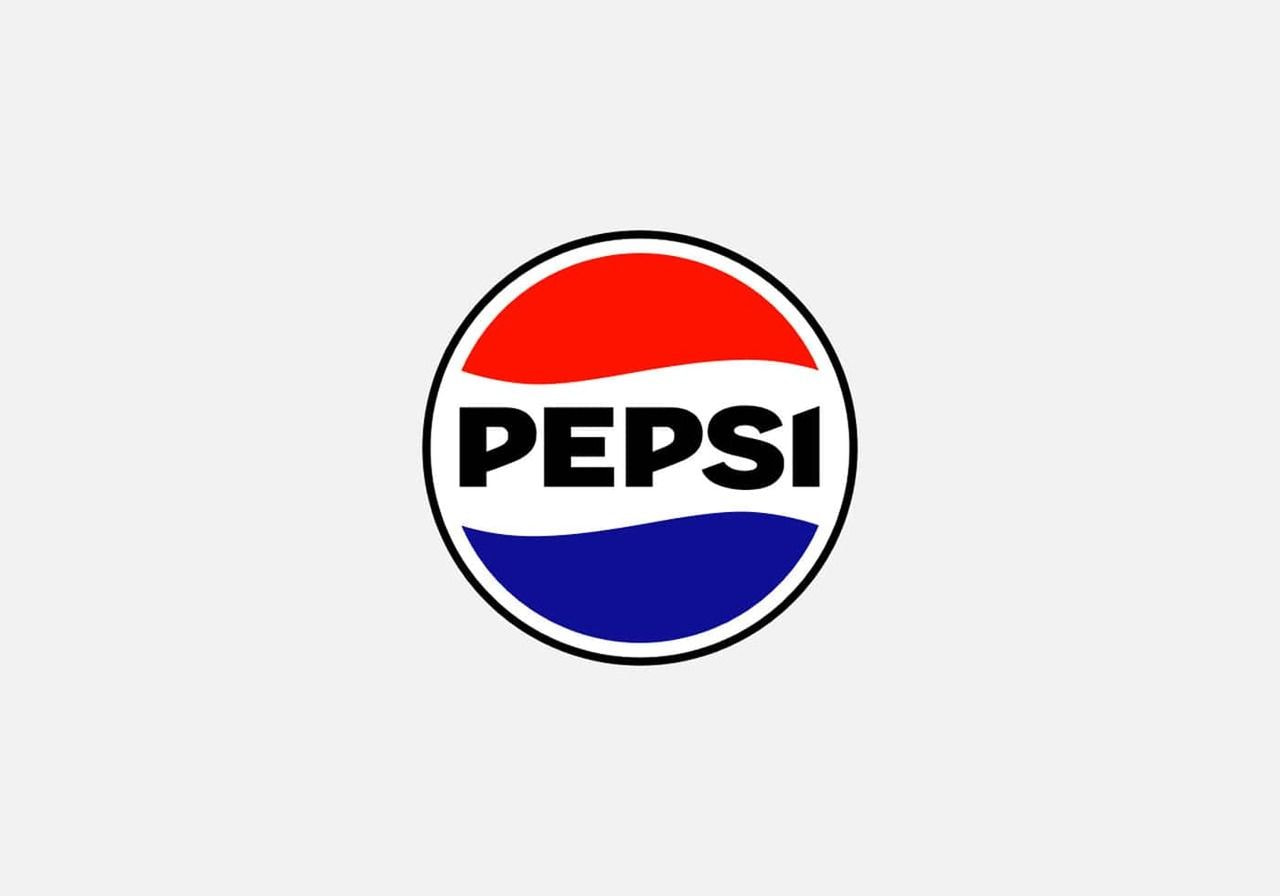
The Pepsi logo keeps its circular shape but has evolved through decades of reinterpretation. The wave inside reflects motion and freshness without overwhelming the layout. Its red, white, and blue palette is bold yet balanced, helping the mark stand out on shelves worldwide.
As the geometry became cleaner, the personality sharpened, giving Pepsi a crisp, modern look. The refreshing symmetry contributes to its place in global visual culture.
9. Nike
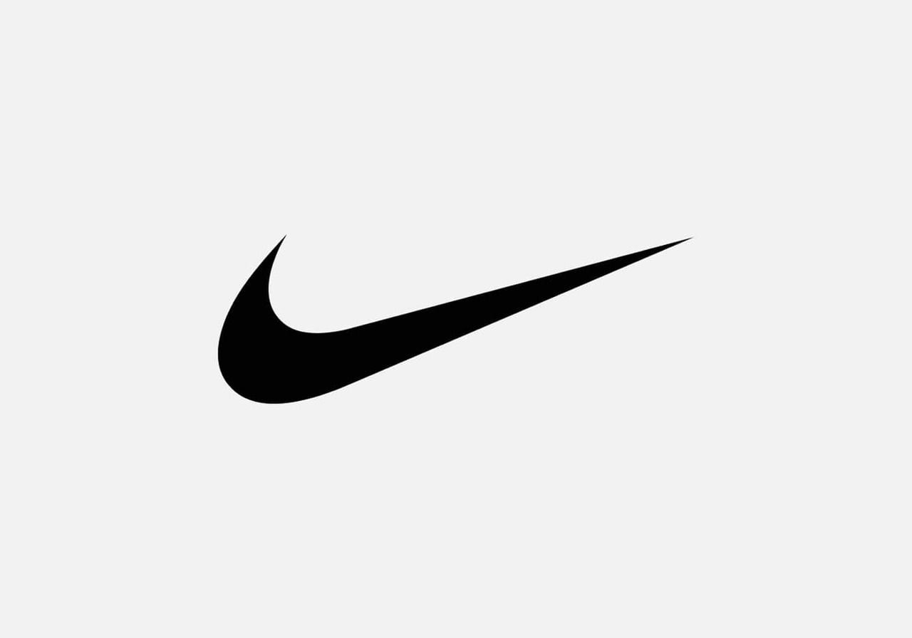
The Nike swoosh delivers one of the cleanest examples of movement captured in a single stroke. Inspired by a goddess, it expresses speed, ambition, and athletic energy instantly. The mark originally cost just a small commission, yet it grew into a cultural icon recognized everywhere.
This fluid curve proves how a minimal form can create a powerful, lasting impression, shaping one of the most successful stories in design history.
Valuable read: Clothing brand logo design principles
10. Adidas
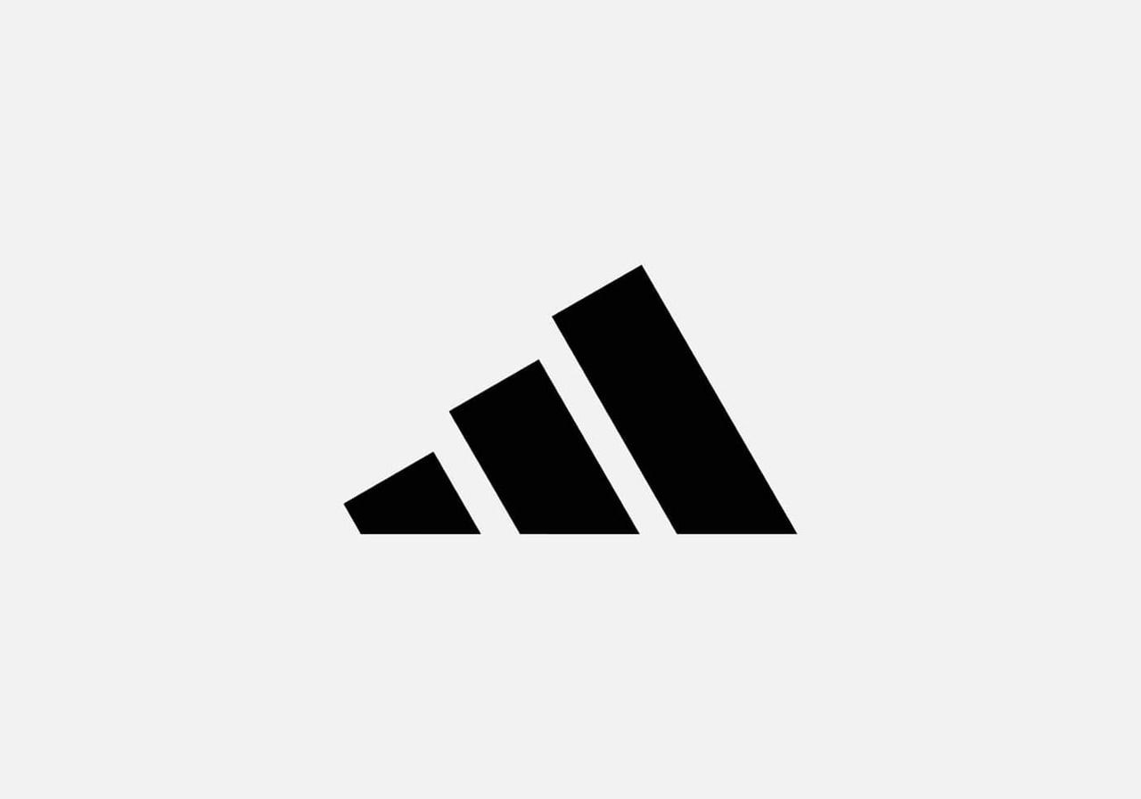
Adidas has explored several geometric directions, but the three stripes remain the constant thread. The angled trio suggests mountains, grit, and progress. Earlier versions were flatter, while later ones added depth or varying line weights. Despite the evolutions, the brand’s core rhythm stays recognizable.
The strength of the concept, not ornamentation, keeps the identity memorable. It’s a reminder that repetition and symbolism can create enduring clarity in sports culture.

11. McDonald’s
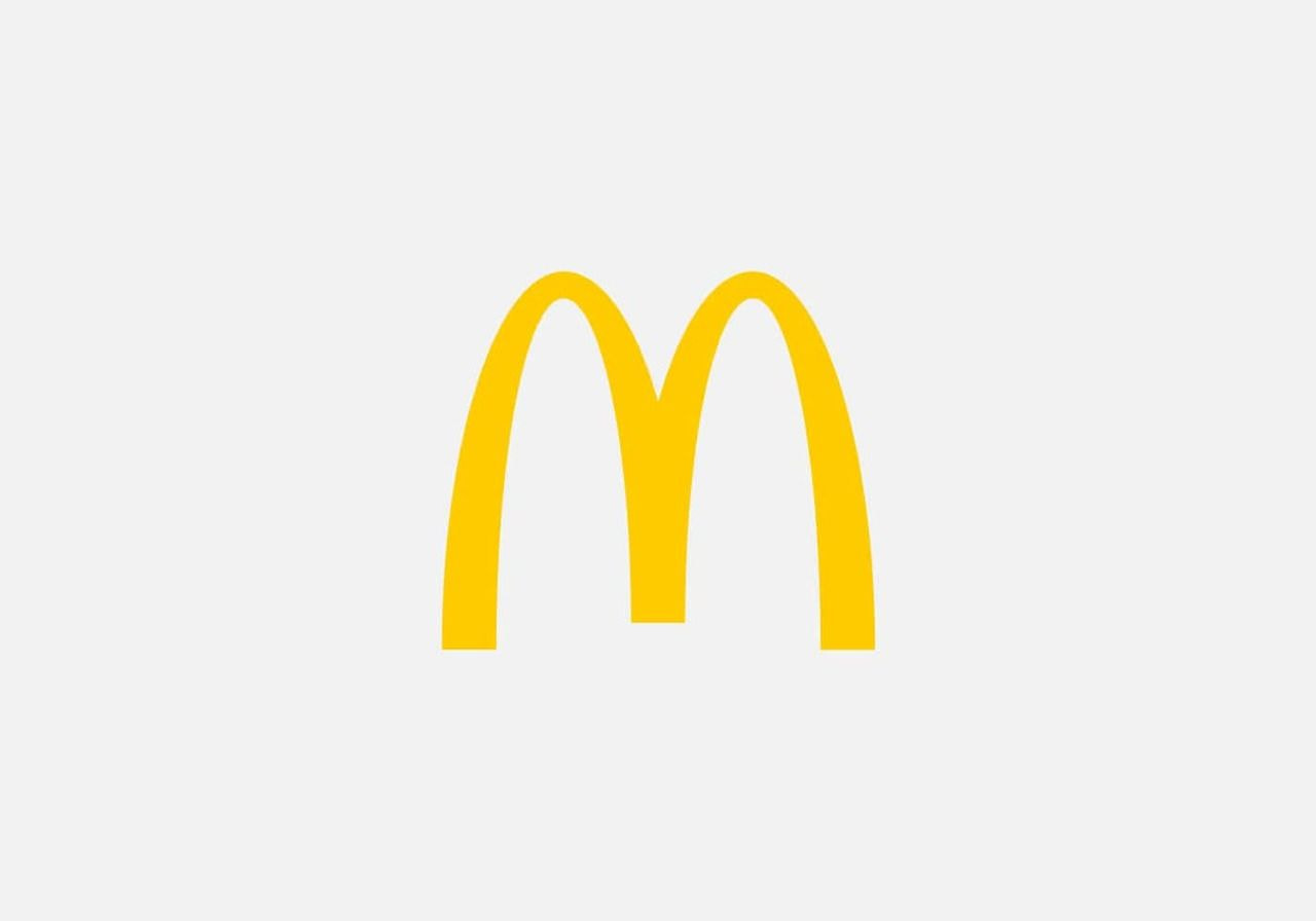
The McDonald's logo turned the restaurant’s architecture into a worldwide signal. Those golden arches started as literal structural elements before transforming into a graphic mark. The bright yellow curve pops against any background, inviting attention fast.
Its story shows how one shape can outgrow its origins and anchor a global identity. The arches became shorthand for quick comfort, helping the chain stand out in crowded food landscapes.
12. Starbucks
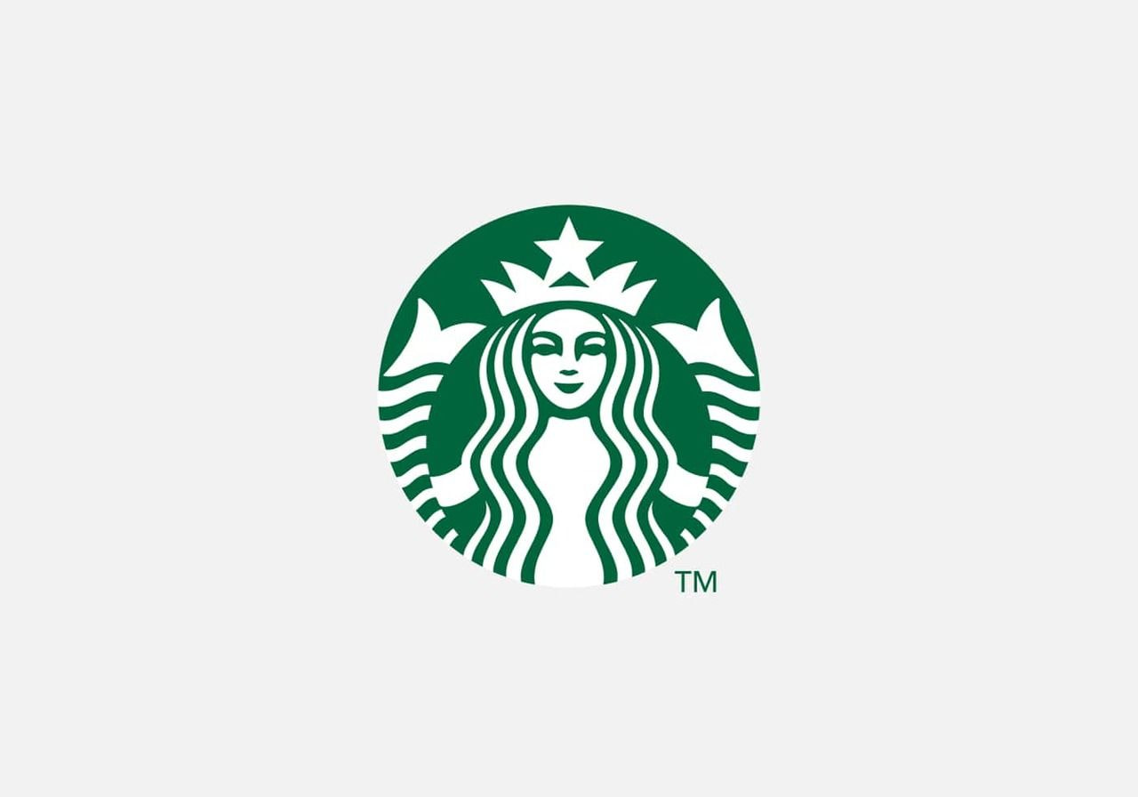
Starbucks kept its siren at the center but refined her details over time for clarity and balance. The outer ring was gradually simplified, placing greater emphasis on the illustration. Green became the anchor for calm, freshness, and community. The character-driven approach distinguishes it from more geometric identities.
The result feels handcrafted yet modern, giving the brand a friendly, myth-inspired personality that appeals to a wide audience.
13. Louis Vuitton
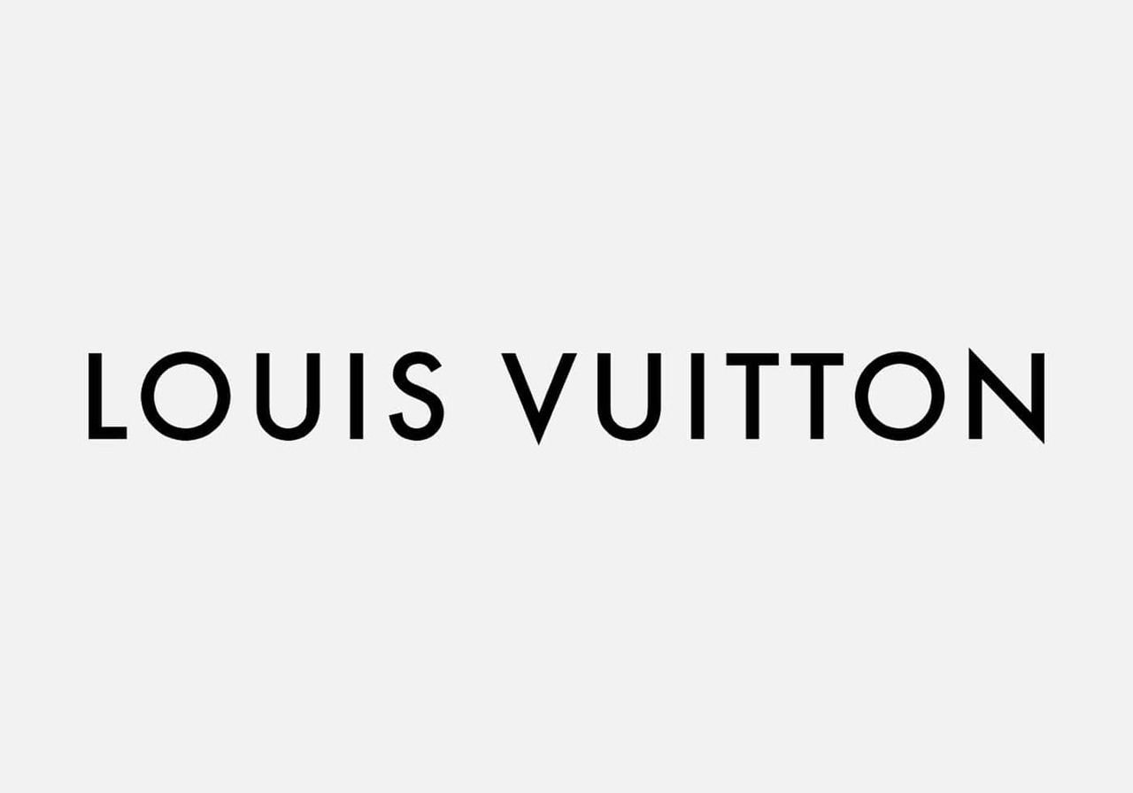
Louis Vuitton’s iconic monogram began as an anti-counterfeit strategy but grew into a cultural emblem. The typography and floral motifs combine into one of the strongest company logos in luxury. Its balance gives it a refined presence at first glance, and the disciplined pattern feels unmistakable even on small surfaces.
This is a masterclass in turning an original logo design into a global signature without losing its character.
14. Chanel
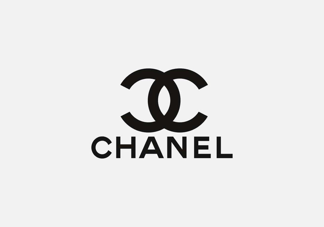
Chanel’s overlapping Cs create symmetry that feels both bold and delicate. The black-and-white palette highlights the clarity of the form, keeping it adaptable in any setting. Originally created to reflect Coco Chanel’s refined vision, the mark continues to convey precision and luxury today.
The double-C shape stands firm across packaging, boutiques, and couture. Its simplicity gives it a modern spirit despite its long history.
15. Gucci
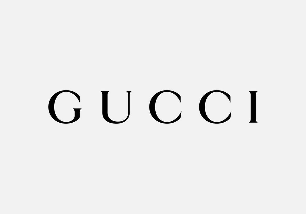
Gucci’s mirrored Gs form a confident pattern that instantly signals luxury. The symmetry gives the mark a strong shape that stands out in any fashion brand lineup. Early versions were more ornate, but today’s structure holds a refined tone.
It’s one of those popular logos that blends heritage with attitude, creating a rhythm that resonates with a global company built on craftsmanship and bold aesthetics.
16. Dolce & Gabbana
Dolce & Gabbana embraces a typographic identity that reflects Italian glamour. The crisp lettering speaks clearly even when placed on intricate patterns or bold textures. The logo acts as a confident signature across perfume bottles, apparel, and accessories.
Its strength lies in directness – no decoration, just a name with attitude. This clarity helps the brand retain influence across shifting fashion eras.
17. Disney
Disney’s looping script captures the sense of wonder woven into the company’s storytelling. Inspired by Walt Disney’s handwriting, the playful curves and tall strokes create an inviting rhythm.
The mark feels optimistic, which aligns with the worlds and characters Disney built. It works across movies, parks, and merchandising. The typography alone delivers emotion, keeping the identity beloved across generations.
18. Netflix
Netflix’s identity shifted from a retro marquee to a sleek, compact design that clicks immediately in modern interfaces. The streamlined “N” creates a ribbon-like depth that reads well even at tiny sizes.
It’s a great example of how logo design adapts to technological advancement, especially when viewed across apps and smart TVs. The red-and-black scheme remains distinct, making it easy to recognize at first glance in crowded media grids.
19. Warner Bros.
Warner Bros. kept its shield shape through countless redesigns, allowing it to evolve while holding onto tradition. From metallic gradients to modern flat styles, each refresh kept the silhouette intact. The monogram inside the shield brings personality, while the structure delivers authority.
This continuity helped the studio preserve its heritage across animation, film, and TV. It’s a steady anchor in entertainment branding.
20. BMW
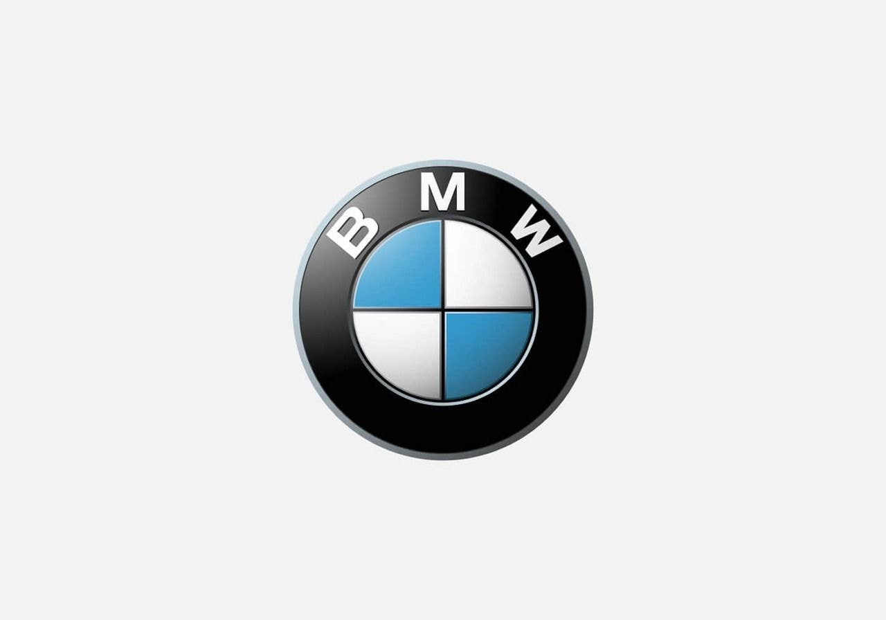
BMW’s roundel mixes Bavarian heritage with a clean geometric layout that still feels modern. The brand kept the circular frame through every update, letting the original design evolve without losing identity.
Many fans think the quadrants suggest rotating propellers, but it’s actually a color reference to the region. As one of the most famous company logos, it delivers clarity at first glance and stays sharp across digital surfaces and metal badges.
How to design a logo for your business

Pick a style that fits your brand personality
Start with your vibe. A wordmark logo works when your company name carries the story, while symbols or combination marks help if you prefer a visual shortcut. Minimal shapes or a bold emblem all steer your logo design toward different moods.
-
Think of how Coca-Cola leans into script or how a dynamic logo works for brands that move fast.
Try exploring styles on tools like Looka, Logo.com, Fiverr Logo Maker, or Adobe’s and Canva’s tools to feel out your direction.
Valuable read: Ten types of logos and what to learn from them
Choose colors and fonts that support your message
Your logo colors shape how people read your brand at first glance.
-
Neutrals feel classic, neon feels playful, and serif fonts lean more polished than geometric sans-serifs.
Create a small palette with one primary and one secondary color, then test how each performs on light and dark backgrounds. Brands like National Geographic show how a single bold color can do the heavy lifting.
Valuable read: Color psychology in eCommerce and branding
Sketch ideas and refine your top concepts
Grab paper or a tablet and sketch fast. Don’t overthink it. Your first logo ideas help uncover shapes, rhythms, and potential hidden symbols that could strengthen your identity. Circle three options, simplify them, and remove any clutter that distracts from the core idea. You’ll spot what feels close to an original logo after a few rounds.
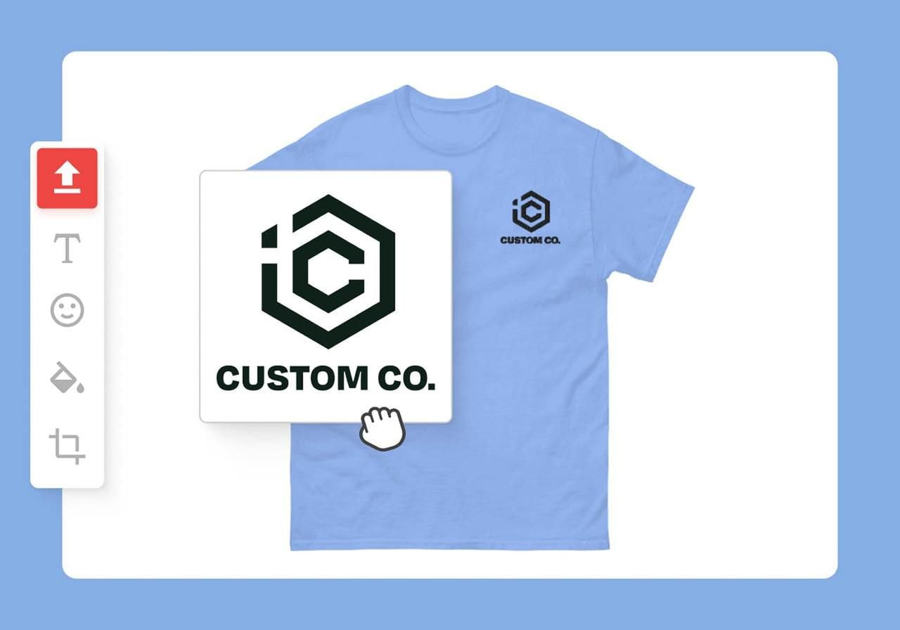
Test your logo across real-world mockups
Before calling it done, drop your logo onto packaging, shirts, social headers, and website banners. Mockups show how it behaves next to other company logos and how it scales down in tight spaces.
Printful’s free Design Maker makes previewing merch straightforward, turning testing into a fun way to see your idea in action.
Valuable read: What is a personal brand and how to build yours
Is your logo ready? Put it to use with Printful
Printful helps you turn a concept into products without managing inventory, shipping, or equipment. You focus on the creative; we handle production so you can grow your brand at your own pace.
Here’s how to launch your branded products:
-
Sign up for free on Printful
-
Pick your products from apparel, accessories, eco-friendly options, and more
-
Customize the design by adding your logo as the main artwork or a subtle branding touch
-
Sell online or order for your company, while Printful fulfills everything behind the scenes
Conclusion
Famous logos earn their place by mixing clarity, character, and strong storytelling. From the Nike swoosh to the yellow bar of National Geographic, each design shows how a simple visual can transform a brand and outlast trends.
With this knowledge and your own logo design ready, you can create products that stand beside the best logos of all time. Bring your idea to Printful and start turning it into something real.
Famous logos: FAQ
The top ten usually include famous logos like the Apple symbol, the Google logo, the Nike swoosh, Amazon’s logo, the Coca-Cola script, the McDonald’s logo with the golden arches, the Pepsi logo, YouTube, Mercedes-Benz, and Disney. These are the most famous logos spotted instantly at first glance.
Many pick the Nike swoosh as the most iconic logo ever. It’s a simple logo design originally designed to capture motion, inspired by a Greek goddess. Plenty of famous brand logos come close, but the swoosh makes a lasting impression across sports, fashion, and digital marketing.
The seven types include the wordmark logo, lettermark logo, emblem logos, abstract logo styles, mascot logos, combination marks, and minimalist symbol-driven logos. Each logo design style shapes how a logo represents a brand image, from clean typography to hidden meaning inside shapes or negative space.
A good example is the Pepsi logo, because it mixes color, balance, and a simple, basic structure that works across every platform. The logo shows how successful logos use clear design elements that draw attention fast without losing personality, scale, or clarity when resized.
Disclaimer.
All trademarks, logos, and brand names are the property of their respective owners and are used for identification and informational purposes only.

By Baiba Blain
With 7+ years of experience in translation and creative writing, Baiba now leads a squad of talented writers, balancing research-backed storytelling with team guidance, quality assurance, and SEO processes. Outside of work, she enjoys exploring old castles, spontaneous road trips, and talking back to her cats. 10/10 arguments won so far.