


Table of contents
When figuring out how to start a clothing brand, color, branding, and ecommerce considerations are rarely black and white.
For most people, visuals matter the most, and your customers are no different. They might not consciously notice the color scheme of your store or catch the exact red hue of the call-to-action button you’ve spent weeks choosing, but their subconscious is hard at work all the time. And there, color takes the cake.
Customers need no more than 90 seconds to make a snap judgment about you and your product. This is true for online shopping in particular because customers can’t use their other senses to make a decision. What’s more, up to 90% of this judgment is based on color alone.
The human eye can see about 10M different colors, so choosing a color scheme for your business can seem like a mission impossible. It doesn’t help that colors are basically just a pigment of our imagination—each person sees colors a little differently. No wonder the white/gold vs. blue/black dressgate got 4.4M tweets in just 24 hours.
But don’t worry, there’s a science behind it all that might help! Let’s look at color theory and color psychology to see how they can help you get the best out of your ecommerce business.

Color theory
Let’s start with the basics, which, in this case, is color theory. Rooted in art and science, color theory explores the use, mixing, and effect of color. Artists, designers, and marketers often apply color theory principles to evoke specific responses or emotions to achieve certain effects.
Color theory strives to create a logical structure for using color, and it all begins with the oh-so-familiar color wheel.
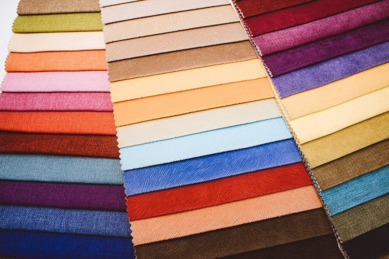
Color wheel
The color wheel is a visually easy way to understand the relationships between colors. The traditional color wheel, most often seen on the walls of high school art classes worldwide, offers 12 colors.

The primary colors in the wheel are red, yellow, and blue, which can be used to create secondary colors (orange, green, violet). By mixing primary and secondary colors, we get tertiary colors – red-orange, yellow-orange, yellow-green, blue-green, blue-violet, and red-violet.
So far, so good, and it might have stayed that way if these were the only colors we had to deal with.
Hues, tints, shades, and tones
The traditional color wheel only shows pure colors (also known as hues). But as the title “50 Shades of Grey” suggests, the world of color has so much more to offer. This is where tints, shades, and tones come into play.
Pure color = hue
Pure color + white = tint
Pure color + black = shade
Pure color + gray = tone
There aren’t a lot of pure colors in our everyday life, so the human eye finds tints, shades, and tones much more pleasing. Whenever you create a tint, a shade, or a tone, the hue remains the same, it just gets lighter, darker, or less vibrant. So, this process doesn’t affect the position of the color on the color wheel, but each variation can evoke an entirely different feeling or convey a different message.
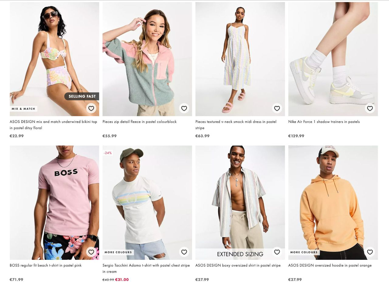
For example, tints, sometimes called pastels, are linked with tranquility and peace. Pastels are generally associated with innocence, playfulness, and youth. That’s why kids’ apparel brands often use pastel-colored schemes. These colors create a fun, whimsical aesthetic that resonates with parents and children alike.

Fashion brands like Kate Spade, Ted Baker, and ASOS frequently incorporate pastel color schemes in their collections, offering a soft, understated elegance that appeals to a wide audience.
Shades, on the other hand, are associated with sophistication, experience, and confidence, so they are often seen on sites that deal with high-end products and want to attract high-end clientele.
Brands like Gucci, Chanel, and Tom Ford have become synonymous with luxury and high fashion, and the color schemes they choose are an integral part of their brand identities. Using saturated hues like deep blacks, royal blues, and opulent golds underscores the exclusivity and aspirational nature of the products, often signaling to the customer that these are not just clothes but investments in a particular lifestyle or status.

Of course, it’s not just a matter of picking one color and sticking to it. You need to create a scheme, and this is where color harmony theory can help.
Color harmony
Color harmony deals with combining colors in a way that’s attractive to the eye. Lucky for us, the techniques for a more effective color harmony are based on the color wheel, so let’s roll it out again.
There are many ways to mix colors, but some techniques are used more often than others:
-
Monochromatic – various tints, shades, and tones of one color, e.g., yellow-green
-
Analogous – hues that are right next to each other on the color wheel, e.g., violet, blue-violet, blue, and blue-green
-
Complementary – opposites on the color wheel, e.g., blue and orange
-
Split-complementary – any color on the color wheel + two that flank its complementary color, e.g., yellow-green, red, and violet
-
Triadic – any three colors that are evenly spaced on the wheel, e.g., green, orange, violet
When you’ve picked your color scheme, the colors have to be balanced in a way that reflects what you want your customers to see and how you want them to react. Shifts in text size and color notifies that something’s different and requires attention. Lighter and darker sections with textual information in contrasting colors automatically attract customers’ attention to what’s important. Research shows that customers are more likely to remember the things that stand out.
For example, Uniqlo is clearly caught up on color theory and uses high contrasts on its page by putting light-colored call-to-action buttons on a dark background image. A reader’s eyes are immediately drawn to the action the brand wants them to take.

Tip: Moderation is the key – when everything’s in high contrast, nothing stands out.
Using colors that stand out against each other in clothing makes people notice them immediately, in the catalog and in real life. These strong contrasts can also make people feel excited to buy and wear your clothes. Plus, these color pairings look fabulous in photos, so they’re good for ads and social media.
Fortunately, there are a lot of tools that make it easier to choose from the millions of possible color combinations. However, when it comes to ecommerce, picking the right colors is not just an artistic choice but also a business decision.

Color in ecommerce and branding
Now that we’ve got all the technical jargon out of the way, it’s time to use color theory for your clothing brand. According to Kissmetrics, color increases brand recognition by 80%, directly linking to buyer confidence. Just think of Coca-Cola or Starbucks, and their colors immediately pop into mind. Kissmetrics also concluded that 52% of shoppers didn’t return to a website because of the overall aesthetic.
Color matters. But how to use it to your advantage?
Color psychology is the study of how colors influence us, so it’s easy to see why it’s such a hot topic in the world of ecommerce, especially when it comes to website color schemes. It’s also a controversial topic because of issues like cultural differences, color preference by gender, and many others. The problem is that there’s not a lot of precise research to go on, but there’s still lots to learn and consider.
When HubSpot did A/B tests with two different call-to-action buttons, they found out that the red button outperformed the green one by a whopping 21%. One of the possible explanations for this is that red excites people, while green relaxes. Each color has certain characteristics linked to them, and the psychology of color in marketing attempts to learn how to use them effectively. Here are some of the most popular associations:
-
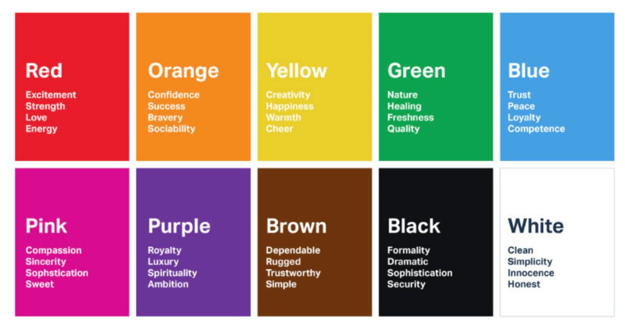
Blue – peace, tranquility, security
-
Purple – royalty, wisdom, respect
-
Orange – excitement, friendliness
-
Yellow – sun, openness, activity
-
Black – power, stability, intelligence
The signature color of Hermès is orange, for example. Not just any orange, though—a specific shade of orange. This shade is incorporated in designs and used for their iconic packaging boxes.

Another well-known hue? Tiffany Blue. It’s trademarked by the brand, so this color can only be used by the jewelry giant.

But how do you decide which colors would fit your store best?
Know your audience
Like any other marketing strategy, first, you have to look at your product and to whom you’re selling, and color is an important dimension of your brand personality.
It’s been proven that customers consider whether your product fits the branding – the colors you pick have to represent what you’re selling. If your main focus group is organic foodies, then green or brown is probably the way to go, while highlighter pink wouldn’t make much sense and would feel a little off. Similarly, if you plan on selling cute racerback tanks in a store called “Honeydew,” you probably shouldn’t go all navy.
Cultural perception of color should also be accounted for. For example, Germany is one of the biggest ecommerce markets in Europe, so it’s a good place to target. But while most of the Western world associates yellow with fun in the sun, Germans connect yellow with envy.
Check out the competition
It’s never wrong to watch what the competition does when choosing colors. When starting from scratch, it’s an opportunity to either connect with the whole industry or set your store apart. For example, if your competitors all use orange logos, it might be beneficial to go purple just to stand out. At the same time, choosing a color typical for your field easily associates your business with the whole industry. It’s your decision which way you want to go.
You should also consider what emotion you want to convey. Here’s a little guide:
Remember that everyone can tap into the internet’s big box of ideas. Granted, not all ideas are successful or even remotely good, but there’s always something to take away. Examples help if you’re starting something new, looking to rebrand, or just trying to find useful tips. There are tons of places that neatly showcase the best and worst of website designs, but you probably come across many examples of the good, the bad, and the ugly every day. Here are some that we’ve noticed recently.
3 iconic colors and brands that use them
Red and Christian Louboutin
Source: HubSpot

Red is often associated with passion, luxury, and power, aligning perfectly with Louboutin’s high-end, glamorous image.

Source: Christian Louboutin
Christian Louboutin’s signature red soles have become a feature that immediately identifies the brand. People buy Louboutins not just for the design or comfort but also for that splash of red, serving as a chic status symbol.
Pink and Valentino

Source: HubSpot
Pink is having its day in the sun thanks to the recently released, widely popular Barbie movie. This color represents elegance, youthful energy, and a touch of romantic allure.

In fall 2022, Valentino’s ready-to-wear show demonstrated 48 single-hued hot-pink ensembles. This collection’s monochromatic looks no doubt contributed to the rise of the Barbiecore trend.
Orange and Hermès

Source: HubSpot
Orange represents enthusiasm, creativity, and warmth. It’s a lively and invigorating color that evokes optimism, excitement, and vitality. The color orange is also commonly associated with autumn and harvest, bringing to mind feelings of abundance, comfort, and coziness.

Although orange is commonly associated with Hermès, the brand didn’t pick this color on purpose. A shortage of cream-colored cardboard boxes during the Second World War led to Hermès using whatever the supplier could provide for packaging, and the boxes were orange.
Final thoughts
So, now that you have all this new knowledge don’t forget the main thing – never generalize (the joke’s on me here, I guess). Knowing that blue calms people, but red excites can come in handy, but there’s nothing like practice and context to base your color choices on. Color psychology, unfortunately, is not magic that immediately attracts clients and sells your product for you.
Evaluate your brand image, play around with color wheels, and see what works for you. After all, sometimes the choice is purely subjective. For example, Facebook is blue because Mark Zuckerberg, being red-green colorblind, “can see all of blue.” Of course, it also helps that blue is generally associated with trustworthiness, security, and peace.
So, color in ecommerce isn’t a one-size-fits-all situation. When building a store or creating a unique design, colors can be a powerful tool in knowledgeable hands. But the follow-up (i.e., your amazing product) matters the most in the end. After all, success comes in every color.

Ilze is dedicated to creating great content, be it a blog, social media post, or video, that allows customers to bring their stores to the next level.