


Table of contents
Stop wasting time on designs that look great on screen but fail in the mail. This guide shares practical t-shirt design tips to help you master the technical side of the creative process.
We break down how to transform a raw idea into a high-conversion graphic tee that looks just as good in print as it does on screen.
Learn the key mechanics for building custom t-shirts that sell.
What makes a good t-shirt design for Print on Demand?
A successful t-shirt design balances strong visuals with technical print requirements. To avoid common issues like blurry graphics or muddy colors, optimize your artwork for fabric absorption and print accuracy.
-
Resolution: High-quality t-shirts require files set to 300 DPI to ensure every line stays sharp.
-
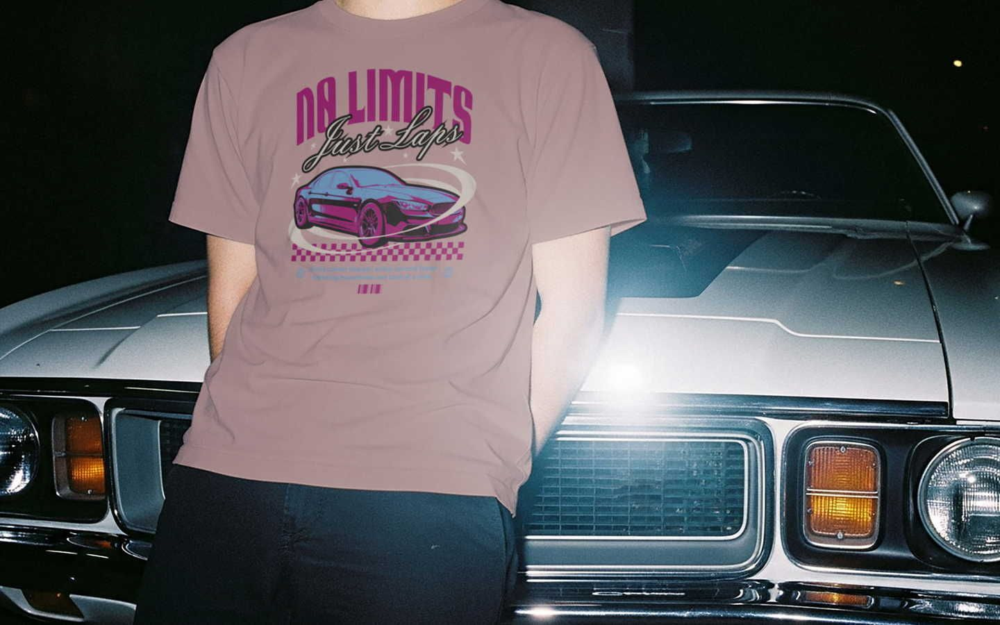
Placement: Standard center-chest designs should sit two to three inches below the collar to look natural to the human eye.
-
Color: Use bright colors with at least 70% contrast against the shirt color so the design stands out.
-
File type: Export designs as vector files or transparent PNGs to avoid unwanted white borders around your artwork.
How to design a t-shirt that sells
Creating a perfect t-shirt design starts with a simple framework:
Design + audience + print method = bestseller
Many product creators struggle because they make t-shirts based on personal preference instead of market data. Instead of guessing what customers want, identify their existing purchasing habits to minimize risk.
For example, a shirt design for a family reunion prioritizes legibility and group identity, whereas a premium clothing brand focuses on visual interest and exclusivity.
Understand your target audience
Research your target market on platforms like Pinterest or Etsy to see whether top-selling products in your niche use minimalist designs or large-print graphics. Streetwear audiences often prefer oversized graphics and bold placements. Athleisure shoppers typically prefer smaller logos and more subtle placement.
Design for your niche
Use design ideas rooted in insider knowledge. For a fishing niche, this means using specific vector graphics of local species rather than generic fish shapes. Check niche forums or Reddit communities to see which symbols, jokes, or visuals people already connect with.
Simplicity vs complexity
Your graphic design should align with your budget and your chosen t-shirt style. Screen printing is cost-effective for bulk orders with simple artwork, while direct-to-garment (DTG) printing works best for detailed, full-color images and smaller runs. Matching your design to the right printing method helps ensure a polished, professional final product.
Check out our t-shirt design ideas for inspiration on your next project.
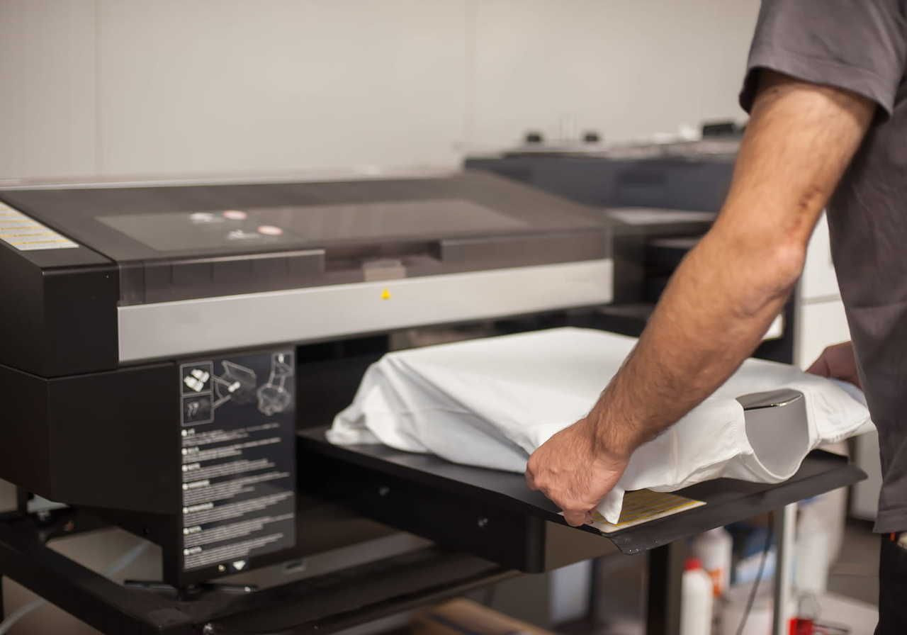
High-resolution t-shirt design tips (300 DPI and file setup)
Your design software settings directly affect print quality. Start with a low-resolution file, and the final print will look pixelated.
How to build print-ready files at 300 DPI
Open Adobe Illustrator or another t-shirt design software and set your artboard to the actual size of the intended print area (if you're trying t-shirt printing with Print on Demand and choose a reliable partner like Printful, our guidelines will tell you the exact dimensions).
Ensure the file format resolution is set to 300 DPI from the start. For a standard 12-16 inch print, your file must reach 3,600-4,800 pixels. This prevents quality loss during the printing process.
Transparent backgrounds and the sticker effect
When making t-shirts, always delete the background layer in your software. If you leave a white box behind your art, the printer treats it as a solid block of black ink or white base. This creates a stiff, uncomfortable patch on the chest known as the sticker effect.
Using a transparent PNG ensures the printing method applies ink only to the graphic, maintaining the garment's natural drape and breathability.
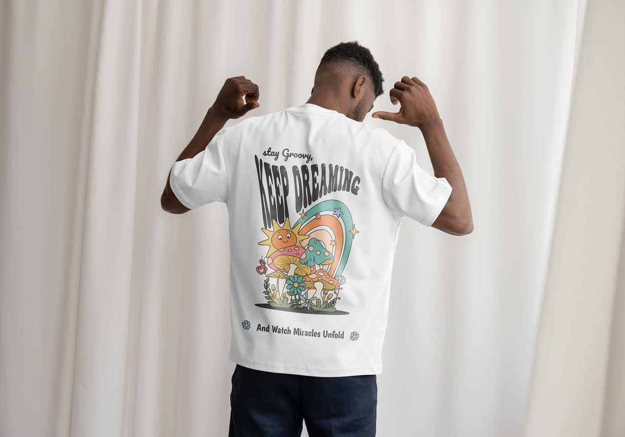
T-shirt design size placement tips and positioning
Where you place your logo or art shapes how people perceive your brand. Proper alignment prevents the entire design from looking like an afterthought.
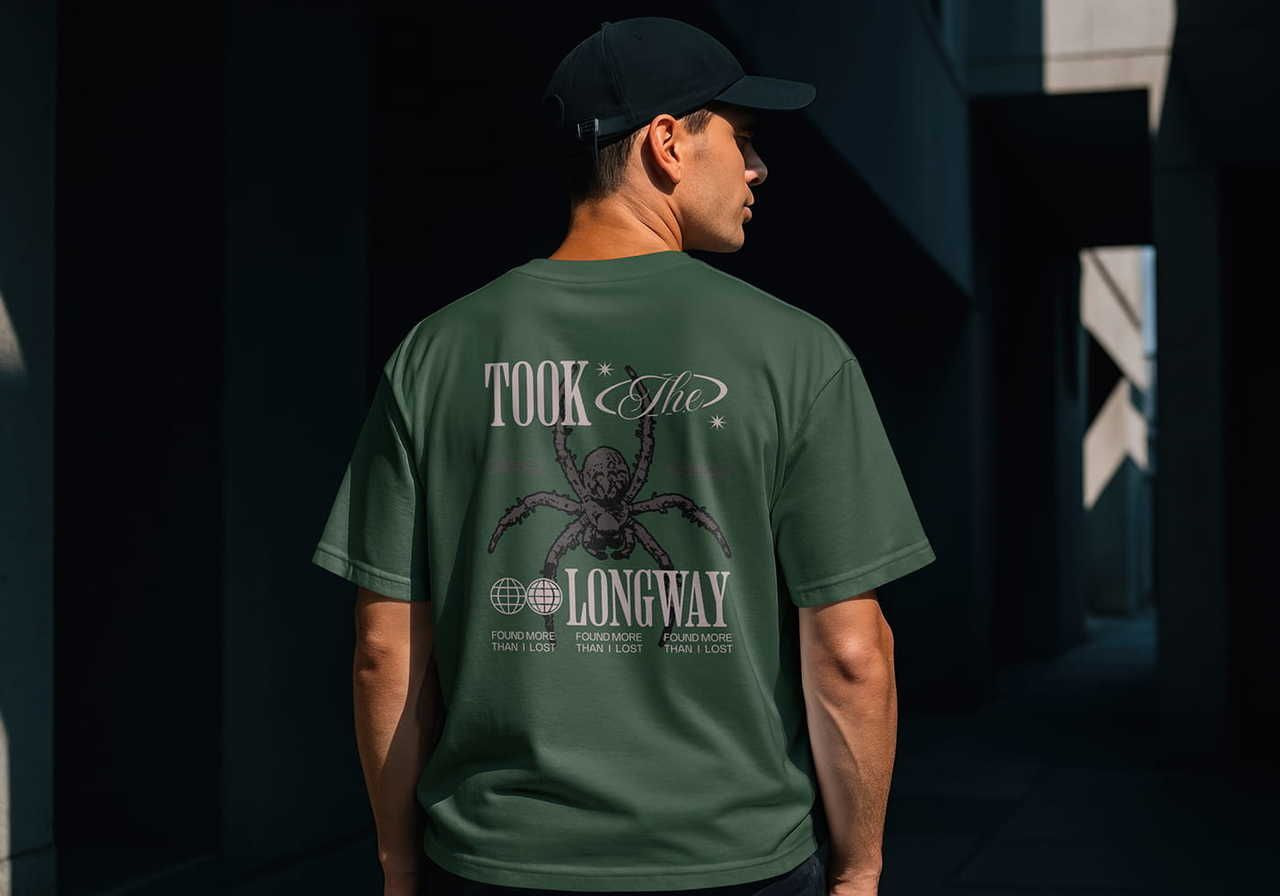
Center chest vs left chest placement
A center chest placement is the industry standard for a graphic tee, usually spanning 10-12 inches wide. A left chest placement, typically three to four inches wide, is better for a professional brand logo.
Use the center for a shirt meant to turn heads and the side for a subtle, high-end style found in corporate or luxury collections.
Using the rule of thirds for balanced designs
Divide your print area into a 3x3 grid to determine the most effective focal points for your artwork.
By placing the primary element of your shirt design at the top or side intersections of this grid, you prevent the graphic from looking off-balance or bottom-heavy. This layout technique ensures that the most important part of your idea sits naturally on the upper chest, where it remains visible regardless of how the fabric folds or moves.
Mastering this grid system helps you avoid placing prints too low on the torso, which often results in an unflattering, amateur look for a clothing line.
Need more information? Read our ultimate guide to t-shirt design placement and turn your t-shirt ideas into profitable art.
How to print designs on shirts: Choosing the right method
Direct-to-garment (DTG) for complex art
DTG works like an industrial inkjet printer, spraying ink directly onto the cotton fibers. It’s the best printing method for intricate images, gradients, and minimalist styles on 100% cotton t-shirts.
This method allows for high-detail reproduction of photographic elements without needing expensive screen setups.
-
Pro: Supports unlimited bright colors and complex shading in a single pass.
-
Con: The final print can look slightly muted on darker colors due to the fabric absorption.
Embroidery for premium branding
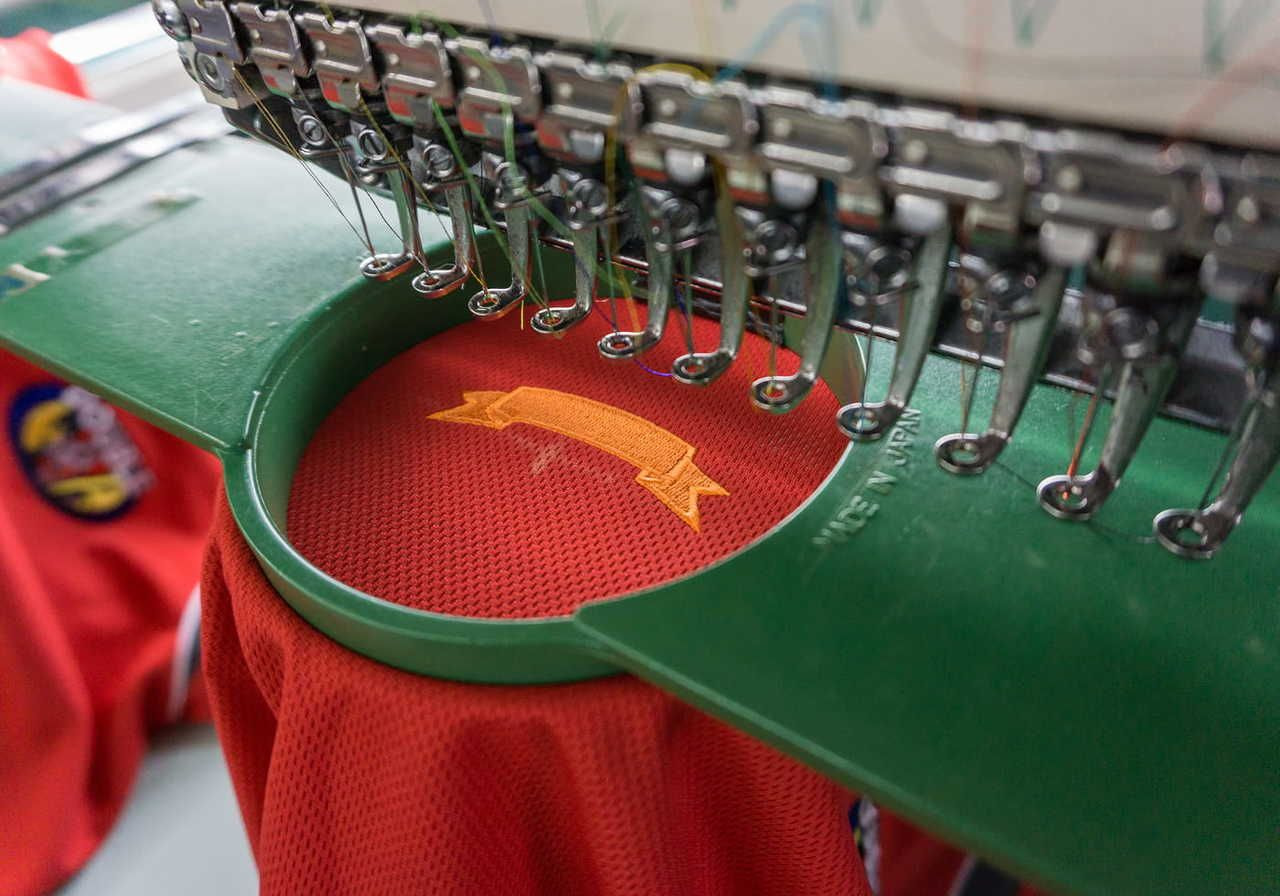
Embroidery uses computerized needles to stitch your artwork onto the garment with durable thread. It’s perfect for a small logo or text on heavy t-shirts, hoodies, or a tank top. Modern machines allow for larger, complex fills, but the method excels at creating a three-dimensional, retail-ready texture that lasts for years.
-
Pro: Extremely durable and provides a high perceived value for any brand.
-
Con: Not capable of reproducing high-resolution photographic images or fine gradients.
When to use direct-to-film (DTF) printing?
DTF prints a design onto a specialized film that’s then heat-pressed onto the shirt. It works on almost any t-shirt type, including polyester, nylon, and cotton blends. This versatility makes it a favorite for product creators who need consistent color across different fabric compositions and tank top styles.
-
Pro: Produces incredibly vibrant colors and sharp, crisp edges for the actual print.
-
Con: Large, solid blocks of color can feel slightly less breathable than DTG prints.
Want an upgrade? Printful provides the in-house exclusive DTFlex method, a perfected version of this tech that removes glue residue and keeps the print flexible. Try it for sharper, cleaner, richer results.
Sublimation or all-over print (AOP)
If you want your artwork to wrap around the sleeves, collar, and every inch of the fabric, sublimation is the winner. This process uses a heat press to turn solid dye into a gas that sinks deep into polyester fibers. Instead of sitting on top like a sticker, the ink becomes part of the shirt itself.
This makes it the best printing method for high-energy patterns and complex images that need to cover the entire design area without any gaps. Because the dye is trapped inside the threads, the result is completely weightless and breathable. Your graphic will never crack, peel, or fade.
T-shirt color combination tips for better designs
Choosing the right color palette can determine whether your shirt sells or sits in a warehouse. Understanding how light interacts with fabric and ink helps ensure your t-shirt design ideas translate into a professional final result.
Use these color rules to build a brand that looks retail-ready.
Contrast rules
The 70% contrast rule refers to the light reflectance value (LRV) between your ink and the shirt. For clear readability, your graphic must be significantly lighter or darker than the fabric.
For example, placing navy blue ink on a black shirt fails because the low contrast makes the logo disappear in natural lighting. Instead, pair darker colors with a white or athletic heather base to make the details pop.
High contrast helps fine details and fonts stay sharp and readable from a distance, which is a requirement for professional t-shirt printing.
Dark vs light garments
The shirt color also affects how your design is printed. Dark t-shirts require a white underbase – a layer of white ink printed beneath the design – to prevent the fabric color from dulling the images.
This creates a slightly thicker print texture. Light-colored custom t-shirts allow the ink to sink directly into the fibers, resulting in a soft, lived-in texture. When you create your design, consider how this physical layer of ink affects the drape. Always order samples to see how your specific colors react to the underbase on different t-shirt sizes.
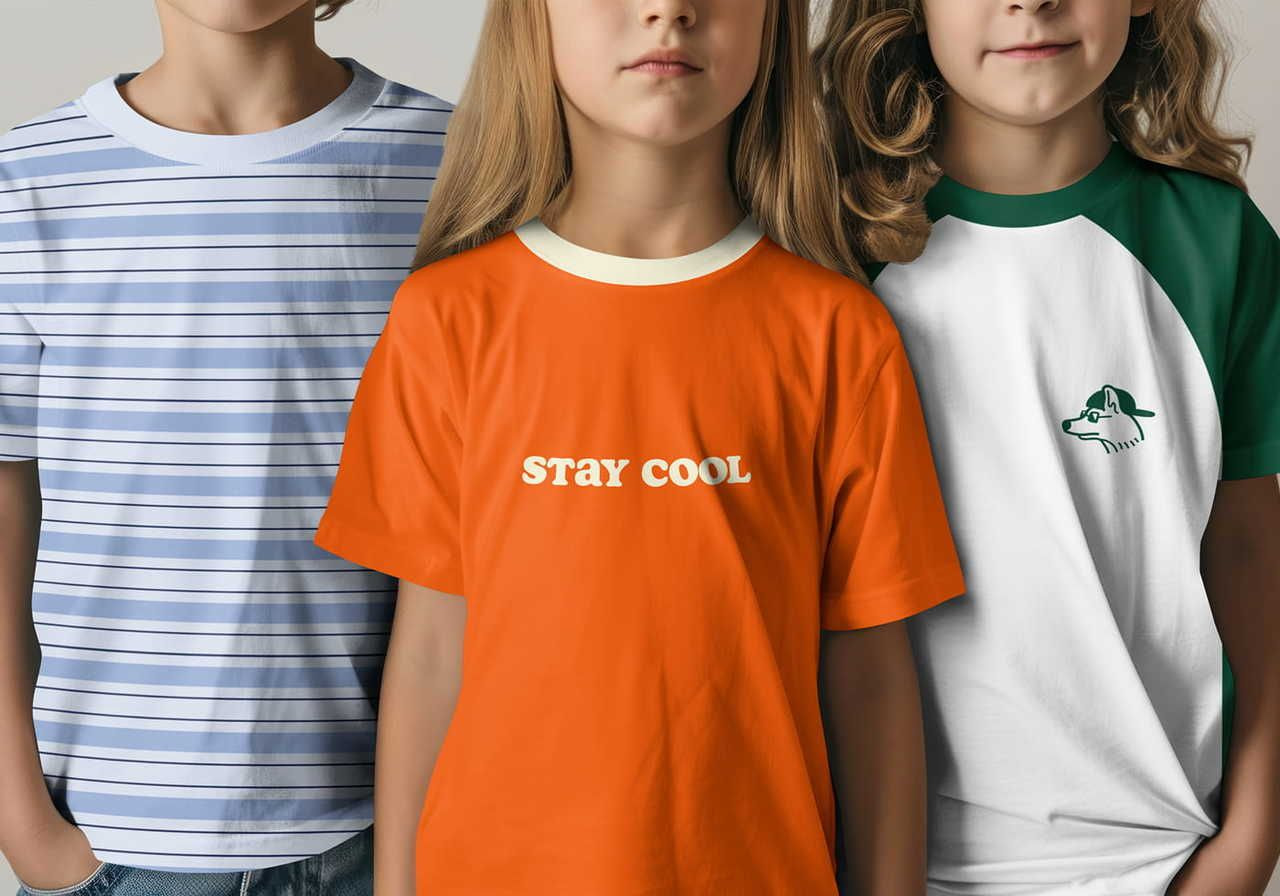
Minimal color palettes
Limiting your shirt design to two to three colors is a strategic choice that often results in a more sophisticated brand image. This design style is currently trending because it's easier for customers to coordinate with their existing wardrobe, which increases how often they wear the item.
From a technical standpoint, a restricted palette ensures better consistency across different t-shirt sizes and batches. It also makes your t-shirt design much more compatible with screen printing, allowing you to transition from one-off digital prints to high-volume bulk orders without needing to completely create a new t-shirt design process.
Stick to a primary focal color and one or two neutral accents to maintain a clean, professional style.
Common t-shirt design mistakes to avoid
Even a great t-shirt design can fail because of sloppy technical execution. Many designers overlook the small details that turn a digital concept into a physical shirt people actually want to wear. Avoid these common pitfalls to keep your design process efficient and your customers happy.
-
Low resolution: If you upload a small, grainy file, the final result will look blurry and cheap. Always build your design at 300 DPI using vector graphics. This ensures that no matter how much you scale the images, the edges remain razor-sharp during the printing stage.
-
Poor placement: Putting a graphic too low on the stomach is a common beginner mistake. Use the rule of thirds to keep your main logo or art in the upper half of the shirt. A well-placed design follows the body’s natural proportions and keeps attention on the chest area.
-
Too many colors: Using too many shades can make a graphic tee look cluttered and messy. For a great t-shirt design, stick to a cohesive color palette of three to five colors for a cleaner, more professional look.
-
Ignoring fabric type: Printing a massive, heavy block of ink on a thin, lightweight tee makes the garment hang awkwardly. Match the density of your design to the t-shirt type. On lighter fabrics, use minimalist art with more open space to keep the shirt breathable.
Design custom t-shirts with Printful!
Printful is the leading print-on-demand partner for merchants who prioritize in-house quality over outsourced uncertainty. Make your own shirts easily using our built-in Design Maker, while we control the entire fulfillment chain to ensure your t-shirt design meets retail standards every time.
Whether you need a crisp logo for a corporate event or a complex t-shirt design for a best friend or family gathering, our fulfillment covers everything from colors to global logistics.
How to bring your t-shirt design ideas to life:
-
Sign up for free: Create your account and connect to sales channels like Etsy or TikTok Shop.
-
Select your tee: Browse our Catalog to fulfill t-shirt ideas across various fits, materials, and sizes.
-
Customize your shirt: Use the Design Maker to upload your idea or experiment with cliparts, fonts, and visuals.
-
Sell or order: Once an order is placed, we handle the printing and shipping while you focus on growth.
Conclusion: Launch your next bestseller today
Building a successful clothing line requires more than just a cool idea – it demands technical precision, which you can achieve by following our tips for designing t-shirts.
Focus on high-resolution images, pick a smart print location, and choose the right printing method to ensure your potential customers receive a shirt they’ll love.
Take the next step in your t-shirt design process by testing your concepts in the real world. Order samples from Printful today to experience our DTFlex technology and see how we can help turn t-shirt design ideas into income.
FAQ: How to design a good t-shirt
Create your design in CMYK mode instead of RGB to get the most accurate print preview. Since screens use light and printers use physical ink, CMYK is the standard for professional t-shirt printing. Always order samples to see how your chosen colors look on different fabric blends before launching.
To keep your text readable, main headlines should be at least 36 points, while secondary details should stay above 18 points. Avoid using tiny serif fonts or scripts like Comic Sans, as they can bleed together during printing. A great t-shirt design uses bold, clear typography that stands out even when the wearer is moving.
Yes, sleeve prints are a fantastic way to add a small logo or brand name to your t-shirts without cluttering the chest. This location adds a premium, retail feel and helps your brand stand out. It’s a simple way to increase the perceived value of your shirt design and attract more customers.

By Baiba Blain
With 7+ years of experience in translation and creative writing, Baiba now leads a squad of talented writers, balancing research-backed storytelling with team guidance, quality assurance, and SEO processes. Outside of work, she enjoys exploring old castles, spontaneous road trips, and talking back to her cats. 10/10 arguments won so far.