


Table of contents
28 Best fonts for t-shirts to express your ideas
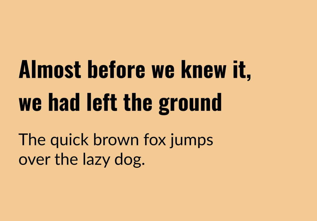
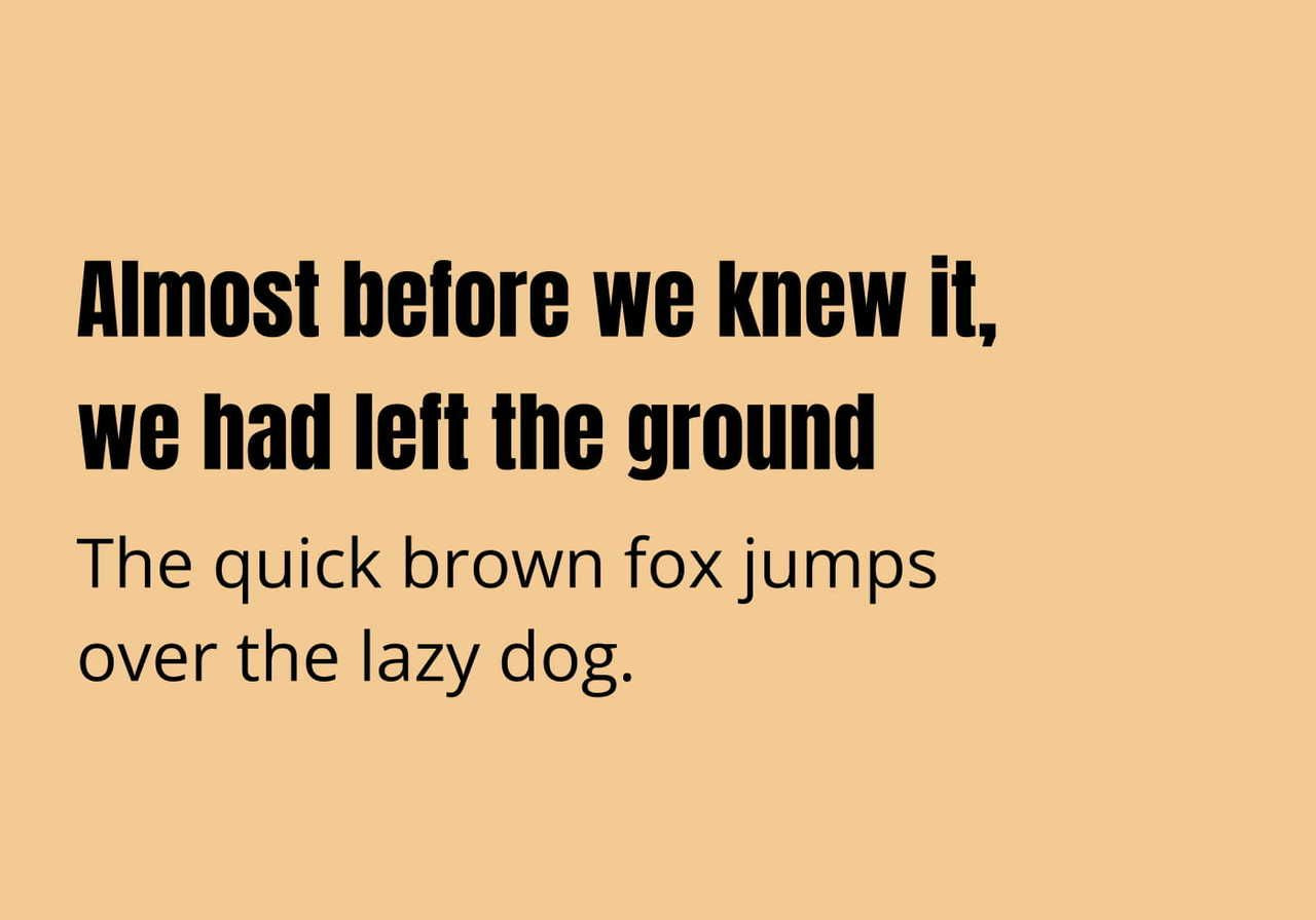
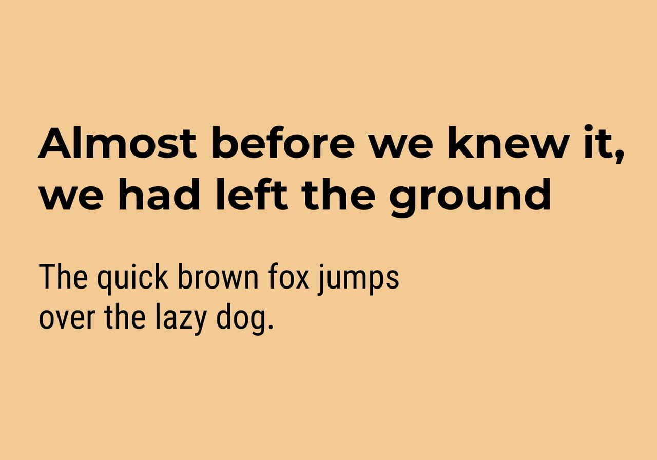
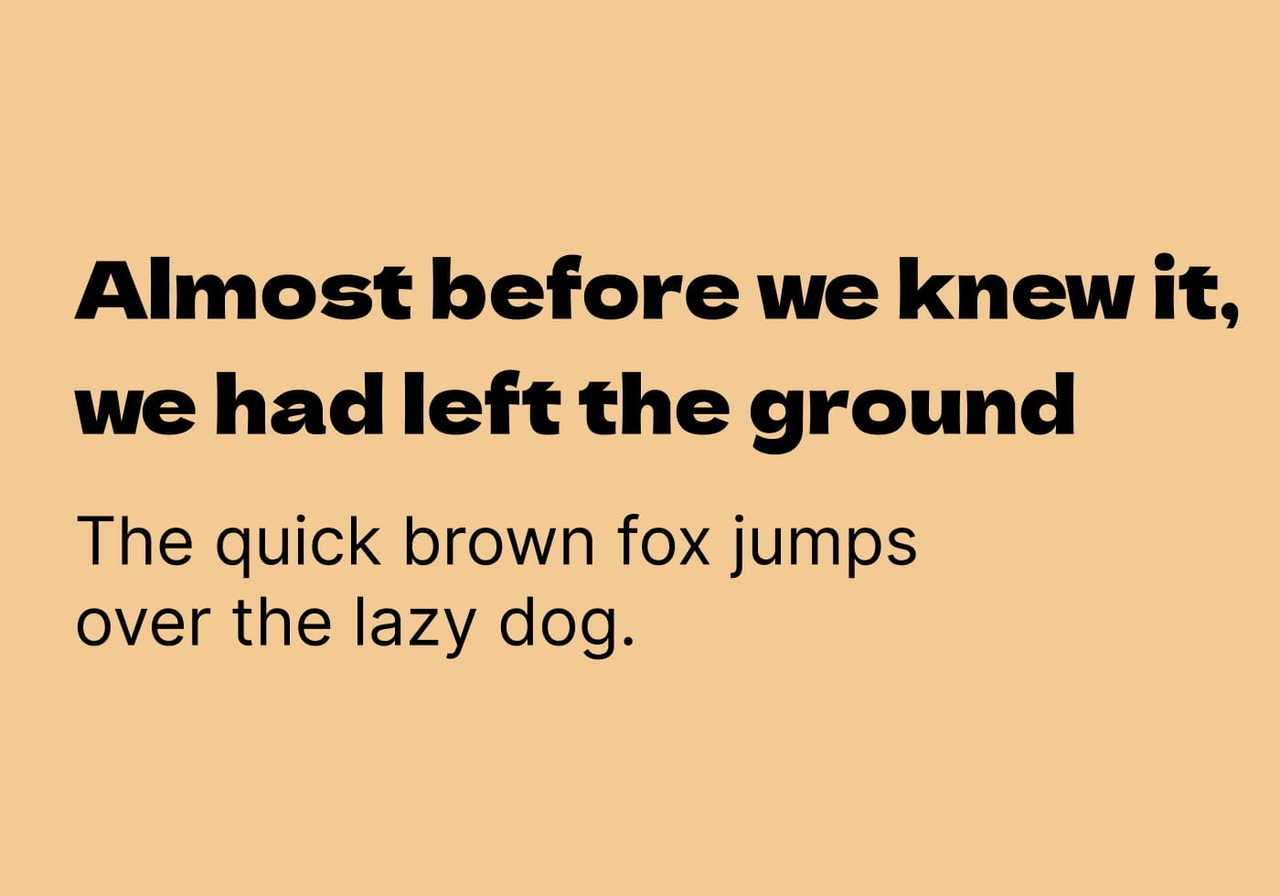
Looking to promote a cause, express your personality, or create memorable merch? Custom t-shirts with text designs are a powerful way to make a statement – but the font you choose is just as important as the words themselves.
Whether you're into playful, cartoon-style designs, prefer something sleek and minimal, or want a bold, attention-grabbing look, our Design Maker has a wide selection of free fonts to fuel your creativity.
In this blog post, we'll walk through the best fonts for t-shirts – from the top 2026 picks to tips on matching typography with the right printing method. So grab a cup of joe, and let's explore some font-tastic t-shirt designs.
2026 T-shirt font cheatsheet
Before we go deeper into each typeface, here's a quick-reference table that maps four trending design directions to their top t-shirt font choices and the best printing methods to bring them to life on a shirt. Use this as a shortcut when you're starting a new t-shirt design and need to decide on a direction quickly.
|
Design style |
Top t-shirt font choice |
Best printing method |
|
Streetwear |
Bebas Neue |
DTG or DTFlex |
|
Retro / Y2K |
Shrikhand |
DTG (color-rich), DTFlex for fine detail |
|
Minimalist |
Inter |
DTG on light shirts; Embroidery for chest marks |
|
Athletic wear |
Bebas Neue |
DTFlex or All-Over Synthetic |
Each of these pairings is a safe default choice – but the rest of this blog post will explore alternatives, pairing ideas, and the technical reasons why some fonts hold up on certain fabrics while others don't.
Top 2026 trends
These six fonts are the workhorses of t-shirt design right now – appearing across streetwear drops, indie band merch, athleisure brands, and minimalist designs alike. Each is paired with a complementary secondary font so you can build a clear visual hierarchy in your t-shirt designs instead of relying on a single typeface alone.
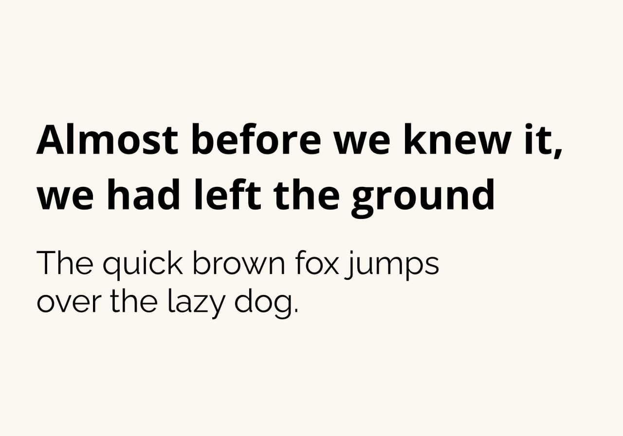
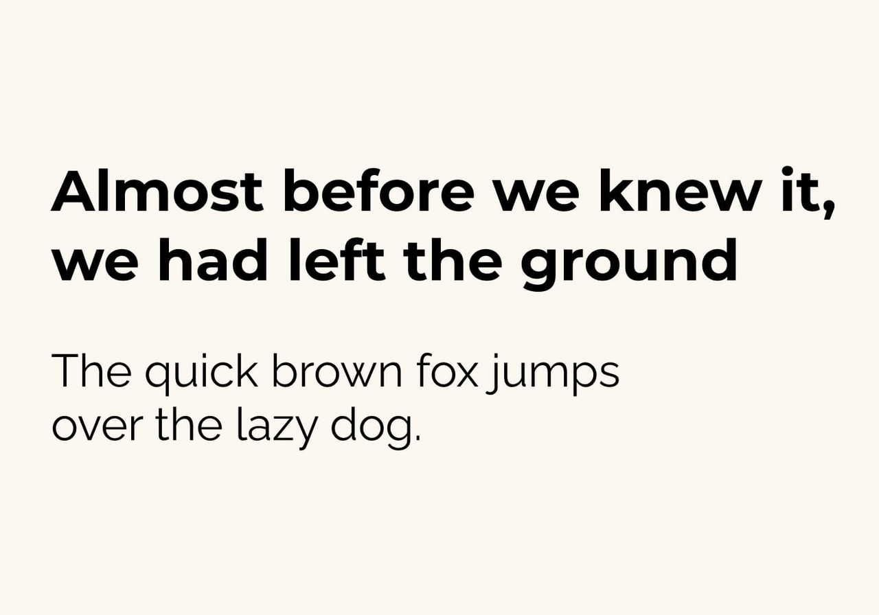
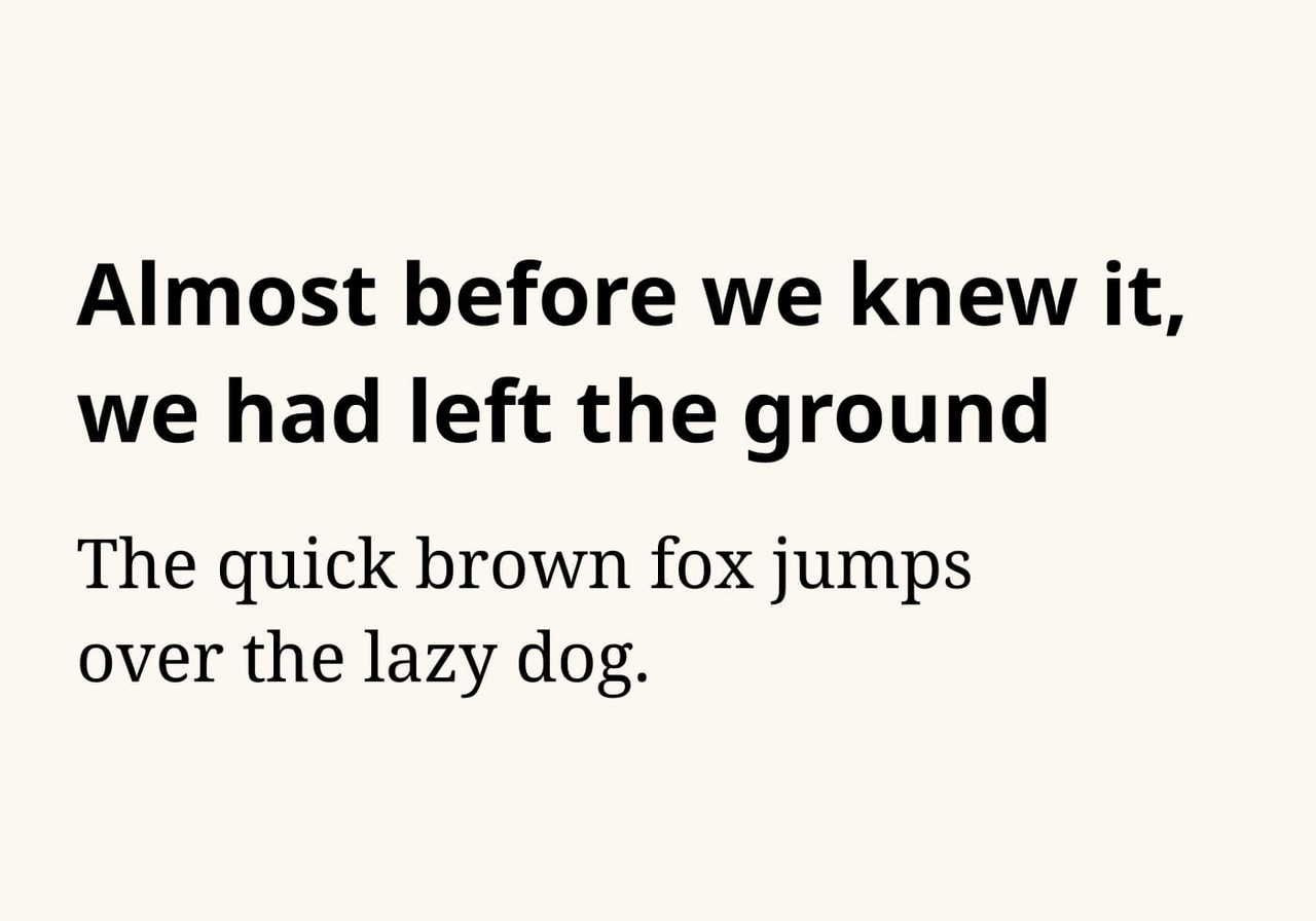
Montserrat
A modern geometric sans-serif with clean, balanced letterforms and generous spacing. Montserrat is highly versatile – readable in body text, strong in headlines, and polished enough to signal a professional brand without feeling cold. It works well as a single font family across product pages, packaging, and t-shirts.
Pair with: Lato
Usage tips: Use Montserrat Bold for the main message and Lato Regular for supporting text or taglines. Tighten letter spacing for small prints (under one inch tall) to maintain clarity. On dark shirts, increase weight one step (Bold instead of SemiBold) so the text doesn’t get lost in the fabric.
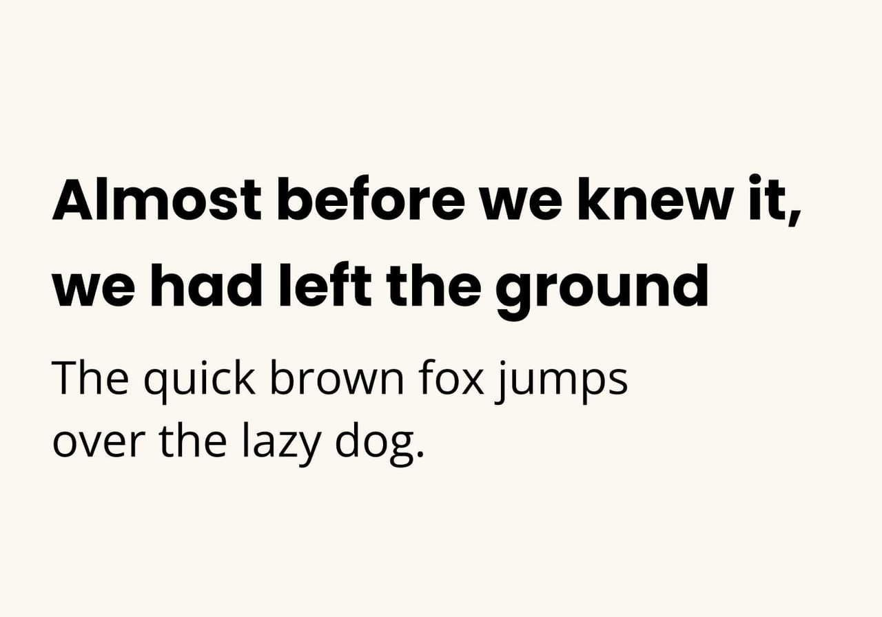
Inter
Inter was designed for screen legibility, which is why it translates so well on printed shirts. The letterforms are clean and balanced, with subtle ink traps that keep them sharp even when the ink spreads slightly on cotton. It’s a strong choice if you want a modern, sleek look without going full minimalist.
Pair with: Libre Baskerville
A serif pairing like Libre Baskerville adds an editorial weight – great for merchandise tied to bookstores, podcasts, or content-driven brands.
Oswald
A condensed sans-serif with strong vertical rhythm. Oswald is one of the best fonts for t-shirts when you need impact in tight spaces – stacked headlines, vertical sleeve prints, or single-word designs that need to feel bold without taking up width. Its narrow form works well for chest prints and small graphics.
Pair with: Montserrat
The contrast between condensed Oswald and wider Montserrat creates a clear visual hierarchy.
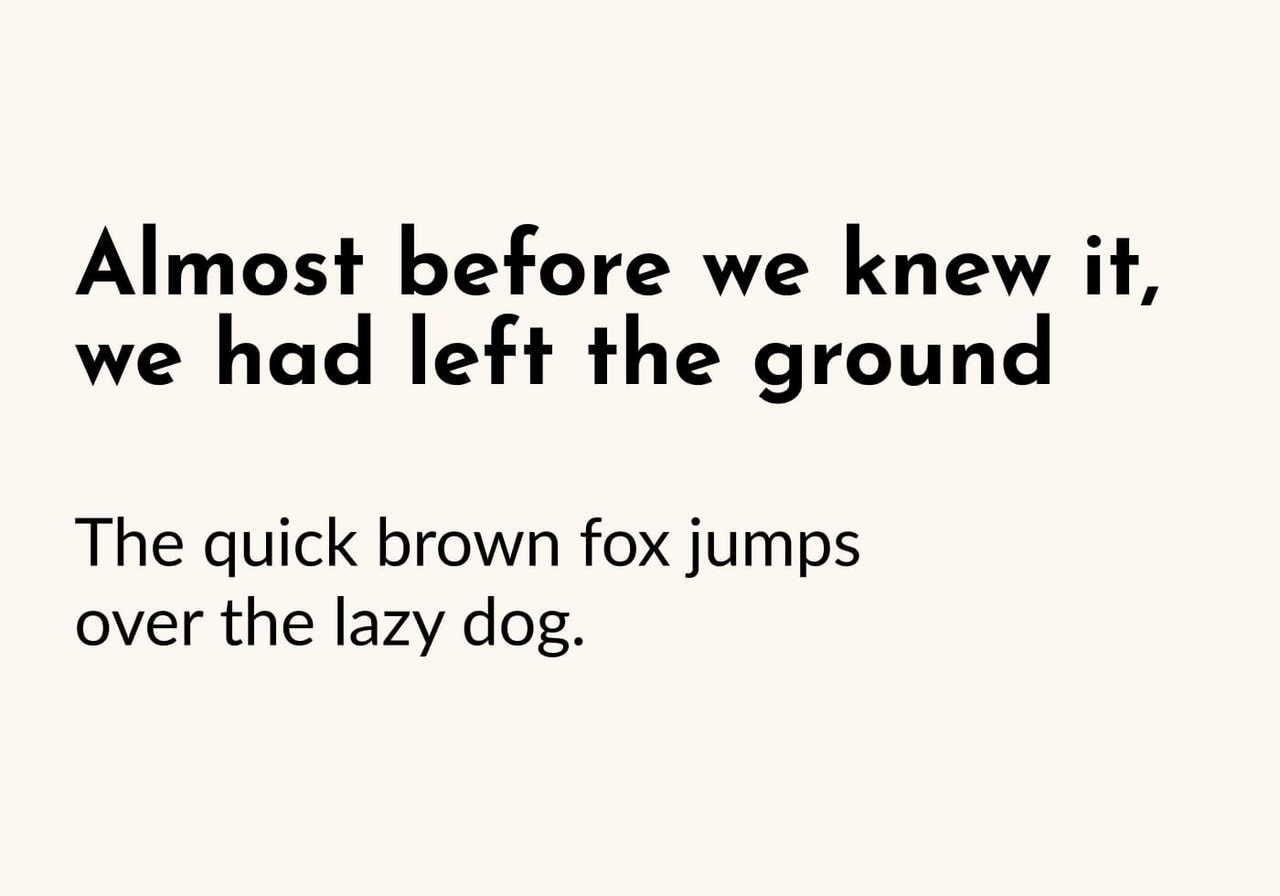
Open Sans
Open Sans is a neutral, highly legible font that works at any size. For shirt designs where clarity matters more than personality (think charity tees, event merch, internal company swag), Open Sans is the safest bet. Its simple letterforms also make it easy to embroider due to minimal stroke variation.
Pair with: Raleway
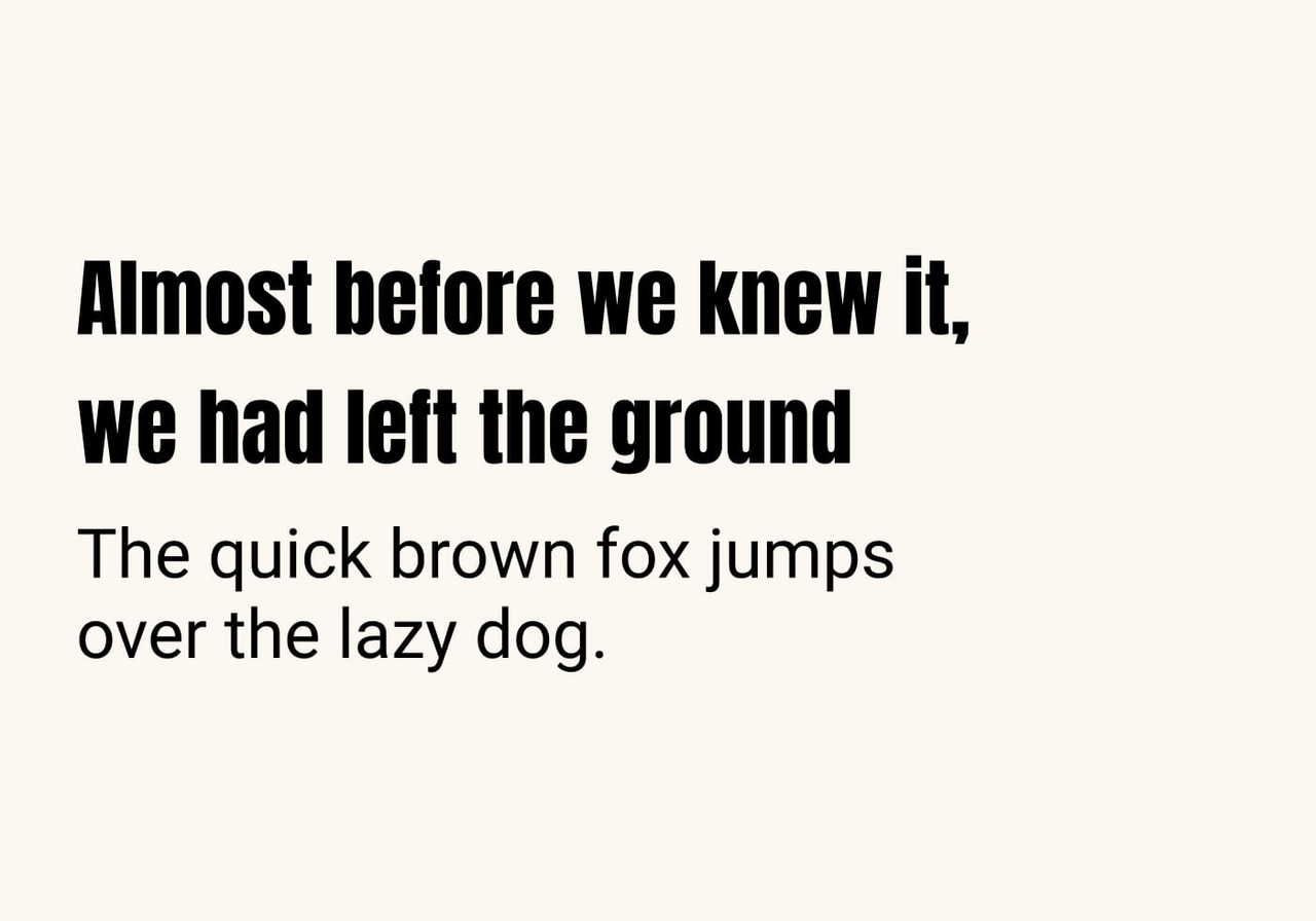
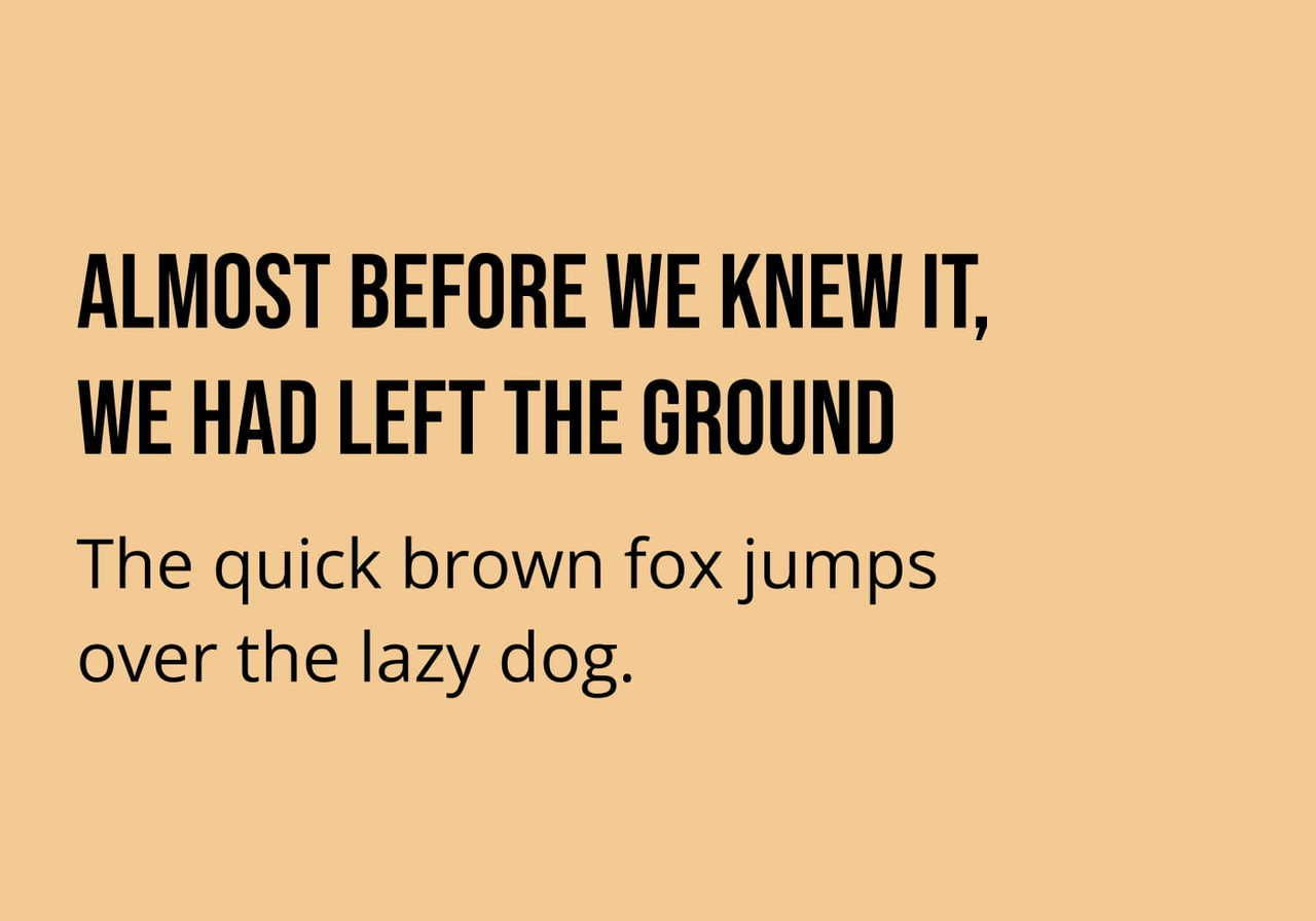
Anton
Anton is a bold, condensed display font designed for impact. It works especially well for streetwear, band merch, and t-shirts where the text should feel loud and attention-grabbing. It performs best in all caps, as lowercase reduces its impact.
Pair with: Roboto
Use Anton for the main headline and Roboto for any supporting line of text.
Titan One
A chunky, rounded display font with a bouncy, playful font personality. Titan One is having a moment in 2026 thanks to the resurgence of Y2K and chunky-cartoon aesthetics. The thick strokes also make it forgiving on textured fabrics, where thin fonts can break up.
Pair with: Open Sans
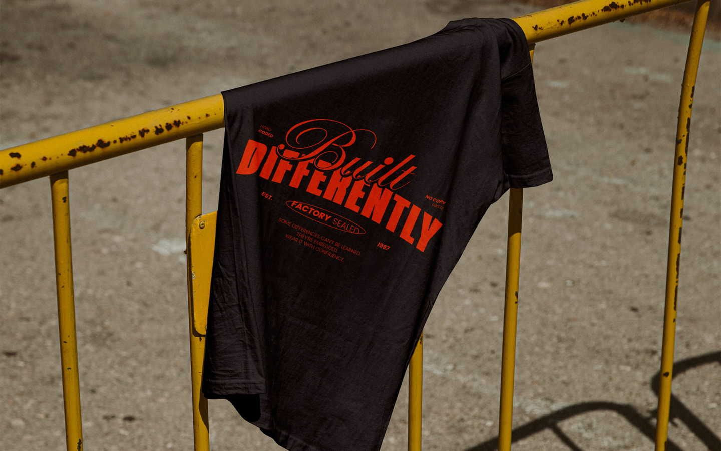
Streetwear
Streetwear t-shirt design is all about confidence – heavy weights, tight stacking, and typography that fills the shirt like it owns the place. These fonts form the backbone of the category. Pair them carefully: streetwear loves contrast between a bold hero font and a subtle supporting line.
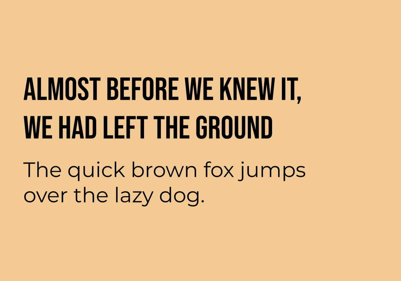
Bebas Neue
The most-used streetwear typeface of the last decade is still going strong. Bebas Neue's tall, narrow caps create a billboard-on-a-shirt effect – perfect for grabbing attention on a busy retail page or social feed. The condensed shape also lets you fit longer phrases across the chest without reducing size.
Pair with: Montserrat
Oswald
Oswald returns here because it offers a softer alternative to Bebas Neue – still bold and condensed, but with more rounded, approachable letterforms. Use it when you want streetwear energy without a harsh edge.
Pair with: Lato
Anton
In streetwear, Anton is often stretched, stacked three or four lines deep, or paired with grungy textures. It's a workhorse for graphic-heavy front and back prints and one of the best t-shirt fonts for high-contrast layouts.
Pair with: Open Sans
Montserrat
Not all streetwear relies on heavy fonts. Modern minimalist streetwear brands often use Montserrat for a cleaner, more elevated look – think small chest logos, simple wordmarks, and back-neck prints.
Pair with: Roboto Condensed
Dela Gothic One
One of the most eye-catching fonts in the Google Fonts library, Dela Gothic One is hyper-bold with sharp angles and tightly spaced letters. It has a graphic, high-impact feel popular in streetwear design and works beautifully for limited-drop campaign tees.
Pair with: Inter
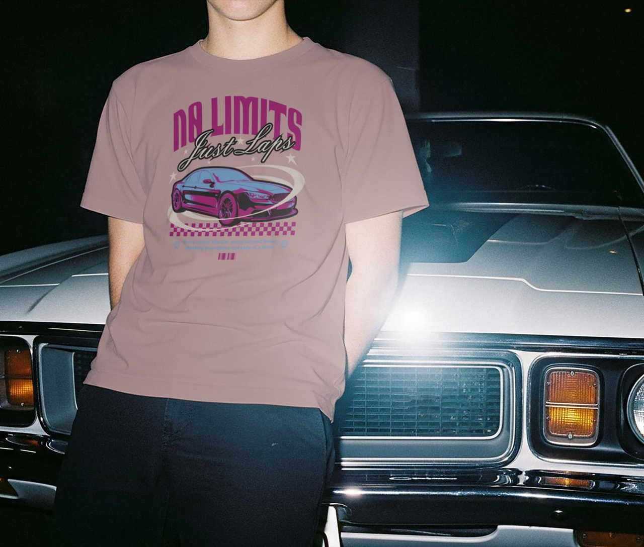
Retro and Y2K
Retro is the dominant t-shirt trend in 2026, with Y2K styles especially popular among younger audiences hungry for chunky, bubbly, slightly experimental typography. These five fonts cover the full retro spectrum – from late-90s rave flyer to 70s-inspired band tees.
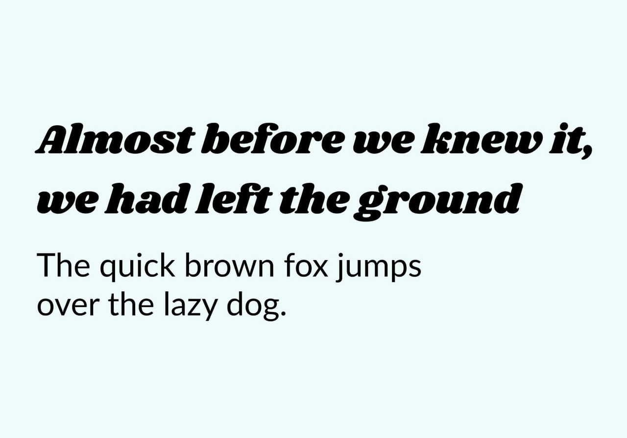
Shrikhand
Shrikhand has a thick, slanted, groovy personality that instantly reads as a vintage band poster. It's a strong choice for music merch, festival tees, and retro shirt designs with a 70s vibe. Its bold, filled letterforms also make it reliable for DTG printing.
Pair with: Lato
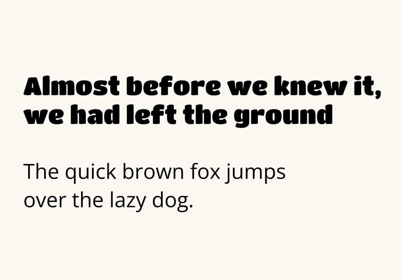
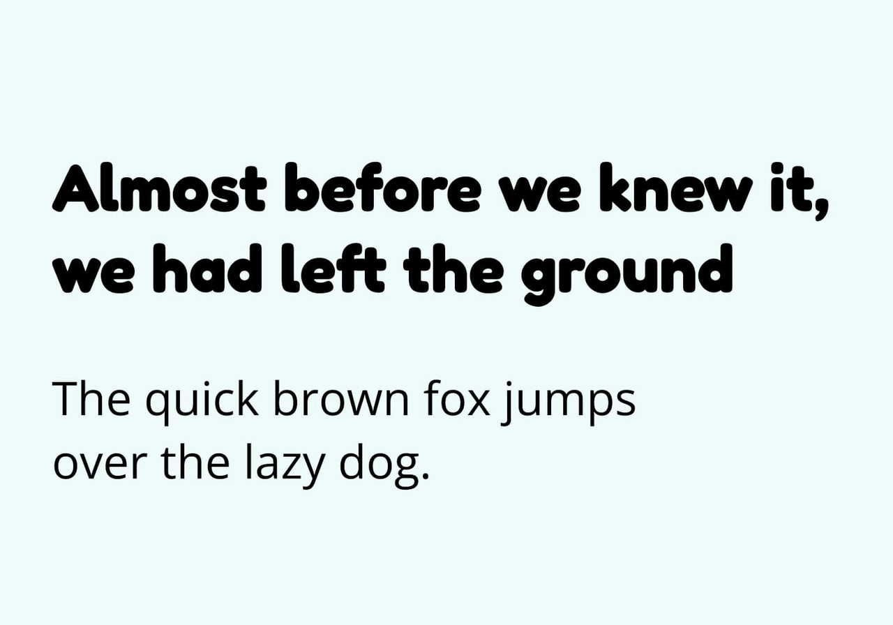
Fredoka
A rounded, friendly font with serious Y2K energy. Fredoka blends bubble-letter playfulness with modern sans-serif structure – approachable, slightly nostalgic, and highly versatile. Great for kids' apparel, indie brands, and lifestyle tees.
Pair with: Open Sans
Poetsen One
Poetsen One is bold, slightly condensed, and carries a 90s skate-shop feel. Its chunky weight works well on large chest prints, especially when a single word needs to carry the entire design.
Pair with: Roboto
Dela Gothic One
Dela Gothic One appears again here because its hyper-bold proportions also evoke late-90s magazine cover typography. Use it for graphic-heavy shirt designs where the text itself becomes the visual.
Pair with: Montserrat
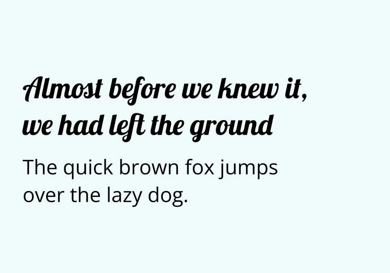
Lobster
A classic retro script, Lobster features flowing, bold letterforms that have been a band-tee staple for years. Use it for scripted phrases, brand wordmarks, and anywhere you want a hand-drawn retro feeling without going fully custom.
Pair with: Open Sans
Minimalist
Minimalist t-shirt designs depend almost entirely on typography – there's nowhere for inconsistent spacing or a poorly chosen font to hide. These six fonts are the cleanest, most accessible options in the category, and each one rewards careful attention to spacing, weight, and contrast.
Montserrat
In minimalist designs, Montserrat shines in lighter weights. Use Light or Regular instead of Bold to let the letters breathe and pair it with generous negative space.
Pair with: Raleway
Inter
Inter is ideal for clean wordmarks and minimalist single-line phrases. The neutral letterforms get out of the way and let the message carry the design.
Pair with: Open Sans
Work Sans
Work Sans is slightly warmer than Inter – still minimalist, but with a subtle humanist quality that keeps the shirt from feeling cold or overly corporate.
Pair with: Lato
Noto Sans
Noto Sans is a strong choice for minimalist designs that need to support multiple languages or special characters. It's one of the most accessible font families in the Google Fonts ecosystem.
Pair with: Noto Serif
Poppins
Poppins has perfectly geometric, almost-circular letters that feel modern and minimal at the same time. Use it sparingly – Poppins is everywhere right now, so relying on it too heavily can make your shirt design feel generic.
Pair with: Open Sans
Josefin Sans
Josefin Sans is a vintage-inflected geometric sans-serif. It's minimalist with a personal, slightly art-deco edge – great for boutique brands and lifestyle merchandise.
Pair with: Lato
Athletic wear
Athletic and performance t-shirts have specific typography needs: high contrast for readability at a distance, bold weights that hold up under sweat and stretch, and condensed letterforms that fit jersey-style chest prints. These six fonts deliver.
Bebas Neue
Bebas Neue is the default athletic wear font for a reason. Tall, narrow, all-caps – legible from across a field, a court, or a gym floor.
Pair with: Open Sans
Anton
Anton is heavier than Bebas Neue, which makes it better for team names and player numbers that need to be read as bold and powerful.
Pair with: Roboto
Oswald
Oswald sits between Bebas Neue and Anton in weight. Use it for event merch, race tees, and hiking-club shirts where you want athletic energy without going fully pro-team.
Pair with: Lato
Roboto Condensed
A condensed version of one of the most widely used fonts on the web. Roboto Condensed is reliable, accessible, and prints cleanly at any size.
Pair with: Montserrat
Titillium Web
Originally designed for technical and aerospace applications, Titillium Web has a modern, slightly futuristic feel that works for cycling, eSports, and performance brands.
Pair with: Open Sans
Work Sans
Work Sans returns here as the softer, more lifestyle-leaning option for athletic wear – great for yoga, running clubs, and athleisure that doesn't want to feel overly competitive.
Pair with: Inter
How to choose fonts for different printing methods?
This is where most t-shirt design guides stop – and where merchants lose money. The wrong font on the wrong printing method can result in blurred edges, broken letters, embroidery puckering, or color bleed. Here's the technical breakdown.
Direct-to-garment
DTG is the most forgiving printing method for typography. Because the design is printed directly onto cotton fibers, you can use thin, complex, and intricate fonts without losing detail. DTG is the default for full-color graphics, photo-realistic prints, and any t-shirt designs with subtle gradients. Keep your minimum stroke width above 1 pt (point) to prevent letters from fading on textured cotton.
All-Over Cotton
All-Over Cotton uses uncut fabric printed before being sewn into the final shirt, producing a soft, matte finish with subtle color variation. For typography, lean toward bold weights – thin fonts can lose definition against the fabric texture, and the softened colors can reduce contrast. Reserve fine typography for accent placements like sleeves and hems.
All-Over Synthetic
Polyester All-Over Synthetic prints deliver sharp, vibrant, high-contrast graphics. This is the right printing method for athletic-wear typography, vivid retro designs, and any shirt where you want the text to pop against bold backgrounds. Fine fonts and intricate letterforms hold up well thanks to the smooth polyester surface.
Sublimation
Sublimation works similarly to all-over print by embedding dye into polyester fibers. It's excellent for full-shirt typography, including repeating text patterns. Stick to bold or medium weights – very thin fonts can lose contrast within a busy background.
Embroidery
Embroidery has the strictest typography requirements. Letters need a minimum height of around 5mm (0.2 inches), and thin fonts simply can't be stitched cleanly – the thread will pucker or cause the letters to blur together. Stick to bold sans-serifs like Open Sans Bold, Montserrat SemiBold, or Bebas Neue. Avoid scripts with thin connectors. For a left-chest design, simple wordmarks in bold caps work best.
DTFlex
DTFlex is Printful's premium direct-to-film method and a strong choice for complex, detailed typography. Its sharp edges and clean detail allow for intricate scripts, decorative fonts, and small supporting text without edge bleed. If a font is too detailed for DTG or embroidery, DTFlex is a reliable alternative.
Knitting
Custom knitting builds the design into the fabric itself, which significantly limits typography options. Stick to thick, blocky fonts with a maximum of four colors and very simple letterforms – pixel-style or chunky display fonts work best. Avoid scripts, thin fonts, and any typography that requires fine detail.
Make your t-shirt designs stand out
Choosing the right font is only half the work – the other half is how you use it. Here are a few fundamentals to apply to every shirt design:
Build a clear visual hierarchy.
One hero word, one supporting line, maybe one tiny accent – if everything competes, nothing stands out. Use various sizes, weights, and cases to guide the viewer’s eye. For example, pairing a large bold headline with smaller regular-weight subtext creates a stronger first impression than three lines at equal size.
Test your color contrast.
Light fonts on light shirts disappear, while dark fonts on dark shirts get lost. Aim for at least 4.5:1 contrast ratio between text and shirt color for clear legibility, and always preview your design on the actual product color. For example, navy text on a black shirt may read fine on screen but vanishes in person.
Limit yourself to two fonts.
One display font for the hero text and one neutral font for supporting copy. Using three or more different fonts in a t-shirt design can overwhelm the viewer and make the design look amateur. For example, Anton paired with Roboto provides plenty of contrast on its own.
Mind your spacing.
Letter spacing (tracking) and line spacing (leading) can make or break readability on a shirt. Tighten tracking for headline caps and loosen it for smaller text. When in doubt, give your text more room than you think it needs – cramped letters quickly create a cheap impression.
Match the font to the message.
A playful font can undermine a serious cause, while a minimalist font can flatten a humorous design. The typeface should reflect the tone of the message – for example, Lobster on a band tee creates a very different impression than Inter on the same shirt.
Test it in print, not just on screen.
Order a sample. What looks crisp on a high-resolution display screen can look entirely different on cotton.
Turn your design into a real product with Printful
Picked your font, paired it, and matched it to the right printing method? You're ready to sell. Here's how:
-
Sign up for a free Printful account and connect your store – Shopify, Etsy, WooCommerce, TikTok Shop, and more.
-
Open the Design Maker and pick a blank product from our Catalog of t-shirts, hoodies, and accessories.
-
Upload your design or build it from scratch using the free font library.
-
Choose your printing method – DTG, DTFlex, embroidery, sublimation, all-over print, or knitting.
-
Order a sample to check the print quality, color accuracy, and font legibility on real fabric.
-
Publish to your store and start selling – we handle fulfillment, packaging, and shipping.
To summarize
The best fonts for t-shirts in 2026 are no longer one-size-fits-all. Streetwear leans on Bebas Neue and Anton. Retro and Y2K pull from Shrikhand, Fredoka, and Lobster. Minimalist designs live and die on Inter, Montserrat, and Work Sans. Athletic wear demands the condensed power of Bebas Neue, Oswald, and Roboto Condensed.
Match the font to your design direction, pair it intentionally for visual hierarchy, and – most importantly – choose a print-on-demand method that supports the typography you've picked. A great font on the wrong printing method becomes a bad shirt fast. With the right combination, your t-shirts will clearly convey their message, look professional on every product page, and perform across every print-on-demand campaign you run.
FAQ
Open Sans, Inter, and Montserrat are the easiest fonts to read on a t-shirt thanks to their balanced letterforms, neutral spacing, and strong legibility at both small and large sizes. For maximum readability, use a bold weight in all caps or sentence case with high color contrast against the shirt fabric.
Yes – Google Fonts are free for both personal and commercial use, including t-shirt design and resale. You can download them directly from the Google Fonts website or use them inside Printful's Design Maker without any additional licensing. Always double-check the specific license listed on each font's page for full clarity and peace of mind around commercial-use rights. Every link on the Google Fonts website points to the license terms for that specific family, so there's no guesswork.
Pick a font with vintage DNA (Lobster, Shrikhand, Fredoka, Special Elite) and add subtle texture overlays – light grain, faded edges, or a slight color wash. Pair with a muted color palette and avoid pure black, which reads as too modern for a true retro vibe. DTG print on a heather or cream shirt amplifies the vintage feeling. For more inspiration, explore our related guides on custom t-shirt design on our website.
Yes. Every font available in Printful's Design Maker is free to use for both personal and commercial t-shirt designs. There are no per-shirt licensing fees, no subscriptions, and no hidden costs – pick your font, build your design, and start selling.

Chan is a copywriter, creative writer, and technical writer with 15 years of experience creating everything from training courses to compelling marketing copy. A self-confessed research nerd, she loves digging deep into a subject and bringing it to life on the page. When she’s not writing, she’s exploring forest trails or walking the beach with her dog, or in the kitchen experimenting with homemade pickles and jams.