


Table of contents
Left-chest logos, bold center prints, and eye-catching back graphics are among the most popular ways to customize a hoodie. The right hoodie logo placement can make your design stand out, strengthen your brand identity, and complement the garment's overall style.
This hoodie logo placement guide covers the most common logo positions, recommended sizes, and placement tips for embroidery and printing. You'll also learn how hoodie design placement differs from sweatshirts and how to avoid common mistakes before you order a sample hoodie.
Why logo placement matters for your hoodie brand
Logo placement influences how customers notice and remember your brand. It affects your hoodie's visual balance, highlights key design elements, and helps establish a polished, professional look.
When choosing a logo placement, consider the hoodie style, garment size, and printing method. Details like the hood, pockets, seams, and zipper on zip-up hoodies can all affect how your design looks once printed.
Think about your audience, too. A small left-chest logo is often best for subtle branding and corporate apparel, while larger front or back graphics are popular for streetwear brands and promotional hoodies. Matching your logo placement to your design and audience helps create a product people recognize and want to wear.
Standard hoodie logo placement guide
Most hoodies use a handful of tried-and-tested logo placements. Each creates a different visual effect, so the right logo placement depends on your hoodie design, branding, and the level of brand visibility you want to achieve. Here are the most common options and when to choose them.
Left-chest logo placement on hoodie
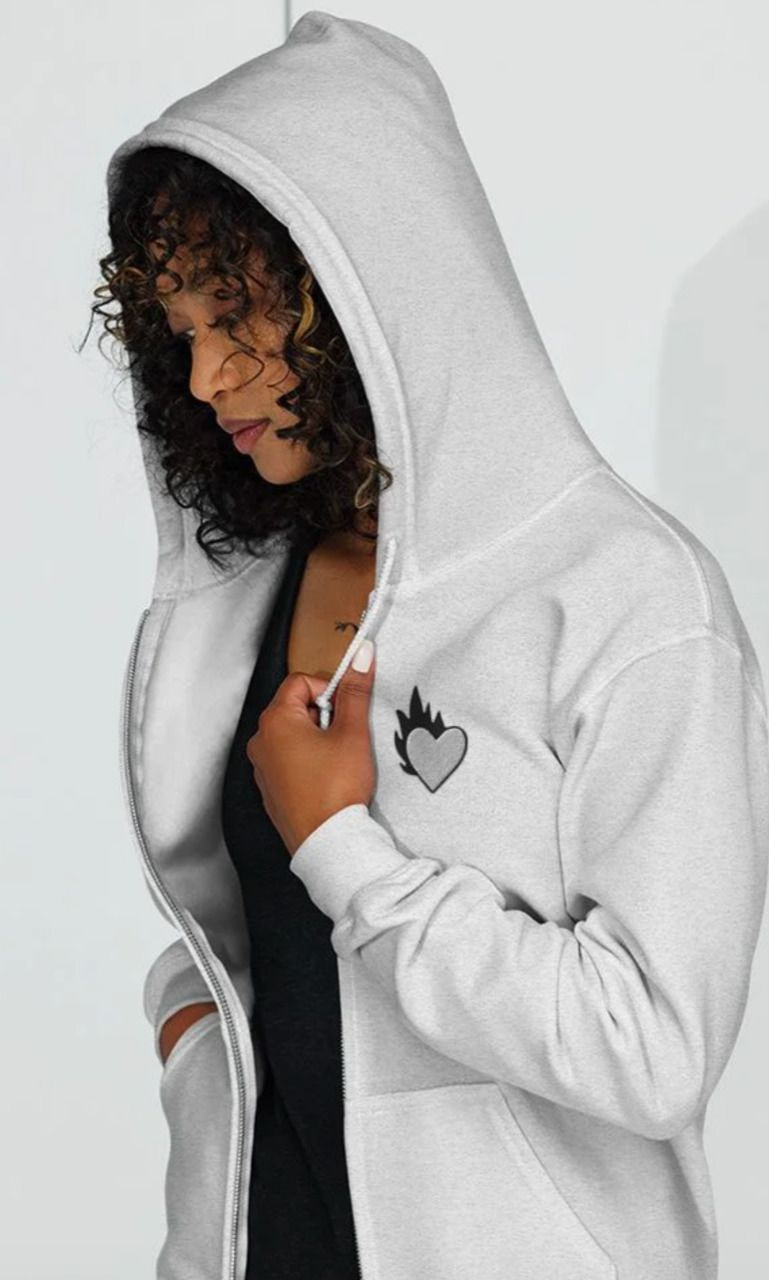
The left chest is one of the most common placements for a hoodie logo. Small logos, embroidered designs, and simple graphics suit this area because they add subtle branding without dominating the garment.
This chest placement is often seen on company uniforms, sports teams, and lifestyle brands thanks to its clean, professional appearance. Keep the design simple, as fine details and small text can become difficult to read at smaller sizes.
Center-chest logo placement
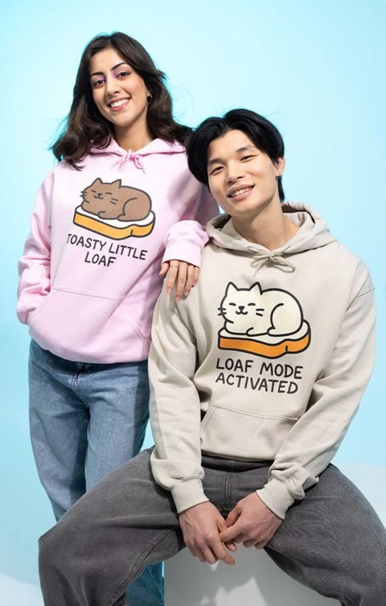
Center-chest placement draws more attention than a left-chest placement and gives your design greater visibility. It accommodates everything from small, minimalist icons to medium-sized logos and larger front graphics.
As your logo size increases, leave enough empty space around the design to maintain visual balance. This helps the design remain clear across different garment sizes without overwhelming the front of the hoodie.
Hood and pocket logo placement
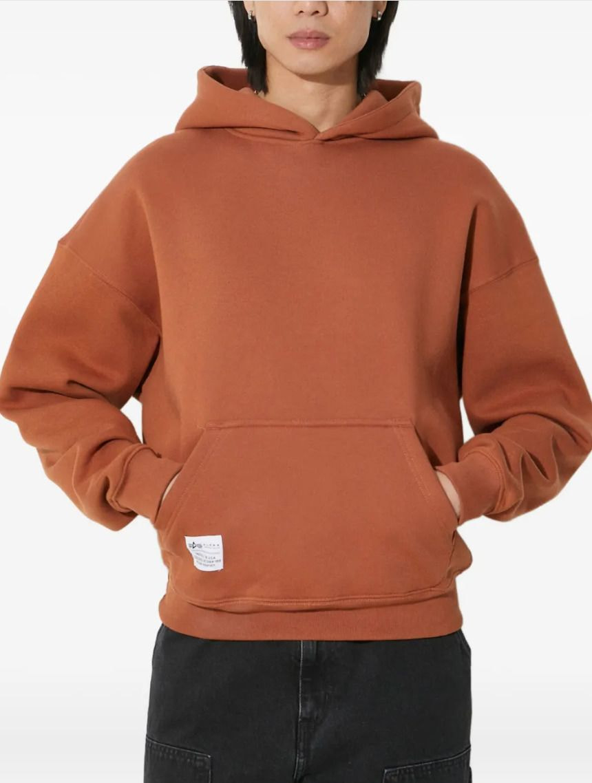
Hood and pocket logos add subtle branding while leaving the main print area available for larger graphics. They're a good place for secondary logos, icons, or short text that supports the overall design.
Avoid placing important designs across seams or over the pocket opening, as these areas can interrupt the design. For hood prints, center the logo below the hood seam to keep it visible when the hood is worn naturally.
Sleeve logo placement
Sleeve logos add subtle branding without competing with the main design. They're often used for company logos, sports teams, streetwear brands, or as a secondary logo that supports artwork on the front or back of the hoodie.
Sizing and positioning
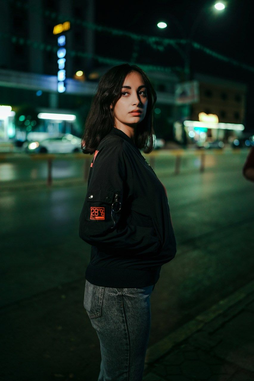
A sleeve logo has the greatest impact when it's small and positioned on the upper or outer part of the sleeve, where it's easy to notice without overwhelming the design. Simple logos and short text are usually the clearest choice for sleeve prints.
Avoid placing artwork too close to the shoulder seam or cuff, as stitching and natural folds can interfere with the design. If your hoodie also features a front or back graphic, keep the sleeve logo smaller so it complements the main illustration instead of drawing attention away from it.
Embroidery vs print on sleeves
Embroidery is a common choice for sleeve logos because it adds a clean, premium accent without taking up much space. Small logos, monograms, and icons usually produce the best results, while detailed artwork and long text can lose clarity on a narrow sleeve.
Printing gives you more flexibility if your sleeve design includes multiple colors, gradients, or fine details. Whatever decoration method you choose, keep the design simple and sized appropriately for the available print area so it's easy to read at a glance.
Hoodie back design placement
The back of a hoodie provides the largest print area, giving your illustration more space than any other placement. Whether you're creating a back print with bold branding or adding a smaller secondary logo, remember that the hood can cover part of the design when it's worn.
Full-back designs
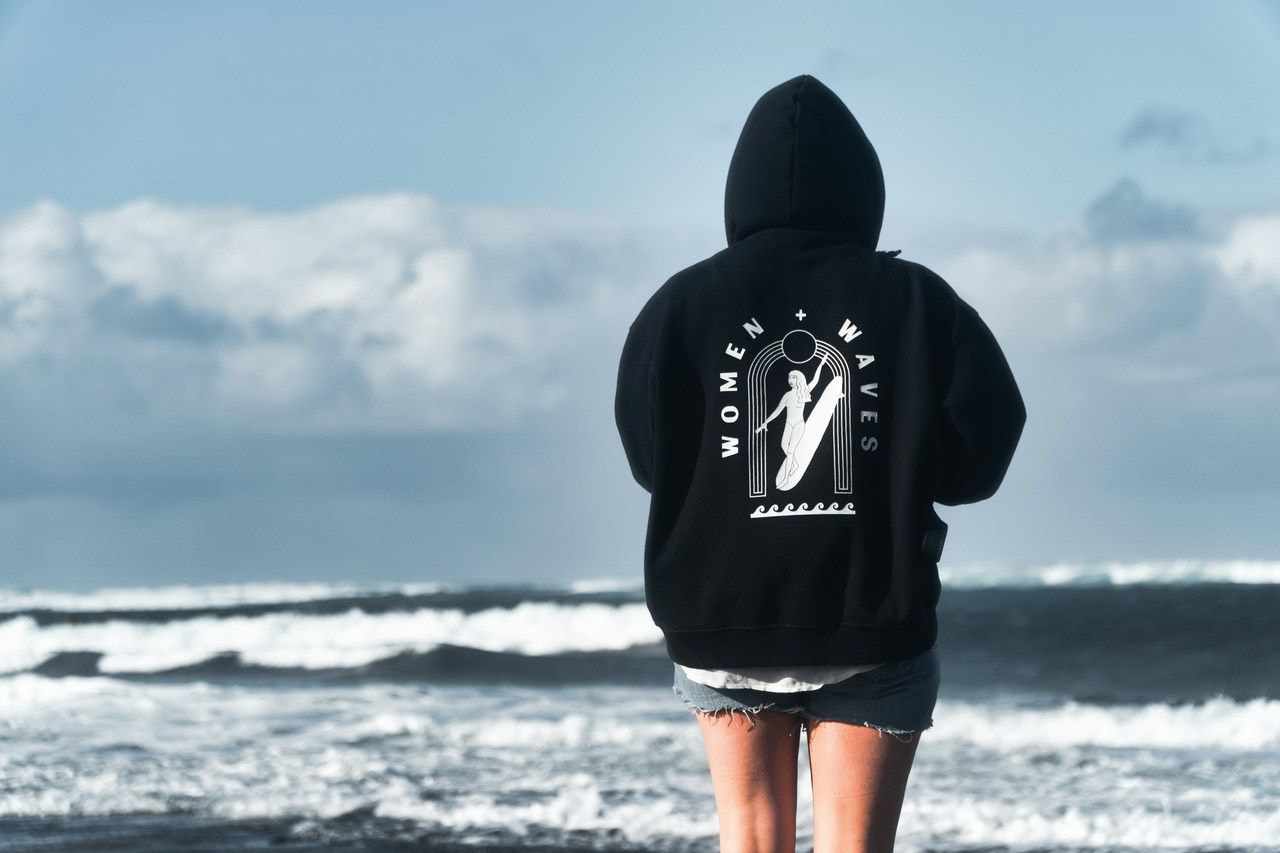
A full-back design gives large logos, illustrations, and eye-catching graphics room to shine. This back-of-hoodie design placement is especially common for streetwear brands, event merchandise, and custom apparel, where maximum visibility is often the goal.
Keep the print centered and avoid placing important elements too close to the hood. On pullover hoodies, the uninterrupted back panel provides plenty of space for larger graphics. Zip-up hoodies offer the same advantage because the zipper line only affects the front of the garment.
Upper-back and nape placement
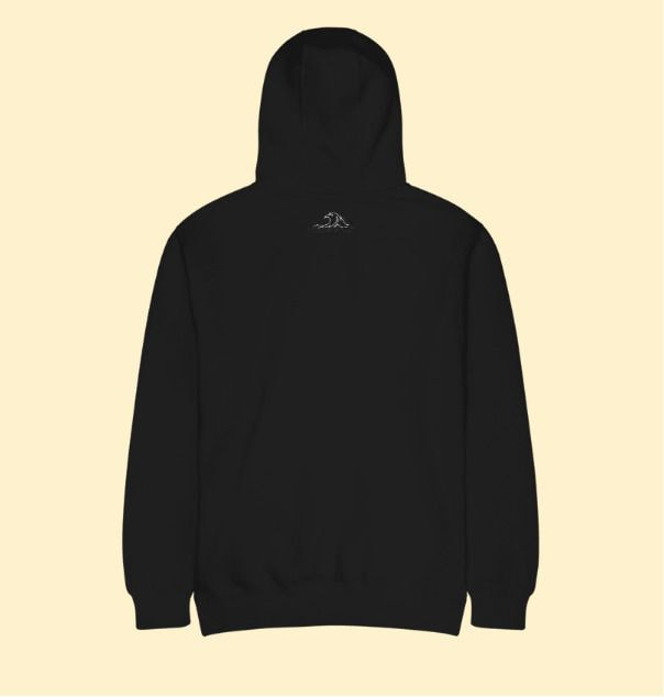
Positioned below the hood and above the shoulder blades, an upper-back logo offers a clean, understated alternative to a full-back design. This area suits secondary logos, brand names, or short text that complements artwork elsewhere on the hoodie.
Small embroidered logos and simple printed graphics are often enough to reinforce brand recognition without overpowering the overall hoodie design.
Hoodie logo size guidelines
Choosing the right logo size is just as important as choosing the right placement. A design that's too small may be difficult to notice, while one that's too large can overwhelm the hoodie. The ideal size depends on where you place the artwork, the printing method, and how much detail your design includes.
Embroidery placement and sizing
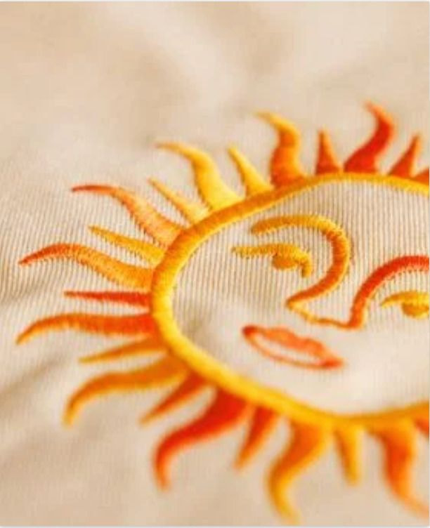
Embroidery works best with clean, simple logos, monograms, and icons. Because stitches add texture, fine lines and small text may lose clarity, especially on smaller designs.
For most left-chest logos, aim for a design around 3”– 4” (7.6–10.2 cm) wide.
Check out Printful's graphics and embroidery guide for more tips on preparing designs, file requirements, and embroidery limitations.
Print placement and sizing
Printing methods like direct-to-garment (DTG) and direct-to-film (DTF) can reproduce fine details, gradients, and larger graphics that aren't suitable for embroidery. This makes them a great choice for full-front and full-back designs, as well as colorful artwork.
As a general guideline, small chest prints are often around 3”– 5” (7.6–12.7 cm) wide, while full-front and full-back designs typically range from 10”– 12” (25.4–30.5 cm) wide. Always check the maximum print area for your chosen hoodie, as it varies by product and printing method.
Pro tip
Before publishing your product, order a sample to check the size, placement, and stitch or print quality in person.

Hoodie labels and tag placement
If you're looking to level up your hoodie game, custom labels are an easy way to give your products a more premium feel. They help polish your hoodie’s look, reinforce your brand identity, and give customers useful information about the garment.
You can place them either inside or outside, depending on the look you want to achieve and the information you want to share.
Inside neck labels
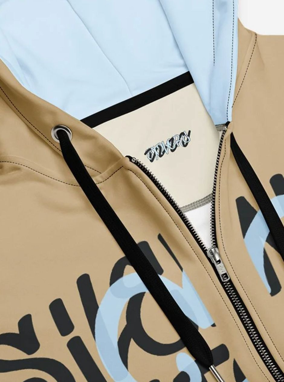
Inside neck labels usually include your brand name, size, and care instructions. They're a practical addition that gives custom apparel a more professional finish while helping customers identify and care for their hoodie.
If you're building a clothing brand, custom inner neck labels also create a more consistent unboxing experience and help customers remember your brand long after the purchase.
Outside labels
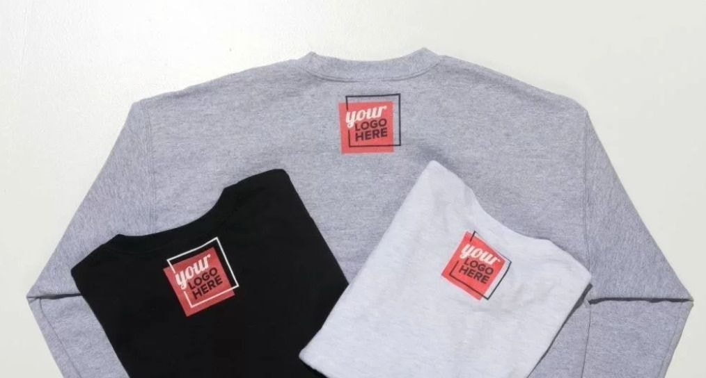
Outside labels are usually sewn onto the hem, sleeve, or pocket. They give your hoodie a premium, branded finish while keeping the main design clean.
Small woven or printed labels work especially well with minimalist designs, premium collections, or streetwear brands. When paired with a front, sleeve, or back logo, they help build a cohesive look across the entire hoodie.
All-over print hoodie placement
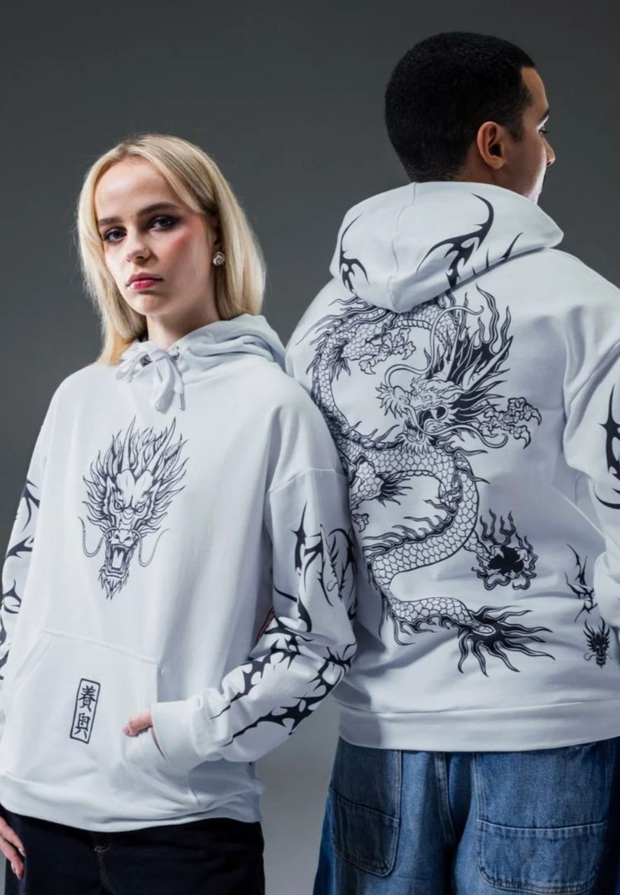
An all-over print extends your hoodie design across multiple panels rather than limiting it to a single location. This style suits bold graphics, repeating patterns, and illustrations that cover most of the garment.
Plan the design placement carefully so important text, logos, or vertical graphics don't fall across seams, pockets, or the hood. Large repeating patterns and edge-to-edge graphics usually create the cleanest result because they flow more naturally across the garment.
Also consider the hoodie color, size, and fabric before finalizing your artwork. Designs can look different on dark hoodies, oversized hoodies, and different fabric blends, so choose graphics that complement the garment and remain consistent from front to back.
Sweatshirt vs hoodie logo placement
Sweatshirts and hoodies share many of the same logo placements, including the left chest, center chest, sleeves, and back. The biggest difference is the garment itself. Features like a hood, kangaroo pocket, or zipper can reduce the available print area and influence where a logo looks best.
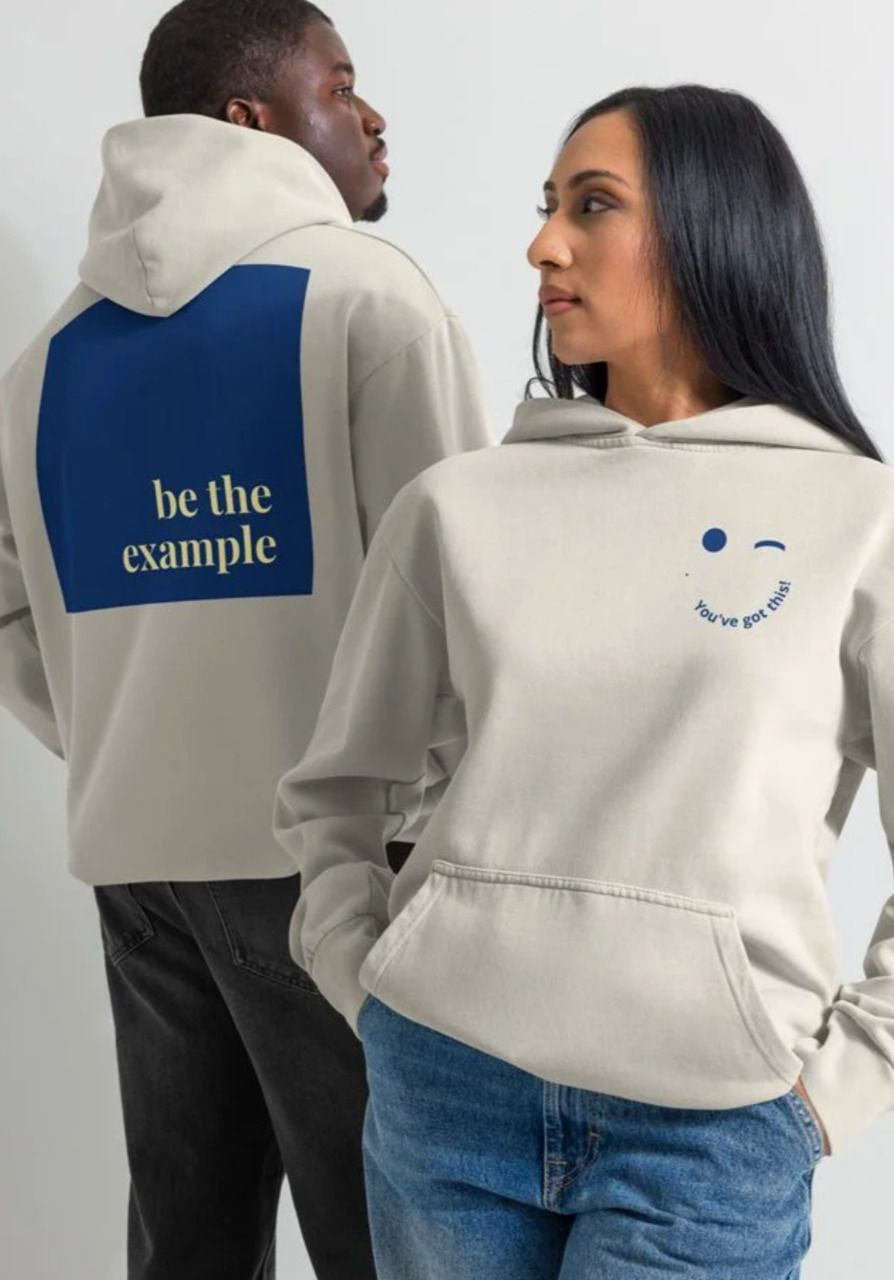
For example, a large center chest graphic that stands out on a sweatshirt may need to be resized or repositioned on a zip-up hoodie to avoid the zipper line. Likewise, a back design should sit low enough to remain visible below the hood when it's worn.
Fabric also plays a role. Hoodies are often made from thicker fabrics or textured fleece than sweatshirts, so consider your logo size, artwork, and best printing method when planning your design. Intricate details may be easier to reproduce with printing, while simple logos are well-suited to embroidery.
Whether you're designing unisex adult hoodies, men’s hoodies, women's hoodies, or youth hoodies, the same principles apply: choose a placement that suits the garment, complements your graphics, and supports your brand perception.
Common hoodie logo placement mistakes to avoid
Even a great logo can lose its impact without proper placement or the right size. Watch out for these common mistakes before publishing your design.
-
Ignoring seams and construction details. Keep illustrations away from the shoulder seam, hood, pockets, and zipper line on zip-up hoodies. These features can interrupt the design or hide important details.
-
Choosing the wrong logo size. Small logos may be difficult to notice and can fall flat on larger hoodies, while oversized designs can overwhelm the garment. Match the logo size to the print area and maintain good visual balance.
-
Using detailed artwork in small print areas. Fine lines, tiny text, and intricate details don't always reproduce well at smaller sizes. Simplify the design or choose a larger print location when needed.
-
Competing with other graphics. If your hoodie includes a chest logo, sleeve print, and back print, give each element a clear purpose. A secondary logo should complement the main design rather than compete for attention.
-
Ignoring the hoodie style. A placement that works well on a pullover hoodie may not suit a zip-up hoodie. Always consider the garment's construction before finalizing your design.
-
Skipping product specifications. Check the maximum print size and available print locations for your chosen hoodie before uploading your illustration. Print areas vary between products and decoration methods.
FAQ
The standard hoodie logo placement options are the left chest, center chest, sleeve, and back. Small logos are commonly placed on the left chest or sleeve, while larger graphics are typically printed on the front or back. The best placement depends on your design, branding, and hoodie style.
Choose the placement based on what you want the design to do. Place a logo on the left chest for subtle branding, the center chest for greater visibility, the sleeve for a secondary logo, or the back for large graphics and maximum impact. Ensure the hood, pocket, or zipper don't interfere with the design.
Yes. Combining a chest logo with a sleeve logo is a common way to add branding without overcrowding the design. Keep the sleeve logo smaller so it complements the main design instead of competing for attention.
As a general guideline, embroidered left chest logos are often 3”– 4” (7.6–10.2 cm) wide, while printed chest logos typically range from 3”– 5” (7.6–12.7 cm). Larger front and back graphics can be 10”– 12” (25.4–30.5 cm) wide, depending on the hoodie and available print area.
Start designing hoodies with Printful
The best hoodie designs balance eye-catching illustrations with thoughtful placement. From a subtle left-chest logo to a bold back graphic, your placement choice can transform a good design into a great one and ensure brand visibility.
Printful’s print-on-demand service lets you upload your artwork, preview different placements in the Design Maker, and create custom hoodies without upfront costs. Experiment with different layouts, order a sample if needed, and launch your design with confidence.

Jordana is a content writer with over 6 years of experience in content writing and technical writing. Her not-so-secret passion is breaking down complex ideas into clear, straightforward content, whether it's explaining tech concepts or crafting stories that connect. When she's not writing, you'll find her enjoying good sushi or falling down movie trivia rabbit holes.

