


Table of contents
First and foremost, you’re here because you’re the designer in charge. You want your work to come out as you envisioned it and don’t want to risk the printing software misrepresenting the colors you chose.
Second, color matching is crucial because you want to meet your customers’ expectations. Remember those “expectations vs. reality” online shopping memes? Imagine that happening to a customer with your products. Yikes.
And third, beautifully cohesive colors just look better. That’s another reason to focus on color matching from design files to prints.
Here’s what we’ll go through to master the art of color matching:
1. The basics of color matching
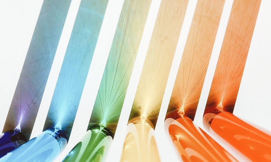
Writer Roy T. Bennett said: “It takes sunshine and rain to make a rainbow.” The same goes for color matching.
Before we explore the ins and outs of color, let’s review the glossary of color printing terminology so you can get a better grip on color matching.
Color design and printing glossary
- Color model—the mathematical formula of a color. The numbers of the formula express what other colors a given color consists of.

A screenshot of Adobe Photoshop Color Picker with various color values
- RGB—a color model where the formula of a color is expressed in three primary colors: Red, Green, and Blue.
The RGB color model is based on how we see colors—with the help of light. Similarly, the RGB color model is used to display images on devices that emit light.
- CMYK—a color model where the formula of color is expressed in four primary colors: Cyan, Magenta, Yellow, and Key (black).
All printers use the CMYK color model. The printed colors are created by overlaying the four colors in CMYK.

- Color space—a range of colors produced by specific color models like RGB and CMYK.
Each color model has multiple color spaces and limitations on what it can display. The way color is displayed varies across devices too. For example, the colors you see on your phone screen will look slightly different than on tablets.
- Color profile—a piece of software that helps to make sure the colors you see or print are consistent and accurate. It does this by defining the color capabilities of devices like cameras, screens, or printers.
Color profiles define the color values within the color space they were created in. For example, you take a photo of a tomato and then upload it to Instagram. Your phone will then pass the color profile information to Instagram, so your tomato photo is in the shade of red it was captured in.
At Printful, we recommend saving and uploading your design files in the Adobe Photoshop color code sRGB IEC61966-2.1 for RGB.
Our DTG printers work with an upgraded CMYK color space. We’ve added more ink colors, allowing us to achieve print colors that fall outside of the CMYK color range. The closest color space to our upgraded CMYK is the sRGB and that’s why we recommend it for print files.
Learn more: Everything You Need to Know to Prepare the Perfect Print File
- Color gamut—a range of colors that can be represented within a given color space.
When you convert a digital design to a different color space than you designed it in, you alter its gamut. Some of your original colors can change to the closest available colors in the color space you converted it to.
The RGB color space has a broader color gamut than CMYK, so converting a design created in RGB to CMYK can result in a loss of colors (especially bright neons).

Source: Ciechanow.ski
- Color matching—the process of transferring a particular color across different technologies or platforms.
Now you know all the whats related to color matching and color design. You’re ready to understand the whys.

2. Why printed colors look different from digital designs
The designs on your screen won’t always match the ones on your printed product 100%.
Various factors contribute to color inconsistencies. Let’s review them so you know what to look out for the next time you design!
Design color spaces
CMYK is the color model used for printing designs. RGB, on the other hand, is the color model used by most creators when designing print files. Due to technicalities, it’s the color model we recommend uploading your design files in.
Most beginner or web design software supports only the RGB color space. Advanced design programs (see our blog on free Photoshop alternatives) allow you to switch between the RGB and CMYK color spaces.
If you’re working within the RGB color space and upload that design for printing, our printing software will convert it to the CMYK color space it supports. This is a risky step, as your design may lose some of its original colors.
The CMYK color space recognizes a smaller range of colors than RGB. If your design has colors outside of the CMYK color space, then our printing software matches those colors to the closest ones in the CMYK color space.

To control color matching, work in sRGB and use CMYK as a preview space. Or, if your software doesn’t support the CMYK color space, use an online RGB to CMYK converter to check which colors of your design are out of the CMYK color space and adjust those.
Types of fabric
Your print outcome varies depending on the fabric you choose to print on. Printful has plenty of options to pick from, like:
- 100% cotton
- Poly blends (50% cotton/50% polyester)
- Tri-blends (50% polyester/25% cotton/25% rayon or 50% polyester/37% ring-spun combed cotton/13% rayon)
We tested how DTG prints show up on different fabrics. Fabric made of 100% cotton has a tight weave, so it’s the best choice to show off your design in its full opacity.
Poly and tri-blend fabric has a looser weave, making it the best choice for showing off your designs in a faded/vintage vibe.

If you like your designs to have a faded color palette, go for products with blended fabric. If you want that maximum opacity, choose products with 100% cotton.
Learn More: The Ultimate Guide to Types of Fabric
Fabric colors
The same color will look different depending on the color of the fabric your design is printed on. There are some objective, unavoidable reasons:
1. Ink transparency varies in different techniques (DTG, DTF (direct-to-film), sublimation, UV printing)
2. The same color looks different on multiple backgrounds (it’s affected by how our brain perceives visuals)

The small squares on both sides are the same exact colors. The background colors make them appear to be different. Source: Exploratorium
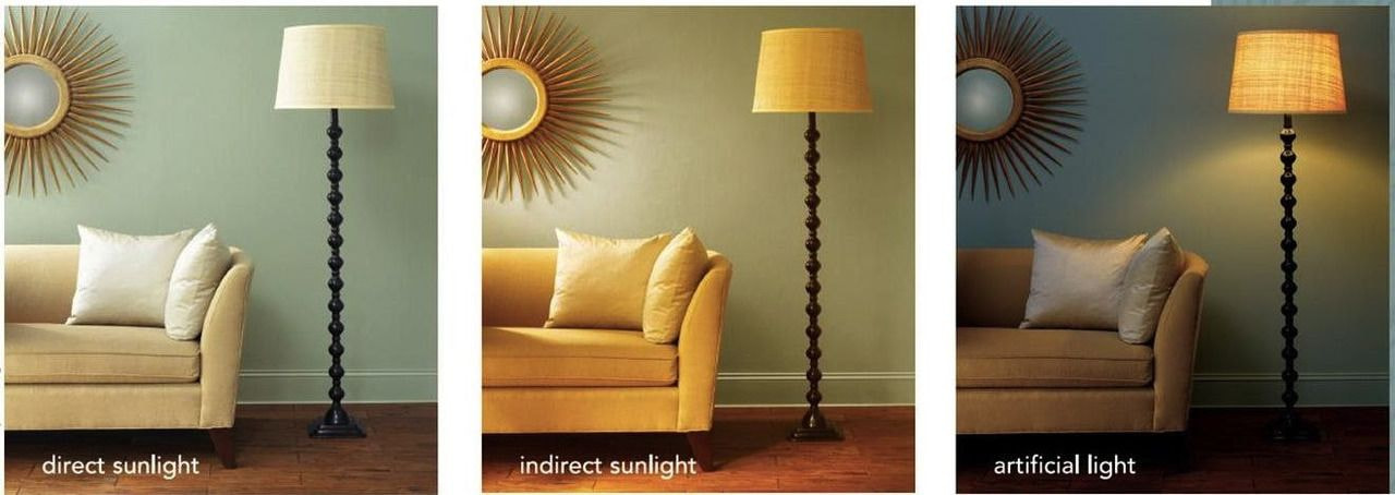
3. Materials, such as fabrics and inks, behave differently depending on the ambient light source
Source: Glenwood Decorating Supplies
At Printful, we use a white underbase layer beneath DTG prints on colored and dark garments to keep the designs vibrant and colorful. When choosing the right colors for your design, I’d even suggest going with darker shades for lighter colored fabrics to get a more vibrant design.
Let’s go through the steps you can take to ensure your design comes out exactly as you envisioned it!
3. Steps to getting the print colors you want
The ideal scenario to get the perfect print color is a combination of actions. I’ll sort these steps, starting with the easiest and most important one.
Avoid neon colors in RGB or create design files in CMYK
Remember that neon colors and deeply saturated shades exist in the RGB color space, but our printers support the narrower, neon-less CMYK space.
For the best color quality, you have two routes:
1. Recommended: Create design files in sRGB and steer clear of neons and saturated shades as they simply won’t print!
2. Alternative: Create design files in CMYK to avoid neons and over-saturated shades
For the best possible color accuracy for your design, convert the file to an sRGB color profile, sRGB IEC61966-2.1 to be exact.
Most editing programs have this color profile as default. If yours doesn’t, don’t worry—the regular RGB color space will also work.
Order product samples
Though, with print-on-demand, you don’t need to pre-order your products, it’s still a good idea to buy one as a sample.
Getting your own product samples is a must to ensure your designs come out great. It’s an investment that lets you check design placement, color, and overall product quality. Plus, you can order samples to create top-notch product photos and videos or to use them in giveaways.
How to order product samples:
-
Go to your Printful Dashboard
-
Click New Order, choose your store, and click Sample order
-
Choose your products and place an order
You can place 1 sample order per month, with a maximum of 3 items when you sign up with Printful. When you complete other milestones, like reaching a certain threshold in accumulated sales, you get more sample orders. Read more about Printful’s sample orders.
Create and order your own custom color swatches
By creating your own color swatches, you can test only the colors you plan to design with. If your designs or brand colors are monotone, wonderful—prepare a design file with all the colors of gray, red, pink, yellow—whatever! And once you check those colors, you won’t have to test each and every design you create with them.
Here’s how to create custom color swatches:
-
Choose the product you’ll test your color swatches on and check the product’s recommended file dimensions
-
Open your design software and start a new design with your product’s recommended file dimensions
-
Draw whichever shapes you like, fill them in with your chosen colors, and add their color values
-
Save your design file in the RGB color space and choose the .png file format
And you’re done! Upload your custom color swatch on Printful and place a sample order with your design. Once you get your product, you can then decide which colors work and which don’t.
Here’s a custom color swatch our designers created. Our designers tested particular RGB color values and went with this weird shape because—well, why not.

And here’s how the custom swatch printed out. We chose to print on the Bella + Canvas 3001 t-shirt in Soft Cream.

Have you ever created a custom color swatch before? Let me know in the comment section below.
The power of color matching is in your hands


As I said before, you’re the designer in charge. Now that you have all this knowledge on color matching and designing for print-on-demand products, it’s time to use it!
I want to hear back from you—what’s your main takeaway from this blog post? What did you find interesting and which design tips will you try out next time you’re in the zone?
Happy designing!
Read Next:

By Una Savčenko
Una’s a passionate content team lead with a keen interest in delving into the world of marketing campaigns and the psychology behind persuasive advertising copy.