


Table of contents
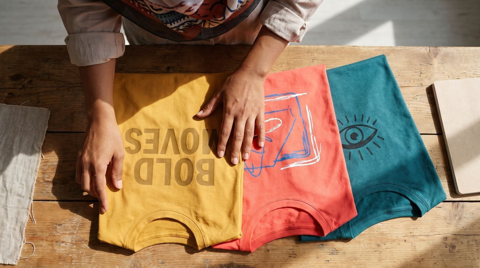
Vintage washes, food art, Y2K revivals, oversized fits, and big lettering with no graphic are the t-shirt design trends buyers are reaching for in 2026. Below are 15 of them: what each style is, who buys it, and how to make it. Test any of them with zero upfront investment. With Print on Demand (POD), we print nothing until a customer orders.
Key takeaways
-
Nostalgia runs through five entries on this list: Y2K, kitsch ’90s graphics, psychedelic color, vintage wash, and retro athletic
-
Humor and attitude cover funny designs, hand-sketched doodles, and the punk aesthetic
-
Nature and symbolism group animal motifs, nature-inspired prints, and spiritual and esoteric designs
-
Clean styles cover minimalism and bold decorative typography, both of which print well in one or two flat colors
-
Food art covers sardine tins, espresso cups, and diner graphics
-
Fit now matters as much as artwork, because a boxy, dropped-shoulder blank changes how large your print reads
How to pick the t-shirt trends worth printing
You don’t have to print all 15. Run the ones you like through three filters before you design.
Check brand fit first: keep the trends you could run for a full season without changing your logo, colors, or tone of voice. Then check audience fit by matching each style to people who already buy from you and reviewing live listings in that niche on Etsy and Pinterest. Finally, check print fit: gradients, halftones, and photo textures suit DTG printing, while embroidery suits solid shapes and bold lines.
Then pick the blank. Garment-dyed and heavyweight tees carry washed, faded artwork better than a light retail-fit tee, and the fabric sets how sharp your lines land.
Read also: 9 best-quality t-shirts for printing
1. Food art designs
AI-generated image. This scene is not real.
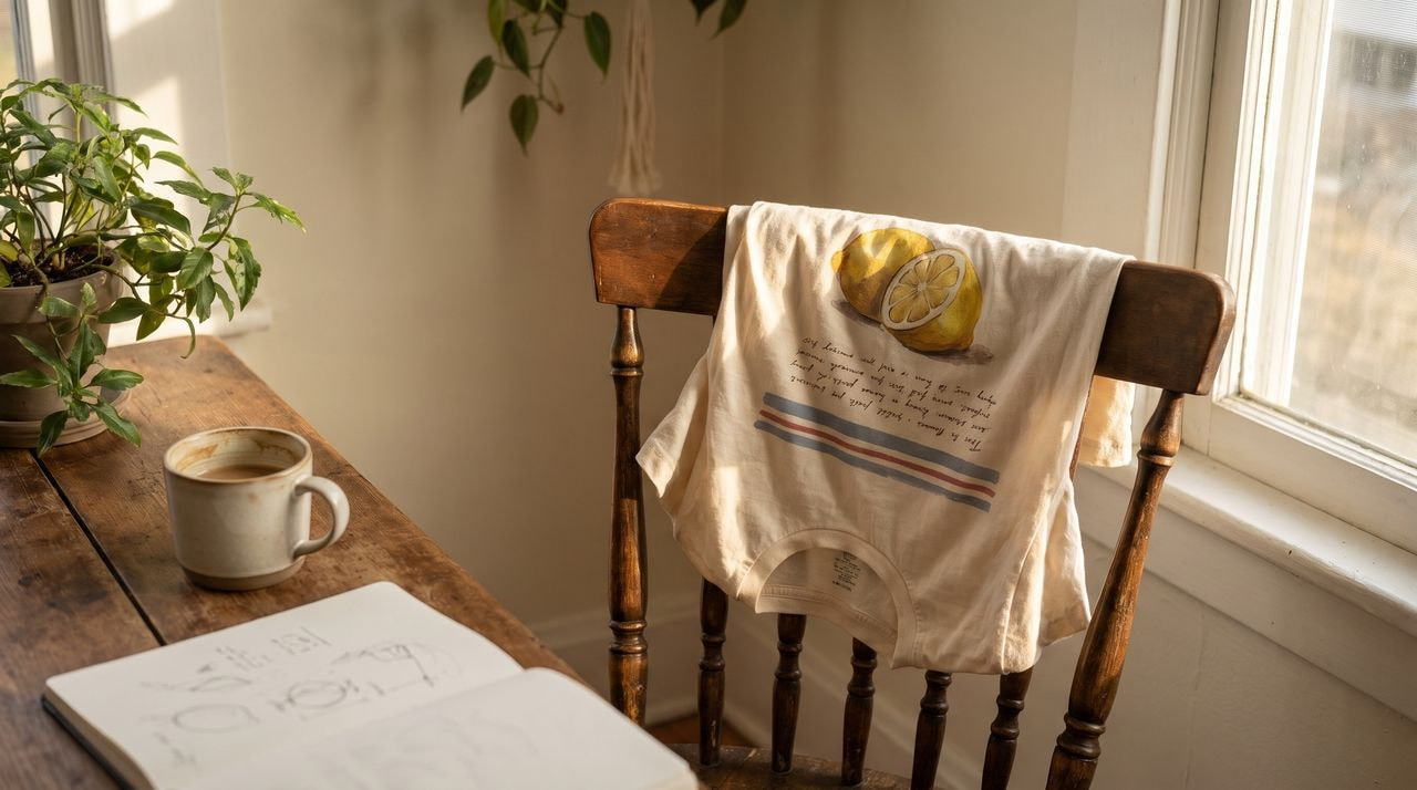
Food art is steadily taking over apparel, from tinned fish labels to espresso cups, and it reads as both playful and polished.
Food evokes strong memories, so t-shirts with nostalgic culinary illustrations connect quickly: a perfectly ripe avocado, a steaming cup of coffee, or a slice of pizza can bring a smile before anyone reads a word.
The trend lets people show their love of food in a fun, wearable way, and designs range from elegant Parisian dinner scenes to the cozy charm of an Italian trattoria.
Tinned fish is having a moment: Fortune named sardines America’s hottest tinned fish snack in 2026, and the motif is now turning up on t-shirts.
How to create food art t-shirt designs
Draw one item and let it fill the chest: a sardine tin label, an espresso cup, a halved lemon. Paint it in gouache or watercolor, scan it, then place it on a cream or butter-yellow tee in our free Design Maker.
Hand-drawn wavy stripes in muted primaries and a line of loose handwriting underneath finish the look. Keep the palette small so the illustration stays readable on light blanks. Build the artwork once, then apply it across sizes, including kids’ tees.
2. Y2K
From the runways to the streets, the 2000s are back, with baggy jeans, crop tops, and tinted sunglasses. Design roundups still name Y2K-inspired tees among the styles to print, and the look lands with buyers who lived through it and teenagers meeting it new.
Y2K t-shirts run bright and playful. Expect neon and sugary pastel palettes, chrome and metallic fills, butterflies, stars, and tech graphics pulled from early internet culture. Dial-up icons, chat windows, and pixel hearts all read instantly.
Short, catchy phrases do a lot of the work here, so a single word can carry the design. One word in the right typeface is a finished design.
Read also: The 2000s are back: 10 pieces to ace your Y2K era
How to create a Y2K t-shirt design
Build the design around one hero word set in a chrome, bubble, or blocky retro typeface, stretched wide across the chest. Fill the letters with a gradient such as hot pink into electric blue, or lime into silver.
Scatter small supporting elements around it in the same palette. For a softer take, swap the neons for baby pink, lilac, and mint. Finish in our free Design Maker with a glitch offset so the print reads like an early desktop screenshot.
Read also: 8 trendiest summer t-shirt colors
3. Kitsch ’90s graphic design
Kitsch ’90s graphics are loud, slightly tacky, and proud of it. Clashing neons, chunky clip art, novelty patterns, and wonky drop shadows all belong here. The style reads as knowingly funny rather than sincere, which is the whole appeal.
Grunge, sportswear, and hip-hop each left a mark on the decade, and modern takes mix those references with current cuts. A kitsch graphic on a boxy, heavyweight blank lands very differently from the same graphic on a slim retail tee.
This trend suits a shop with a humorous voice and a young audience. It also forgives rough edges, so a design that looks slightly wrong is doing its job.
Learn more: Greatest ’90s fashion trends and how to recreate the most iconic looks
How to design kitsch ’90s graphics
Pile elements on deliberately. Start with a piece of chunky clip art, drop a squiggle or confetti pattern behind it, then set the text in Comic Sans or a bouncy display font with a hard outline.
Pull your palette from the muted greens, browns, and purples that came after the saturated ’80s. Browse the ’90s cliparts, backgrounds, and Quick Designs in our free Design Maker, and pull extra reference from iStock.
Learn more: Grunge fashion: how to recreate the look
4. Funny t-shirt designs
Funny shirts rely on clever wordplay, comic strips, or illustrations that make people smile. The wearer shows their sense of humor without saying a word, which gives the trend wide appeal.
Puns are the staple: food jokes like Let’s taco ’bout it, animal jokes like I’m paw-sitive, and one-line observations about pets, coffee, or work. Independent shops such as LuckyLorrainePrints, JulieFitzGeraldArt, and SnowMoonApparel build whole catalogs this way.
Comic strips are the other route. A three-frame strip adds a small story to the shirt, and quirky characters or absurd scenarios give you a cast you can reuse across a collection.
How to create funny t-shirt designs
Write the joke first, then draw the minimum needed to land it. Set the punchline in bold, readable type across the chest in our Design Maker, and keep any illustration to a single flat-color figure underneath.
The reader should get it in the time it takes to walk past. For comic strips, cap it at three frames and under ten words. Before you list a phrase, run a trademark search, because common sayings are often registered.
5. Animal motifs
AI-generated person, not a real individual.
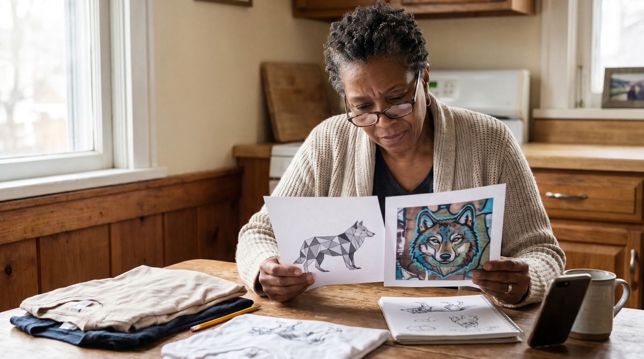
Animal designs run across independent apparel shops in two clear directions. Geometric versions build the animal from angular shapes and clean lines, which keeps the print minimal and easy to produce. Stylized versions exaggerate the features instead: an oversized mane, heavy feather detail, saturated color.
Shops like YatraDesign, WaryaTshirts, and OniGara show how far the same animal can be pushed in either direction.
Buyers here are specific. Someone buys the wolf because they like wolves, not because they like animal shirts, so build a listing per animal rather than one listing with 12 options.
How to create geometric and stylized animal prints
For the geometric version, trace a reference photo, then rebuild the outline from triangles and straight segments. Layer the shapes to suggest depth and hold the palette to monochrome or a few muted tones so the facets stay visible.
For the stylized version, pick the one feature that identifies the animal, make it twice the size it should be, then color it brightly and outline it thickly. Center the finished animal on the chest, and lean on street art and pop art textures.
6. Nature-inspired t-shirt designs
Nature-inspired t-shirt designs bring the outdoors onto everyday clothing, and the motifs selling now are specific rather than general. Mushrooms, ocean waves, botanical line art, pressed-flower layouts, and single-line mountain ranges all turn up across independent shops like FindPeaks.
The category works for brands with an outdoor, wellness, or sustainability angle, because the artwork matches what the buyer already says about themselves. The motifs don’t date the way a novelty graphic does, so the same design can stay in your shop for seasons.
Pair it with the right blank. Earth-toned and undyed tees suit botanical line work far better than bright white.
How to create nature-inspired t-shirt designs
Pick one motif and one treatment, then repeat the pair across a collection. Botanical line art works as a thin single-weight outline in one ink color, printed small on the left chest or large and centered.
Landscapes work better as layered blocks of flat color, sunset bands behind a ridge line, with no gradients to muddy the print. Draw mushrooms and waves large enough to cross the chest seam to seam. Green, rust, sand, and off-white carry these designs best.
7. Spiritual and esoteric
Spiritual and esoteric tees often lean gothic. Stained glass panels, moon phases, skulls wrapped in florals, hands holding candles, tarot card layouts, and sacred geometry are the motifs doing the work, often in black and bone on a dark blank.
The softer end of the category still sells: celestial line art, evil eyes, crystals, and affirmation lettering. Browse spiritual t-shirt listings on Etsy to see how wide the range runs.
Zodiac designs need one listing per sign. People buy their own sign, not the set of 12, so a single shirt with all 12 on it sells to nobody in particular.
How to create spiritual and esoteric t-shirt designs
Work in a limited palette of two inks and build the design symmetrically, since most of these motifs read as emblems. A stained glass treatment is heavy black outlines filled with flat color, drawn as panels inside an arch.
Moon phases work as a single row across the chest. Many carry real religious meaning, so understand what you’re printing and respect it.
Read also: 8 effective t-shirt ads and why they work
8. Psychedelic art and vibrant colors
AI-generated image. This scene is not real.
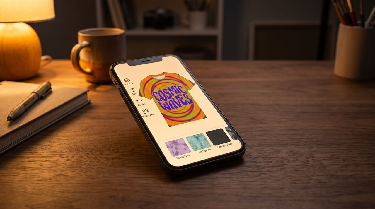
Psychedelic tees are built on swirls, melting letterforms, kaleidoscopic repeats, paisley, and free-flowing linework in colors that clash on purpose. The style sits next to tie-dye in most streetwear shops, which is why the two keep appearing together.
Two palettes run through these prints. One is loud: electric orange, lime, and magenta on black. The other is washed out, the acid-wash and muted tie-dye range of dusty lilac, faded teal, and sand, which suits a brand that wants the pattern without the volume.
A psychedelic print stands out on a rail from across the store, so it earns its place as the loudest item in an otherwise restrained collection.
Read also: Gen Z fashion: 12 fashion trends
How to create psychedelic t-shirt designs
Start with type, not pattern. Set a short phrase in a groovy, bulging font, then warp it along a curve so the baseline ripples. Build the background from concentric rings in three clashing colors, then mask the type over it in a fourth.
Keep white space at the edges so the print has a shape rather than bleeding into the fabric. Tie-dye and acid-wash blanks carry this style, and an embroidered detail on a washed tee reads as premium.
9. Bold and decorative typography
Typography shirts carry the message and the artwork in one element, so a big, bold line of text with no graphic can be the whole design. Letterforms alone hold recognizable meanings, which is why a typeface choice changes who buys the shirt.
Bold works two ways here. It can mean daring in content, in the tradition of Katharine Hamnett’s oversized slogan tees, which turned a shirt into a statement. It can also mean visually strong: heavy weights, tight spacing, and letters that fill the chest edge to edge.
The experimental end of the trend uses unusual shapes, variable fonts, and cut-out magazine lettering. Collaborative typefaces like DIVERSITY show how much a letterform can say on its own.
How to create bold and decorative typography designs
Write the line first and cut it to four words or fewer. Set it in a heavy display face, then stack it in two or three lines so the block sits as a rectangle on the chest rather than a thin strip.
Tighten the spacing until the letters almost touch. Our Design Maker carries a large font collection plus arc, outline, and shadow tools for curving the block or adding a contrast outline in one pass. Keep the wording original.
Set your slogan in type that sells
Start designing in our free Design Maker and see the layout on a real blank before you commit.
10. Hand-sketched t-shirt designs
Hand-sketched designs show the wobble of a real hand: uneven lines, loose lettering, and imperfect shapes that clean digital artwork rarely has. That human quality is the appeal.
The category covers doodles, detailed pen drawings, handwritten text, and personal motifs. Because the artwork is yours, nobody else can sell the same shirt.
How to create hand-sketched t-shirt designs
Draw on paper first, scan it at high resolution, then drop the file onto the blank without cleaning up the wobble. Ink it with a fat marker so the lines survive scaling.
The naive version turns up most: flat childlike doodles with thick uneven outlines, a lopsided smiley face or a badly drawn dog, paired with goofy hand-drawn lettering at an angle. The doodles, abstract shapes, and handwritten fonts in our free Design Maker give you the same look.
11. Return of the punk aesthetic
Punk has stayed in the alternative apparel aisle for decades, and the look is easy to recognize before you read a word of it.
Punk grew out of the 1970s music scene as a deliberate provocation, and tattoos, piercings, metal studs, and spiked accessories became part of its look.
Punk shirts express a few consistent attitudes: individual freedom, anti-consumerism, distrust of authority and corporate greed, anti-mainstream defiance, and a healthy dose of anger. Slogans about direct action and against selling out sit alongside blunt, unsentimental takes on relationships.
If your store has an alternative streak, this trend gives you a visual language your buyers already read fluently, and rough artwork is part of the look, so imperfect files are not a problem.
How to create custom t-shirts with a punk aesthetic
Build the artwork like a ransom note. Cut letters from scanned newsprint, overlap them at odd angles, then photocopy or scan the result twice so the edges break up and the blacks go patchy. Early punk flyers and zines are the reference point.
12. Vintage wash and distressed graphics
AI-generated person, not a real individual.
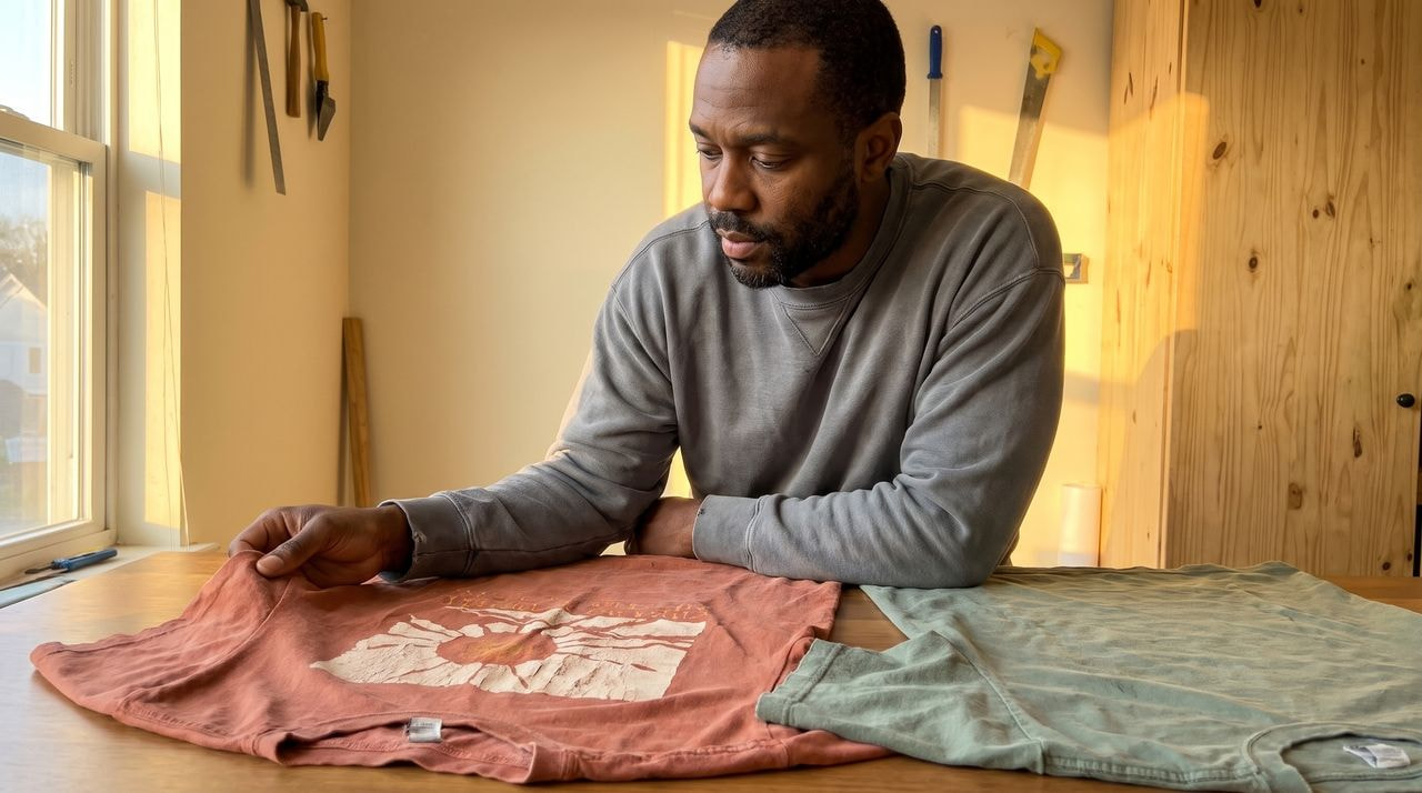
A vintage wash tee looks like it has been worn and laundered for years before you bought it. The print is faded, cracked, and slightly off-register, the colors are sun-bleached, and the blank itself is garment-dyed so the fabric reads soft and lived-in.
Faded pastels and muted brights replace the saturated palettes you would use on a white blank, which makes the whole shirt feel like an archive piece rather than new merch.
The look suits band-style graphics, tour-poster layouts, hometown lettering, and nature scenes. It also hides imperfection, so a design with rough edges fits the aesthetic instead of fighting it. Browse our Style Trends collection for current blanks.
How to create vintage wash t-shirt designs
Design in full color first, then age it. Drop the artwork’s opacity so the fabric shows through, add a halftone dot pattern over the fills, and lay a cracked-ink texture on top as a mask so the print looks flaked.
Knock the saturation down and shift the whites to cream. Pick your blank before you finish, because a garment-dyed tee does half the work for you and a bright white tee undoes it.
13. Minimalism
Minimalist tees carry very few elements, often one small image or a few words, in a look that suits buyers who want something understated.
Color stays basic: black, white, gray, or soft pastels. Those shades go with most outfits, so the shirt stays wearable for years.
Any text is short and set in a plain face, so every word earns its place. That restraint also makes minimalism quick to produce and easy to extend into a full collection.
How to create minimalist t-shirt designs
Reduce the idea to one shape, one word, or one line. Use basic geometry or a single continuous-line drawing, and avoid detail that clutters the print. Hold the palette to one or two colors, a monochrome scheme or neutrals with one accent.
Choose a readable font with no decoration and keep the text short. Place it small on the left chest rather than large and centered, because a small mark reads as a brand label while a big one reads as a graphic tee.
14. Oversized and boxy fits
An oversized tee is a design decision, not a size option. Heavyweight, dropped-shoulder, boxy blanks hang wider and shorter than a classic fit, so the shoulder seam sits down the arm and the chest panel is larger and flatter.
That changes your artwork. The same graphic reads smaller on a boxy tee because there’s more fabric around it, and a design centered for a standard fit can sit too high on the chest once the shoulders drop.
Buyers choose these for comfort and silhouette, which means the fabric sells as hard as the print. Heavier cotton holds its shape after washing and feels like a premium piece in hand, so describe the weight and the drop shoulder in your listing.
Read also: 9 best-quality t-shirts for printing
How to design for an oversized tee
Pair a large back print with a small front mark. Put the full artwork across the upper back, where the flat boxy panel gives you the most uninterrupted space, and keep the front to a pocket-sized logo or a line of text on the left chest.
Scale the back print up against the mockup rather than reusing a standard-fit file. Check the print area in our Design Maker for the blank you choose, since the maximum print size differs by product and size.
15. Retro athletic and varsity
AI-generated image. This scene is not real.
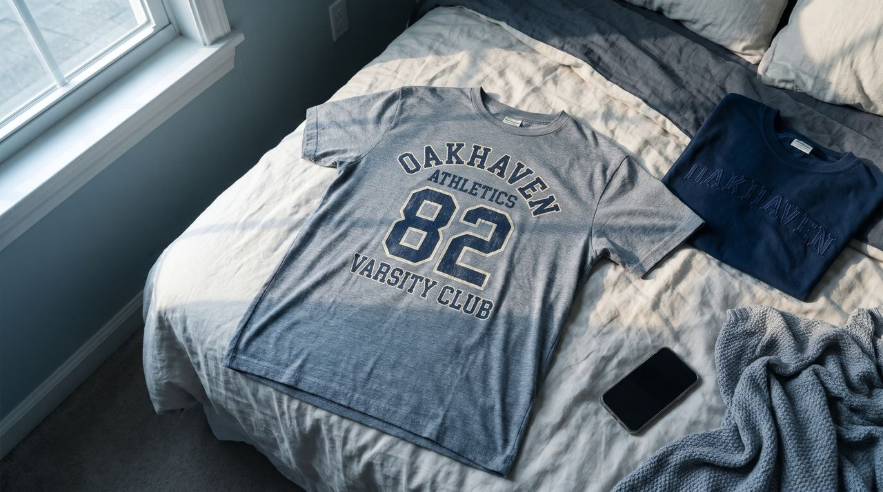
Retro athletic borrows the look of old team merchandise: block numbers across the chest, an arched word above them, contrast raglan sleeves, ringer collars, and a faux team name invented for your brand. Sport-inspired designs appear on trend roundups, and the style gives a shop an instant collection structure, because one template produces a dozen listings.
Keep the wording original. Never print a real school, college, or university name or logo, because that’s licensed property and the listing gets removed. Invent your own town, club, or year instead and lean on the collegiate layout rather than the institution.
The buyer is usually after the nostalgia of a gym shirt rather than any specific team, which is why fictional team names work.
How to create retro athletic t-shirt designs
Build it in three stacked elements: an arched word on top, a large block number beneath it, and a smaller straight line of text under that. Use a condensed slab or collegiate face and give the letters a contrast outline.
Hold the palette to two colors, usually a cream or athletic gray base with one strong accent, then add a light distress texture so it reads as an old shirt. Numbers and arched text also run well as embroidery on a heavier blank.
How to turn a trend into a product with Printful
Once you’ve chosen a style, the route from file to live listing is short.
-
Pick the trend and the audience. Choose one style from this list and the group of people who already want it.
-
Choose the blank. Browse our product catalog and pick a fit and fabric that matches the look, such as a garment-dyed tee for vintage wash.
-
Build the design. Upload your artwork or make it from scratch in our free Design Maker, then position it on the blank.
-
Create your mockups. Generate product photos in the Mockup Generator so your listing shows the shirt on a model.
-
Connect your store and publish. Push the product to Etsy, Shopify, TikTok Shop, or another of our integrations, and we print, pack, and ship each order only after a customer buys it.
Nothing is produced in advance, so testing a trend costs you design time and nothing else.
Read also: How to create a t-shirt design: the complete step-by-step guide
T-shirt design trends FAQ
Here are the questions sellers ask most about the latest t-shirt design trends and which of them belong in your shop.
Vintage wash, food art, oversized boxy fits, gothic romance motifs, and big block lettering are the styles on this list that run across independent apparel shops. For men’s listings, vintage washes, varsity graphics, and oversized fits carry over directly. Pick two that match your brand voice and test them.
Food art, Y2K, kitsch ’90s graphics, funny designs, animal motifs, nature-inspired prints, spiritual and esoteric motifs, psychedelic color, bold typography, hand-sketched doodles, punk, vintage wash, minimalism, oversized fits, and retro athletic. They group into six themes: nostalgia, humor and attitude, nature and symbolism, clean typography, food art, and fit.
Beyond graphics, the garment itself is part of the trend. Heavyweight, boxy, and dropped-shoulder blanks, garment-dyed and acid-washed finishes, and faded pastels and muted brights all change how a design reads. Choose the blank before you draw, because the fit sets the scale of your print.
Pick a style from this list, choose a blank from our product catalog, build the artwork in our Design Maker, then connect your store and publish. We print and ship each order as it comes in, so you buy no stock and carry no inventory risk.
Start your t-shirt brand with Printful
The t-shirt design trends above only earn anything once they’re on a product someone can buy. If you’re starting this week, test vintage wash, food art, and oversized fits first. They sit on three different blanks, so you’ll learn quickly which one your audience responds to.
We handle everything after the design. Printful prints and embroiders your artwork across our product catalog, then packs and ships each order under your brand. No minimums, no inventory risk, and zero upfront investment. You pay only when a customer buys.
Create a free account to design your first tee and connect your store today.
Read next:

Printful is an on-demand printing and fulfillment service that helps businesses create and ship custom products.

