Table of contents
If you’re running an online store, then you should be no stranger to popups. Whether or not you have them running, here are 40 examples to spark some ideas for developing yours.
Typical popups can be divided into these categories:
- Welcome popups: a popup that is presented as soon as your visitor arrives. You can use this tool if you want your visitor to browse, already with a certain knowledge in mind (for example, that you’ve got a sale going on for a certain product category)
- Exit intent: when the visitor moves their cursor to leave the page, the popup is shown to them, offering a deal that’s difficult to refuse, this way retaining the potential customer.
- Behaviour-driven: when a visitor performs a certain behavior, the popup is shown. The behavior’s indicative of something, and you’ll offer them just that. For example, scrolling.
- Time-driven: when a visitor has spent a certain amount of time on your site, you can safely assume that they’re interested in what they see, and you can use that knowledge to offer them more
- Push notification: this is a relatively new function that is currently underutilized: it lets you send push notifications to your visitor through their browser
Popups are too resultative to be ignored
The facts are in.
- Stores with an exit intent popup are able to turn an average of 35% of leaving visitors into customers. Imagine – that’s 35% of people who wouldn’t have bought from you!
- Stores with opt-in popups (asking for the visitor’s email) are 1375% more likely to generate subscribers.
Popups can have certain different values to you, the store owner. When choosing what sort of popup to add to your store, you should think about the outcome that’s most important to you. Here are some:
Collecting leads: you can ask for their email address, so that you can address them again through email marketing. That is, after all, one of the best ways to drive a direct result *cough* sales *cough*. Usually the best results arrive when you can give them something in return
Converting a sale: you might offer a discount code that your visitor can shop with, or remind them of an upcoming
Growing social media followers: you can present an option for your visitor to follow you on social networks, to stay up to date
Don’t dismiss popups too fast…
On the consumer end of popups, you know that they suck. There’s nothing worse than being in the middle of browsing a cool online store you just discovered, or being halfway through a blog post you really wanted to read when a pesky popup severs your attention and ruins your experience…
Or does it?
After browsing hundreds of ecommerce popups, the best kind tend to be the ones that enhance the online experience, rather than detract from it.
The secret?
Being of value. Offer something that the visitor wants, and you have a completely smooth UX and happy customer.


40 examples of online popups that work
We’ve scoured the internet to find the best examples of popups, so that whenever you’re left in the dark, you can scroll through these and get a jolt of inspiration.
Welcome popups
These popups are displayed when your visitor arrives to your store, or very soon afterwards. Use them to inform your visitor about something. A deal, for example. This usually works best when you have something to tell them.
GlassesUSA

Frank and Oak
Ok, this isn’t a popup. This is a bar that shows up at the bottom of the page. Their copy, however, is great. It reads:
“Get instant 15% off
Because that’s how we treat our new guests. You’re welcome.”
You can see that the popup specifically targets new visitors and makes them feel special.

Danielle Laporte
Danielle Laporte does popups the right way. Again, this is a full-screen “popup”. It gets you intrigued by asking you to unlock the surprise they have hidden behind a key.

Then follows the opportunity to subscribe:

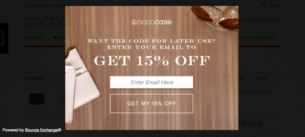
Dodo case
Dodo Case also has a fantastic two-part popup. The first one is a 15% discount for the store, but with a catch that it’s only active for half an hour. This gives the visitor a sense of urgency and boosts immediate sales.

However if the visitor choses the “No thanks, I’d like to save my discount”, they’re offered this popup video, in which they receive a code to be used at a later time, however this time in exchange for their email address:
Vainags
A simple, yet effective discount for new visitors arriving.

Topman
Topman has an informative popup for new visitors, giving them important information to help them feel at ease and safe making an order. This, in turn, is certain to improve conversions.

Gilt
Gilt will recognise which country you’re accessing their page from, and will let you know everything you need to know to shop.

ModCloth
ModCloth tries to attract new registered users by offering new users a discount in return for signing up.

The Middle Finger Project
One of my personal favorites, The Middle Finger Project always manages to infuse a tonne of their brand personality into every aspect of the website. This is also an ever-present bar at the bottom of the website when a visitor arrives. It has you “pledge”, and by submitting the pledge, you become subscribed to the list.

Opt-in popups
This is a popup that can occur at any moment – you can have it show up immediately when your visitor arrives, or later on. The main goal here, however, is to have the visitor leave their email address. Check out how these creative sites managed to do that.
Frank and Oak
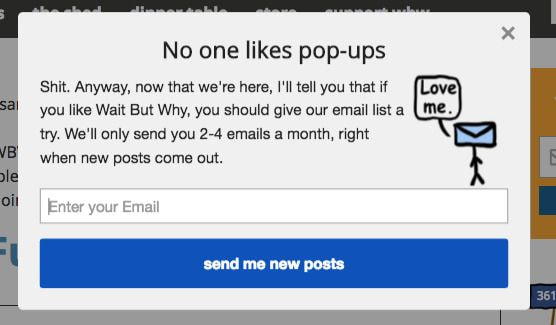
Frank and Oak also have a fantastic popup later on, that plays up the traditional hatred of popups:

Topshop
Topshop immediately recognizes your location, and offers relevant information based on that. It eases your mind, and sets you up for the types of payments accessible.

Envie de Fraises
There are many things that are great about this. First of all, offering the visitor $10 off. Second, it’s only available “today”, meaning there’s urgency and the visitor is more likely to go through with the order. Third, Envie de Fraise asks for the subscriber’s due date. As a pregnancy apparel brand, they use this information afterwards to market their pregnancy apparel before the due date, and post-pregnancy apparel afterwards. A great example of personalized marketing.

Fed by Threads

Five Four

G-Star
G-star gets it right by telling their visitors up front that they offer free shipping. This is the #1 boosting element to make a visitor take the plunge and make the purchase. If you offer free shipping, you’re best off letting your visitors know that.

Shinesty
Using some humor + a great offer to draw in the email. Pay close attention to the example email address they’ve added – it’s totally on-brand and on-message. And who wouldn’t want to click on a magenta “Get $10” button?

Invison
Ok, Invision is an app, but their popup idea can be used by any online store. Simply offer up your apparel as a prize, and have visitors sign up for a chance to win. But really, you’ll be the winner, since you’ll have an email address, plus another person walking around the world, reppin’ your brand.

ZooShoo
The typical email-for-a-discount deal. Upgraded with a shot of brand personality.
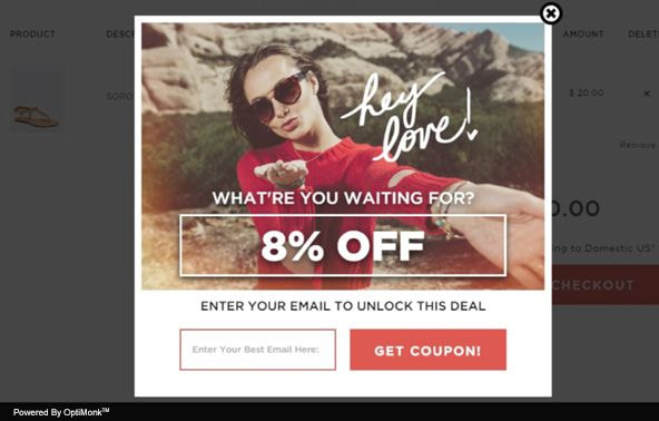
What most opt-in popups have in common is that they always offer their visitor something in return. A fair transaction – an email for something that the visitor would want.
Quicksprout
Though Quicksprout isn’t an ecommerce apparel store, they are masters in conversions. If there’s one authority you can count on to be doing it right, it’s these guys, headed up by Neil Patel. In this case, he’s got a full screen popup over the entire page, and is offering to share everything he knows.

Gothamist
Gothamist offers to keep you in the know. Take a look at the CTA (call to action) buttons, and see why they’re so effective.

The Couturing Online Store

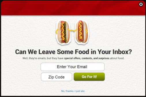
Grub Hub
A great personality-infused popup, and who wouldn’t want food in their inbox?
Avigne Lingerie

Cosmopolitan
This is a great example of offering your visitors something they want in return for the email addresses. And it doesn’t necessarily have to be a discount. Be creative and thing about the digital products you can create to offer your visitors.

A great way to attract subscribers is to offer a chance to win.

Fed by Threads
You are fabuous! That’s all I have to say.

A stark black and white is an excellent way to draw attention to your offer. Note that the benefit for the visitor is the biggest font here, and left uncluttered for maximum visibility:

Party Packed
An attention grabbing “hey you” and copy that speaks to the readers in their kind of lingo.

South Tree
South Tree put a focus on growing their Facebook followers, by using a Facebook follow as a gateway to a discount.

Exit-intent examples
Tobi
Tobi reserves their absolute best offer for those visitors who are about to leave.
Charge Card
This exit-intent popup offers a $4 discount…in exchange for a social action.

Baby Age
In case you’ve already put something in your cart, Baby Age reminds you of it.

Green Mountain Mustard

House of Holland
Leaving so soon? House of Holland addresses the fact that the visitor has the intention of leaving, and gives them a reason to return.

Cool Material
Though Cool Material has no reference to the fact that the visitor is leaving, they do offer them to join in on their email list.

Push notifications
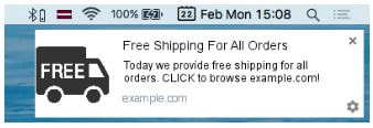
The push notification lets you send messages to your visitor through their browser, even after they’ve left your store.
This is a comparatively new technology that you stand to gain from right now, since not many are capitalizing on it yet and the regular consumer isn’t used to it.
Here are some ways to use them:

Wait but why
Tools to build popups
Now that you’ve soaked up all of this inspiration, you’re just about ready to start implementing these popup ideas in your own store. Here are some tools that we’ve tested and come to love to build converting popups:
Hubspot Pop-up Forms: For growing your mailing list (free)
Sumo: For collecting emails in exchange for something
MaxTraffic: For exit intent emails, opt-in emails and push notifications
WisePops: For exit offers, email overlays, and survey popups
Popups can be an incredible resource to boost your store. Let us know in the comments what you’ve done with your popups!
Read next: 10 Effective Ways How to Market a Product


