


Table of contents
In an era where digital access is at our fingertips, millions of users are still being left behind. Shockingly, only 3% of the web is fully accessible, leaving a significant gap for the 16% of the global population living with disabilities. Barriers like low-contrast visuals and illegible logos make it harder for these individuals to connect with the brands they love.
Accessibility isn’t just a nice-to-have; in many regions, it’s actually a legal requirement. Yet, the level of commitment to inclusive design varies widely across industries. So, which brands are setting the standard and which are falling short?
To answer this, we conducted an in-depth analysis of 44 leading brands, evaluating them on key criteria such as color accessibility, contrast ratio, and logo legibility.
The top most accessible logos
Our analysis shows that food and drink brands are setting the standard for accessibility, with three of the top five brands hailing from this industry. This strong performance underscores a clear commitment to creating inclusive and user-friendly branding, a critical priority for brands whose products are daily life staples.
1. Doritos
Doritos dominates accessibility rankings with perfect logo legibility and color accessibility scores of 10. Its bold black, white, and orange design is fully colorblind-friendly thanks to its high contrast, earning it a near-perfect contrast score of 9.94.
2. Taco Bell
In second place is Taco Bell. Taco Bell’s vibrant pink and purple logo shines with a perfect contrast score of 10 and a strong legibility score of 9.4, making it easy to read for those with visual impairments.
3. Pepsi
There is an age-old debate over which is better, Coca-Cola or Pepsi, but when it comes to accessibility, Pepsi stands out. In particular, Pepsi takes the lead in contrast, with its iconic red, blue, black, and white palette achieving the highest attainable contrast ratio score—a perfect 10. This makes the logo highly readable for individuals with low vision or color blindness.
| Rank | Brand | Logo | Color accessibility | Contrast ratio score | Logo legibility score |
| 1 | Doritos |  |
10 | 9.9 | 10 |
| 2 | Taco Bell | 10 | 10 | 9.4 | |
| 3 | Pepsi |
|
10 | 10 | 8.9 |
| 4 |
Nike |

|
10 | 10 | 8.3 |
| 5 | TikTok | 
|
10 | 10 | 8.3 |
| 6 | X (Twitter) | 
|
10 | 10 | 7.6 |
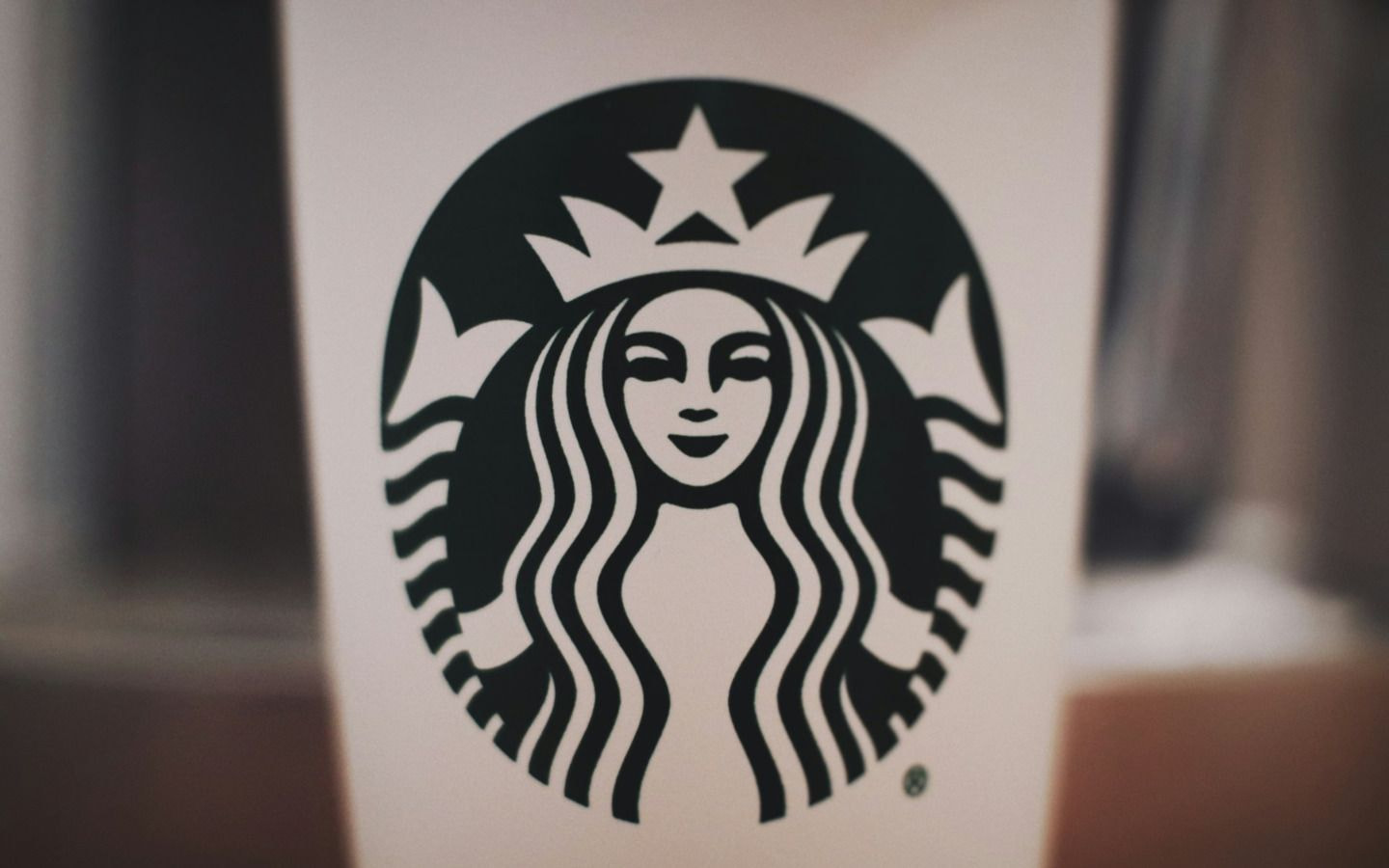
| 7 | Starbucks | 
|
10 | 4.6 | 9.2 |
| 8 | Kraft |
|
10 | 5.2 | 8.8 |
| 9 | The Cheesecake Factory |
|
10 | 6.7 | 7.8 |
| 10 | Converse | 
|
10 | 10 |
5.9 |
The least accessible logos
1. Microsoft
This tech giant’s iconic logo significantly undermines the brand’s accessibility. Its vibrant blue, green, red, and yellow colors result in a poor contrast ratio of just 1.87, a legibility score of 5.4, and a color accessibility score of 7.6. These issues pose major challenges for users with visual impairments like color blindness or dyslexia, highlighting a surprising gap for Microsoft.
2. Lays
While food and beverage brands often lead in accessibility, Lay’s stands out as an exception, ranking second for inaccessibility. The logo’s red and yellow color scheme earns a disappointing 6.8 for color accessibility, posing a significant challenge for individuals with Tritanomaly or Tritanopia, who struggle to differentiate between these hues. Its low contrast score of 1.69 only magnifies the issue, further reducing the logo’s visibility. Surprisingly, despite its somewhat obscure font, the logo scores 8.3 for legibility, offering a silver lining.
3. Dunkin Donuts
Dunkin Donuts also deviates from the trend of food and beverage brands being the most accessible, boasting the third least accessible logo. Dunkin’s playful orange and pink logo creates serious accessibility issues, especially for users with tritanopia (blue-yellow color blindness). It scores a low 1.45 for contrast ratio and 7.6 for color accessibility, while its legibility score of 7.7 shows room for improvement.
| Rank | Brand | Logo | Color accessibility | Contrast ratio score | Logo legibility score |
| 1 | Microsoft |
|
7.6 | 1.8 | 5.4 |
| 2 | Lays | 
|
6.8 | 1.6 | 8.3 |
| 3 | Dunkin | 
|
7.6 | 1.4 | 7.7 |
| 4 | Walmart | 
|
10 | 1.9 | 5.1 |
| 5 | Trader Joe’s |
|
10 | 2.2 | 5.2 |
| 6 | Netflix | 
|
10 | 1.4 | 5.7 |
| 7 | M&Ms |
|
6.8 | 6.9 | 6.7 |
| 8 | Oreo | 
|
6 | 2.9 | 10 |
| 9 | Home Depot | 
|
10 | 0.9 | 6.9 |
| 10 | In N Out Burger | 
|
7.6 | 1.8 | 9.7 |
How brands can be more accessible
Creating an accessible brand isn’t just about meeting legal requirements. It’s about making sure that everyone’s able to engage with your content. To achieve this, guidelines recommend that your content should be perceivable, operable, understandable, and robust. Here are 3 ways you can implement these principles in your design:
Follow WCAG guidelines for color contrast
The Web Content Accessibility Guidelines (WCAG) provide clear recommendations to ensure online content is inclusive, particularly for those with color blindness or who have difficulty distinguishing between colors. For text, the guidelines recommend a contrast ratio of at least 7:1 for normal text and 4.5:1 for large text. High contrast between background and text is essential for readability, so opt for bold, distinguishable color combinations to make your brand visually accessible to all.
Utilize accessible fonts
Creative fonts can be eye-catching but can also be a barrier to accessibility. Stick with accessible fonts: simple, clean, and easily legible typefaces that work well for those with visual impairments. Test for font choices across various devices, screen sizes, and resolutions to ensure consistency and readability. Size matters too: choose a font size that is easy to read without zooming, and consider enabling resizable text for user convenience. For print materials, check readability through a sample or preview before ordering via a print-on-demand service.
Simplify visual elements
Overly complex designs or cluttered elements can be challenging to interpret quickly, especially for individuals with visual impairments. Opting for a clean, straightforward design will enhance accessibility and ensure your logo remains impactful across all audiences.

Methodology and sources
To determine which logos were the most and least accessible, Printful analyzed 44 brands, ranking them based on 4 key metrics:
-
Logo color accessibility score
-
Logo contrast ratio score
-
Logo legibility score
The evaluation followed a structured methodology: each brand’s logo was uploaded to extract brand colors and identify conflicts under “Color Blind Safe,” with scores weighted at 60% for overall theme conflicts and 20% for each type of color blindness, resulting in a final score out of 10. For contrast analysis, the logo was uploaded to the “Contrast Checker,” and the font and background colors were used to calculate a contrast ratio, which was then scaled to a score out of 10. Once all data was collected, brands were indexed and ranked from highest to lowest.
1 https://userway.org/blog/disability-statistics/
2 https://www.who.int/news-room/fact-sheets/detail/disability-and-health

Printful is an on-demand printing and fulfillment service that helps businesses create and ship custom products.