


Table of contents
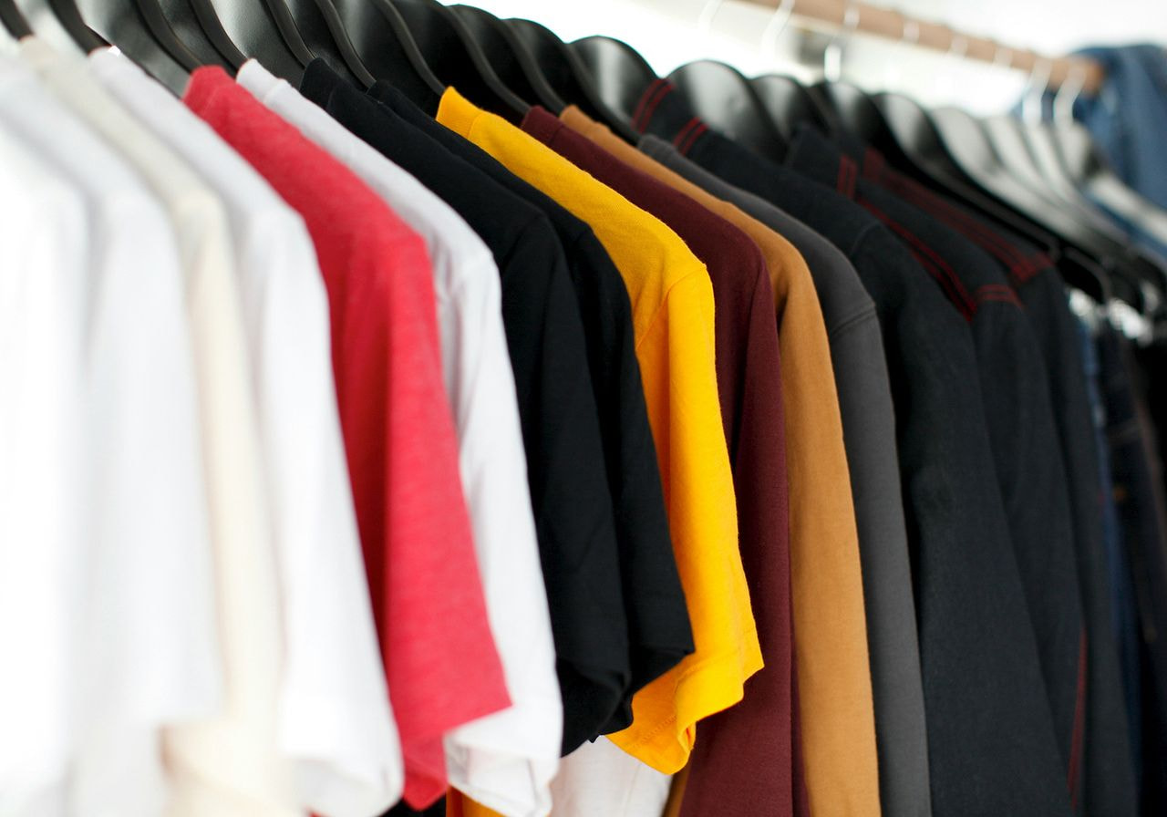
Great designs grab attention – but the right t-shirt and ink color combinations sell the product. In fact, color increases brand recognition by 80%, making it one of the most powerful tools in your lineup.
A strong design isn’t just about the artwork. The right color combo turns a basic idea into trending products people actually want to wear.
Need ideas that work? This guide breaks down 21 proven t-shirt and ink color combinations to help your designs stand out and look polished – every time.
Key takeaways
-
Prioritize high contrast: For maximum legibility, pair darker colors with light ink (and vice versa). This ensures your shirt designs are readable from a distance.
-
Utilize color theory: Use the color wheel to find complementary colors for high-energy designs or analogous colors for sophisticated, minimalist designs.
-
Understand fabric interaction: Dark shirts often require a white underbase to maintain the ink vibrancy of bright colors.
-
Match the palette to brand identity: Choose earth tones for rugged outdoor brands, and vibrant primary colors for athletic team uniforms.
-
Select the right printing method: Use DTG for intricate designs, and screen printing for bold, high-opacity ink color pairings.
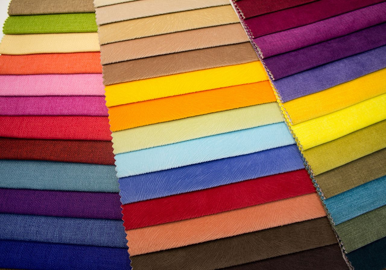
How to choose the right t-shirt and ink color combinations
Before picking a palette for your custom t-shirts, you need to understand how ink colors interact with fabric. Professional brand building requires a balance of aesthetic appeal and technical printability.
Contrast and readability
The most critical factor in a color t-shirt design is high contrast. If your ink color pairings are too similar – such as navy blue ink on a black shirt – the design will disappear. Aim for a striking contrast by pairing darker colors with light ink, or vice versa.
Fabric color vs ink opacity
Different t-shirt colors absorb ink differently. Dark shirts often require an underbase (a layer of white ink) to ensure bright colors like neon green or bright orange remain vibrant. On light colored t-shirts, the ink often sits flatter and more naturally within the fibers.
Audience and brand identity
Your color combination should reflect your brand identity. Minimalist designs often rely on neutral colors and earth tones, while sports team uniforms typically use high-energy primary colors like royal blue and red.
Printing method considerations
-
Direct-to-garment (DTG): Best for intricate designs, thin lines, and colorful designs with many gradients.
-
Screen printing: Ideal for bulk orders with limited ink colors. It provides excellent ink vibrancy and durability.
Best t-shirt and ink color combinations
To help you build a professional brand that stands out, we’ve curated a list of the most effective and visually striking color pairings.
1. Black and white
You won't find a more traditional duo than black and white. While not technically on the color wheel, this timeless classic provides the most striking contrast available.
-
Pairing: White ink on a black t-shirt or black ink on a white t-shirt.
-
Style: Works for everything from bold typography to minimalist designs.
2. Heather grey and navy blue
While many designers use dark backgrounds for light text, heather grey and navy blue prove the opposite works beautifully.
-
Pairing: Navy blue ink on a heather grey shirt.
-
Style: Popular for vintage-looking shirt designs, colleges, and athletic clubs.
3. Navy blue and yellow
On opposite sides of the color spectrum, these form an uplifting and energetic color combo.
-
Pairing: Yellow ink on a navy blue t-shirt.
-
Style: Best for sports-themed designs and high-impact illustrations.
4. Royal blue and orange
These complementary colors are among the most exciting color schemes. The cool depth of royal blue makes the bright orange pop.
-
Pairing: Orange ink on a royal blue shirt.
-
Style: Perfect for inspirational texts and high-energy brand colors.
5. Forest green and beige
If you want a calming, sophisticated look, look no further than forest green and beige.
-
Pairing: Beige ink on a forest green shirt.
-
Style: Ideal for nature-inspired graphics and outdoorsy custom apparel.
6. Maroon and white
White-maroon combinations exude wisdom and confidence. The deep brownish-red of the shirt allows the white ink to look crisp and clean.
-
Pairing: White ink on a maroon shirt.
-
Style: Best for varsity styles and delicate, high-end typography.
7. Olive and gold
This is a luxurious version of the earthy palette. The olive green provides a serene base for gold designs.
-
Pairing: Gold ink on an olive green shirt.
-
Style: Excellent for intricate designs, military-themed apparel, or premium streetwear.
8. Red, blue, and yellow
Using all three primary colors can be tricky, but it results in a highly vibrant energy.
-
Pairing: Red and blue ink on a mustard yellow shirt.
-
Style: Great for retro 1970s themes and playful, colorful designs.
9. Navy blue and light blue
Using different shades of the same color creates a sense of serenity and balance.
-
Pairing: Light blue ink on a navy blue shirt.
-
Style: Ideal for ocean-themed graphics and cohesive, modern branding.
10. Baby pink and red
This color combo creates a dreamy, romantic aesthetic.
-
Pairing: Red ink on a baby pink t-shirt.
-
Style: Perfect for Valentine’s Day themes or whimsical designs.
11. Dark green and white
Similar to maroon, dark green conveys sophistication and timeless appeal.
-
Pairing: White ink on a dark green shirt.
-
Style: A staple for team uniforms and vintage floral drawings.
12. Orange and black
This combination is perfect for brands that prefer attention-grabbing shirt designs.
-
Pairing: Black ink on an orange shirt (or vice-versa).
-
Style: Halloween-themed shirts or high-visibility workwear.
13. Red and yellow
While common in fast-food branding, this t-shirt color palette also works for bold retro art.
-
Pairing: Yellow designs on a red t-shirt.
-
Style: Cheerful graphics and fun, high-impact statements.
14. Orchid purple and midnight blue
Among secondary colors, purple can be hard to pair. Midnight blue adds depth and balance.
-
Pairing: Midnight blue ink on an orchid purple shirt.
-
Style: Best for galaxy-inspired graphics and sophisticated, artistic brands.
15. Light t-shirts with dark ink
For light-colored t-shirts like white, cream, or light blue, using darker shades of ink is a failsafe to ensure enough contrast.
-
Pairing: Charcoal, black ink, or navy blue ink on a white t-shirt or sand-colored base.
-
Style: Professional, clean, and highly legible – ideal for minimalist designs and casual wear.
16. Dark t-shirts with light ink
To make a t-shirt pop, use light ink on dark shirts. This is the gold standard for high-visibility streetwear and bold branding.
-
Pairing: White ink, mint green, or lavender on a black or navy blue t-shirt.
-
Style: Modern and edgy, perfect for bold graphic tees and impactful typography.
17. Neutral shirts with bold ink colors
Pairing neutral colors like sand, stone, or cream with bright colors creates a fashion-forward aesthetic that feels intentional and curated.
-
Pairing: Neon green, bright orange, or royal blue ink on a cream or tan shirt.
-
Style: Trend-focused and vibrant, great for lifestyle brands and artistic shirt designs.
18. Monochrome and tonal combinations
Using different shades of the same color creates a sophisticated, subtle look that exudes a premium brand feel.
-
Pairing: Dark grey ink on a light heather grey shirt or forest green ink on a mint green shirt.
-
Style: Understated and high-end, ideal for luxury loungewear and corporate brand identity.
19. Vintage and muted color palettes
Muted color schemes – such as dusty rose, sage, and mustard – work harmoniously for a heritage or retro-inspired feel.
-
Pairing: Burnt orange or forest green ink on a sage green or dusty rose t-shirt.
-
Style: Nostalgic and organic, perfect for sustainable brands and custom apparel.
20. High-contrast combinations that always work
When in doubt, the high-low approach ensures a striking contrast that never fails.
-
Pairing: White ink on a royal blue shirt or bright orange on a navy blue base.
-
Style: Classic athletic and collegiate looks that guarantee visibility and consumer appeal.
21. Trending t-shirt and ink color combinations
Current market trends favor ‘90s retro tones and deep earth tones, moving away from standard primary palettes.
-
Pairing: Cream ink on a clay or terracotta shirt, or chocolate brown ink on a matcha green base.
-
Style: Contemporary and earthy, best for eco-conscious brands and modern streetwear.
T-shirt and ink color combinations by printing method

To achieve a retail-ready finish, your chosen t-shirt and ink color combinations must align with your print method. Each process interacts differently with the fabric fibers, influencing how your color pairing appears on the final product.
Explore how Printful’s printing methods impact your color choices and design execution.
DTG printing color considerations
Direct-to-garment printing works much like a high-end inkjet printer, spraying water-based inks directly into the fabric. This method is the champion for intricate designs, thin lines, and colorful graphics that require high-resolution detail.
-
Ink vibrancy: Because DTG inks are absorbed by the fibers, they offer a soft, vintage feel. For dark shirts, we apply a white underbase to ensure light ink and bright colors like neon green or bright orange still pop.
-
Color spectrum: DTG supports a virtually unlimited range of colors, making it ideal for photorealistic graphics and smooth gradients that would be difficult to achieve with other methods.
Screen printing color considerations
Screen printing remains the heavy hitter for durability and bold, solid colors. In this process, ink is pushed through a mesh stencil, creating a thicker layer that sits on top of the fabric.
-
High-opacity results: This method excels at creating striking contrast on darker colors. The thicker ink application produces a slightly raised texture and exceptional ink vibrancy that can last for decades.
-
Layering and simplification: Since each color requires a separate screen, it’s best to simplify your color schemes. Focus on high-contrast pairings, like white ink on navy blue, to maximize impact while keeping production efficient.
Conclusion
The right t-shirt and ink color combination can elevate a design – or hold it back. Get clear on your brand’s look and feel, then use these combinations as a starting point to create pieces that look just as good in real life as they do on screen.
Great ink color combos don’t happen instantly. Test different options, order samples, and check contrast and print quality before launching.
Ready to create your next bestseller? Start designing with Printful and bring your brand to life.
Read next: The most popular t-shirt colors to sell this year
FAQ
Virtually any t-shirt color can work if you follow the rules of high contrast. For dark shirts, choose light ink like white, gold, or neon.
For light colored t-shirts, use darker colors like black, navy, or forest green. Always check the color wheel for complementary colors to ensure the t-shirt pops visually.
The most effective ink color combinations for a black t-shirt include white ink, silver, and gold designs.
Bright colors like neon green, bright orange, and royal blue also perform exceptionally well on black fabric, provided a proper white underbase is used during printing.
For a professional look, most minimalist designs use 1-2 ink colors. However, colorful designs can utilize 3-6 colors, as long it maintains visual balance.
For screen printing, fewer colors are more cost-effective. For DTG, you can use an unlimited number of ink colors without increasing the production price per garment.
Generally, no, but light-colored inks may require more preparation. When printing light ink on darker colors, a white underbase is necessary to prevent the shirt color from bleeding through.
While this adds a step to the manufacturing process, most modern print-on-demand companies like Printful include this in their standard fulfillment services.
The safest shirt and ink color combination is white ink on a navy blue or black shirt. These color pairings provide maximum readability and are universally popular among customers.
Another safe bet is black ink on a white shirt or a heather grey shirt, which fits almost any casual wear brand.

Published author, scholar, and musician, Andris draws on over 11 years of experience in and outside academia to make complex topics accessible – from SEO and website building to AI and monetizing art. Devoted to his family and self-confessed introvert, he loves creating things, playing musical instruments, and walking around forests.