


Table of contents
Creating the perfect print file is the first step to a successful print-on-demand (POD) business.
Before you hit upload, make sure your design file is set up right. Image size, file format, resolution, and bleed area all affect how your final product turns out. A clean, print-ready file is the foundation of a product that looks professional and sells well.
Get it wrong, and you’ll get blurry prints, unexpected white borders, or production delays. Get it right, and you’ll enjoy higher-quality results, faster turnaround, and repeat customers.
In this guide, we’ll walk you through how to prepare perfect print files – from picking the right file type and dots per inch (DPI) to setting up your design for clean, consistent results. Plus, we’ve added insider tips and real examples from our Graphics Team so you can hit the ground running.
Print file terminology
Understanding these terms will help you meet Printful’s image size requirements and guide you toward a clean, professional finished product.
-
Print size – The size your design will appear on a product, measured in inches or centimeters. This can differ from the digital image size.
-
Image file size – Measured in bytes (like MB or KB), this tells you how much storage space your file takes up. Printful’s Design Maker accepts files up to 200 MB.
-
Pixels – The tiny building blocks of any digital image. The more pixels, the higher the potential quality.
-
Pixel dimensions – The total number of pixels across the width and height of your image (e.g., 4500 × 5400 px).
Get your resolution and DPI right
Resolution is non-negotiable when it comes to printing. It determines the clarity, sharpness, and overall quality of your design.
-
Resolution – The density of pixels (for digital) or dots (for print). It’s measured in PPI (pixels per inch) and DPI (dots per inch), respectively.
-
DPI – The gold standard for print quality. A higher DPI means more printed dots, more detail, and a cleaner finished product. Lower DPI = fewer dots = blurry results.
-
Best resolution – For Printful products, 150 DPI is the sweet spot. It gives you sharp lines, vibrant colors, and a pro-grade look.
Why resolution makes all the difference
Let’s put theory into practice. Check out the penguin comparison below – three identical images in size, but with different DPIs: 30, 60, and 150.
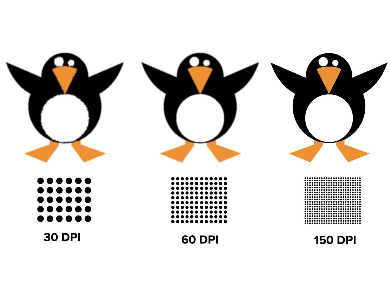
Which one would you want to sell? Exactly. The 150 DPI penguin looks cleaner, sharper, and more like your digital design print. That’s the one that translates best to the real thing.
If you want to avoid fuzzy prints and frustrated customers, always aim for the best resolution. The detail is what sets a great finished product apart from the rest.
Now that terminology is out of the way, let’s get back to Printful print files.
Guidelines for print-on-demand print files
Always check the Printful guidelines and download the print file templates under the File guidelines tab on each product page. They’re tailored for each print project, so you don’t have to guess the correct file type, resolution, or print-ready dimensions.
The File guidelines tab is your friend

Whether you’re designing t-shirts, mugs, or posters, templates help you get the sizing, DPI, and bleed area right. They’re especially useful for print-on-demand all-over-print and embroidery designs – both require precision in image size, placement, and background.
New to the game? Use the Design Maker. It includes tools like Clipart, Quick Design, and a Text Tool that let you create solid print-ready files with minimal effort. If something’s off – say, your PNG file is too low-res or missing a transparent background – the Design Maker flags it before you place an order.
Print file checklist – the essentials
-
Accepted print file formats – PNG, JPEG.
-
Embroidery files – PNG only (JPEG not recommended due to unwanted background and higher stitch count).
-
Maximum print area – Varies by product. Example: 12″ × 16″ for t-shirts, expanding to 15″ × 18″ on select DTG products.
-
Resolution – 150–300 DPI is ideal. For smaller products with lots of detail, like mugs or personalized phone cases, use 300 DPI.
-
Color profile – Use standard RGB IEC61966-2.1 (sRGB). Why not CMYK? Because our printers use an advanced CMYK process optimized for RGB files, giving you more vibrant colors and greater accuracy in the finished product. Set the color profile in your image editing software.
-
File size – Max upload is 200 MB.
-
Acceptable content – Must follow Printful’s content guidelines. Designs that violate legal or ethical rules won’t be printed.
Read more:

5 Print project mistakes and how to fix them
Even if you know what the best file format for t-shirt printing is and other specifics, mistakes can still ruin the final result. One of the most common issues? Uploading a low-res image and stretching it across the t-shirt print area size like Play-Doh. Let’s fix that.
1. You resized a low-quality image, lowering its DPI even more
You upload a 335 × 410 px moka pot to the Design Maker. It's crisp at that size, but tiny for standard custom t-shirt printing (up to 12″ × 16″). You scale it up, and your DPI plummets to 60. That’s nowhere near Printful’s recommended 150–300 DPI range for larger prints.
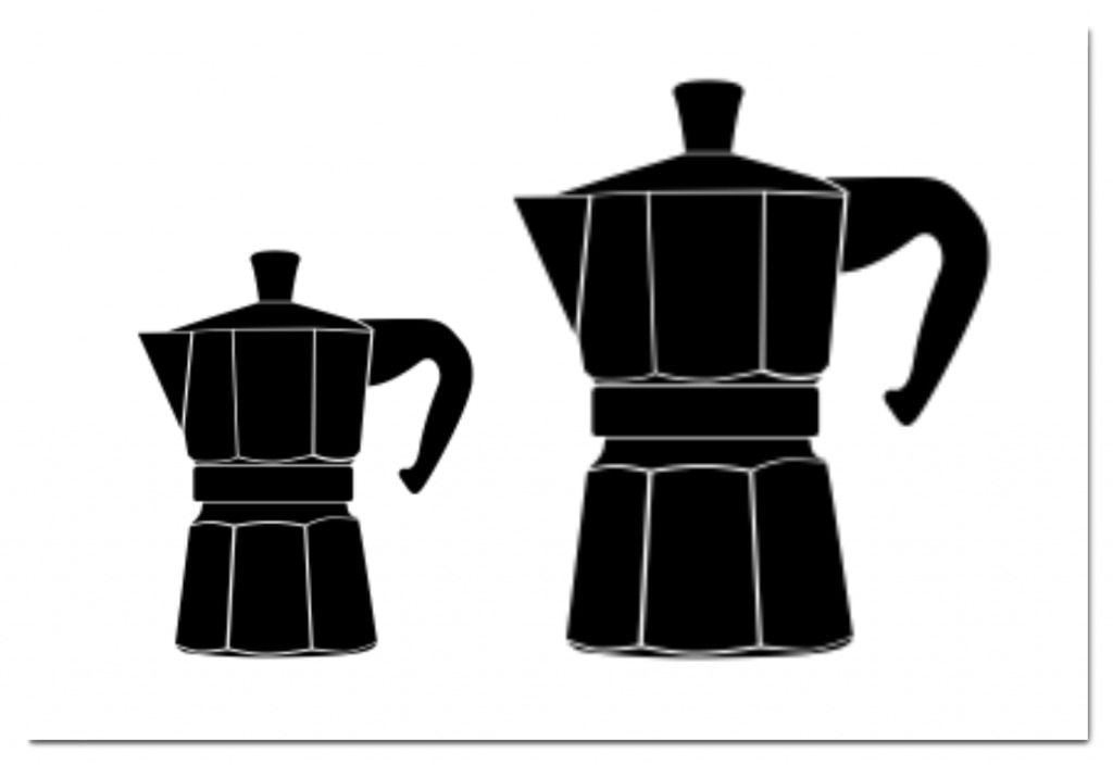
Low-quality image (left), the same image enlarged (right)
Your options
Here’s how to deal with low-resolution images and get your print-ready files back on track:
-
Option A – Find a new, high-quality image of a moka pot that’s 150–300 DPI.
-
Option B – Use the image at a smaller size.
Shrink it back down. In the Design Maker, reduce the image size using the blue corner handles. This tightens the DPI, making the moka pot sharper. Sure, it may only work as a pocket design, but the final document will pass the quality check.
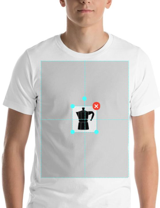
A bit sad, but might work as a pocket print!
-
Option C – Convert your image to a vector.
If you’re comfortable using tools like Adobe Illustrator, Photoshop, or Inkscape, try recreating the moka pot as a vector graphic. Vectors are great for digital printing because they’re infinitely scalable without losing quality. Use the Pen tool or trace features to redraw your design.
Then, export it as a PNG file with a transparent background. Now you’ve got a print-ready raster image. You can tweak the format, adjust size and colors, and prep it for printing. Just remember to save the right file type and double-check there’s enough space between design elements.
Tip: Avoid adding effects like gradients or shadows that your printer might not reproduce well. Use solid tones or rich black for better results.
-
Option D – Use the Smart Image Tool.
No time to redraw? Printful’s Smart Image Tool uses AI to enhance low-DPI files. It analyzes your image and fills in missing info to meet minimum print project standards.
For example, your 60 DPI moka pot gets adjusted to 120 DPI. It’s still under 150, but the tool boosts it enough to meet quality guidelines.

The Smart Image Tool in action
This is a quick fix if your design print isn’t too complex. But remember: more detail and higher resolution always mean a higher-quality finished product.
2. You made a DTG design with a background that shouldn’t be there
Avoid adding a background color unless it’s a part of your design. This is especially important for the custom clothing designs you want printed using the direct-to-garment (DTG) technique.
Learn more: DTG vs. Screen printing: Choosing the right apparel printing method for you
Why? The printer will print all the colors it sees in the design. For the printer, a black background on a black garment does not equal transparency.
So, if you create a DTG design with a black background on a black garment, you’ll be left with a grayish rectangle around your design. It will be gray because prints on all non-white garments require a white underbase to help the colors stand out.
If you want the gray rectangle, that’s cool. But if you don’t, remove the background! Use the Background Removal Tool in the Design Maker to remove the unnecessary background with just one click.
If you’re not sure if your design has a solid background, open the file in Photoshop, GIMP, or a similar image editing software. You’ll see the standard white-and-grey checkered background if the background is transparent.

Design with a white background (left), design without a background (right)
3. You went crazy with transparency, where you should’ve kept cool
Transparency as a design element can look great on certain products and with AOP, but on DTG printing, it’s tricky. If you don’t fully understand how it behaves, your final print project could look patchy or unintentional.
DTG and transparency don’t always mix
Whether your semi-transparent artwork prints well on a t-shirt depends on:
How you created the design – Effects like feather brushes or low-opacity layers are technically semi-transparent.
The level of transparency – Fully transparent elements (100%) will disappear, but anything in between might not behave as expected.
Garment color and white underbase behavior:
-
White garments – No white underbase, transparency will print as-is.
-
Light garments – The underbase might peek through just a little.
-
Dark garments – The underbase may appear as small white speckles in semi-transparent areas.
Tip: Always check your transparency in the Design Maker preview before ordering a test print. This will prevent surprises.

Here, the white underbase peeking through is a design choice
Transparency and AOP or sublimation? No problem
For all-over print (AOP) and sublimation products (like leggings, mugs, or towels), transparency is fine. These printing methods don’t use a white underbase, so your design will appear exactly as it looks in your final document.
Still, it’s best to fill the entire bleed area to avoid white borders or blank fabric showing through, unless you’re intentionally designing around those.

AOP design example
Important note on phone cases: Keep your design elements at either 0% or 100% transparency. We don’t recommend using semi-transparent areas, as they often result in patchy or uneven printing.
If semi-transparencies are your thing, our Graphics Team recommends using the halftone effect instead. Halftone can be used on any product, regardless of the printing process.
Valuable read: 11 Things you didn’t know Printful’s Design Maker could do
4. You didn’t remove your background properly
A design might look sharp on-screen, but once printed, those fuzzy leftover edges from a poorly removed background can make the artwork look cheap or unprofessional.
It’s not a resolution issue – it’s about how cleanly you removed the background before exporting your print file.
How to spot and fix leftover edges
When you create your final design with a transparent background, duplicate the design layer several times in your editing software (Photoshop, Illustrator, etc.). This trick helps expose faint remnants that weren’t fully erased – think of tiny specks or jagged lines around your design.
Here’s how it works:
-
Duplicate the design layer 3–5 times
-
Watch for any haze, noise, or white edge glow
-
Zoom in to clean up those leftover bits manually
This step is critical, especially if you're submitting your final document as a PNG or PSD with a transparent background.
Here’s what you might see after duplicating those layers:

The yellow arrows point to the fuzzy edges that need to be removed
Tip: Cleaning up your edges ensures your artwork looks neat and professional once it's printed on the product – no weird glows or dirty outlines.
Final steps to clean export
Once your background is fully cleaned:
-
Flatten the image if needed
-
Save it in the right file format (PNG is best for transparency)
-
Double-check that no shadowed edges remain around the artwork
Use a solid contrasting background temporarily in your design tool to preview what the print file really looks like before uploading.
5. You chose the wrong product for your print
Not all products behave the same when it comes to printing. What looks great on your screen might not translate well when it hits the printer.
When deciding where to place your design, consider the fabric, surface texture, and how your elements, like photos, fonts, or intricate lines, will hold up. The rule of thumb?
-
Patterns shine on all-over prints
-
Photos work best as posters
-
Text-heavy designs with clean fonts are ideal for DTG or embroidery
And don’t forget about fabric type. A design printed on a thick cotton custom hoodie will look different than the same file printed on a lightweight tee. Thicker garments absorb more ink, which can cause your design to appear softer or more faded.
Take tri-blend fabrics, for example. Their looser weave and fiber mix give your DTG print a washed-out, vintage look. If that’s not what you’re after, it might feel like a failed print instead of a creative choice.
Tip: Always review the product description and test your design with a high-resolution preview. If needed, order a test print before adding it to your store.
Make sure your print-ready document matches the product’s printing method. What looks sharp on your screen won’t automatically look crisp in real life without the proper setup.
Valuable read: Guide to Cotton, Polyester, and Blended Fabrics
Ready to create your perfect print file?
If there’s one thing to remember from this blog post – stick to our print file guidelines. Knowing the terminology and Printful specs is a must if you want your orders to reach your customers without hiccups.
Ready to start designing? Head to Printful’s Design Maker and have a go! To make it more fun, check out this batch of typography designs you can use on Printful products – download below.
Read next:
FAQ
For most professional CMYK printing jobs, the best format is PDF or TIFF, especially if you want to preserve fonts, layers, and color accuracy. These formats retain the color data better than JPEGs and are ideal for exporting your document from tools like Adobe Illustrator.
Before you export, always convert your color profile from RGB to CMYK to ensure accurate results with your printer.
To create a high-quality print, start with a high-resolution design and use clearly defined fonts. Make sure your document size matches the required product dimensions and includes a proper bleed to avoid white edges. Use the correct format (usually PNG or PDF) depending on the product and printing method.
Finally, double-check the color profile – use RGB for on-demand digital printing and CMYK for traditional offset printing. Always test on-screen or with a sample print before going to production.
